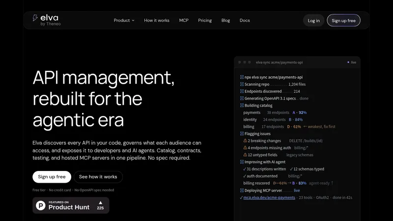
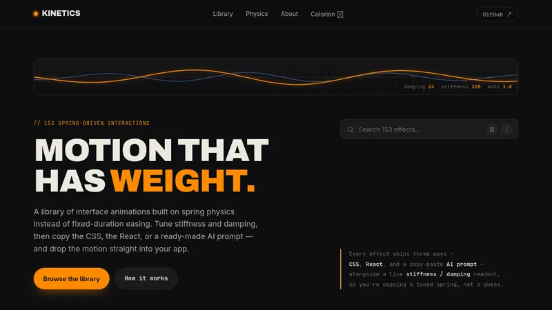
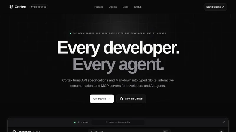
kage
kage
trycase.dev
Design analysis
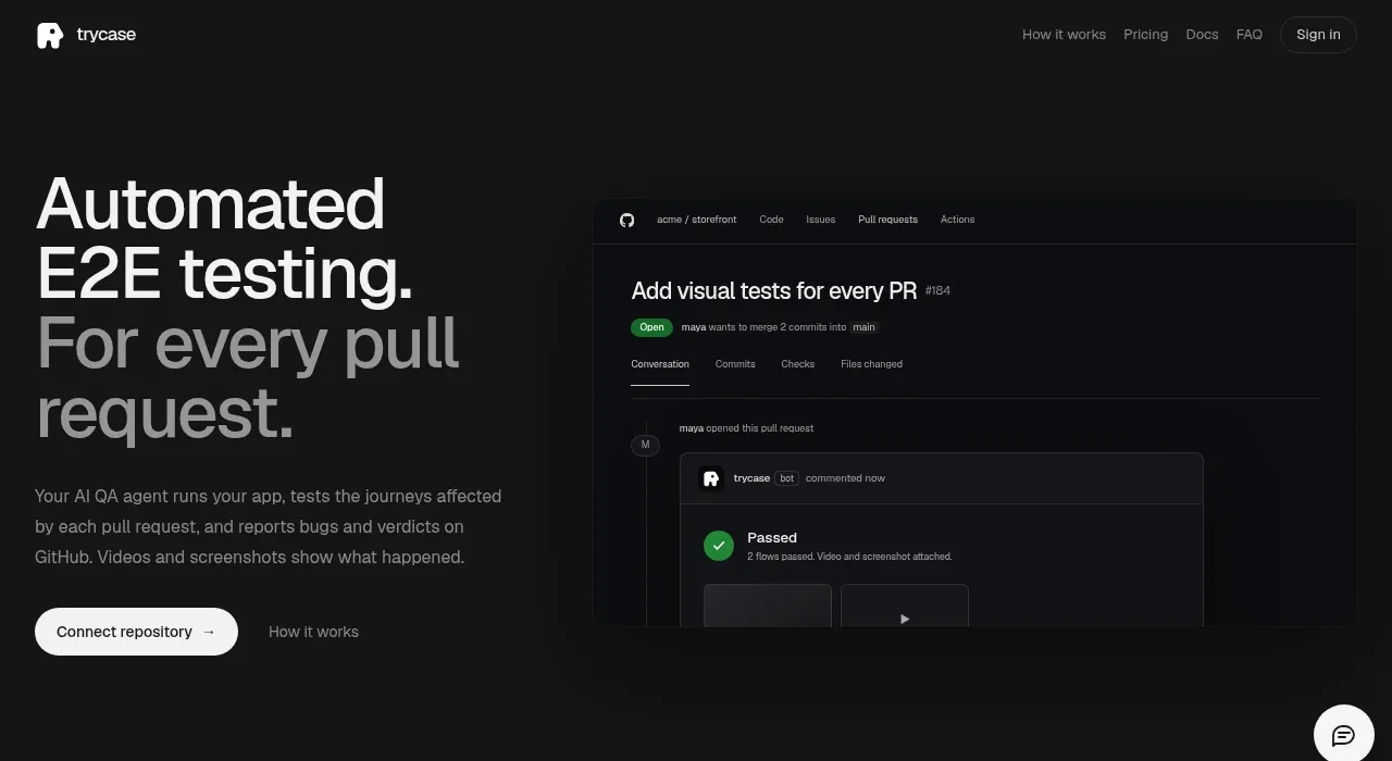
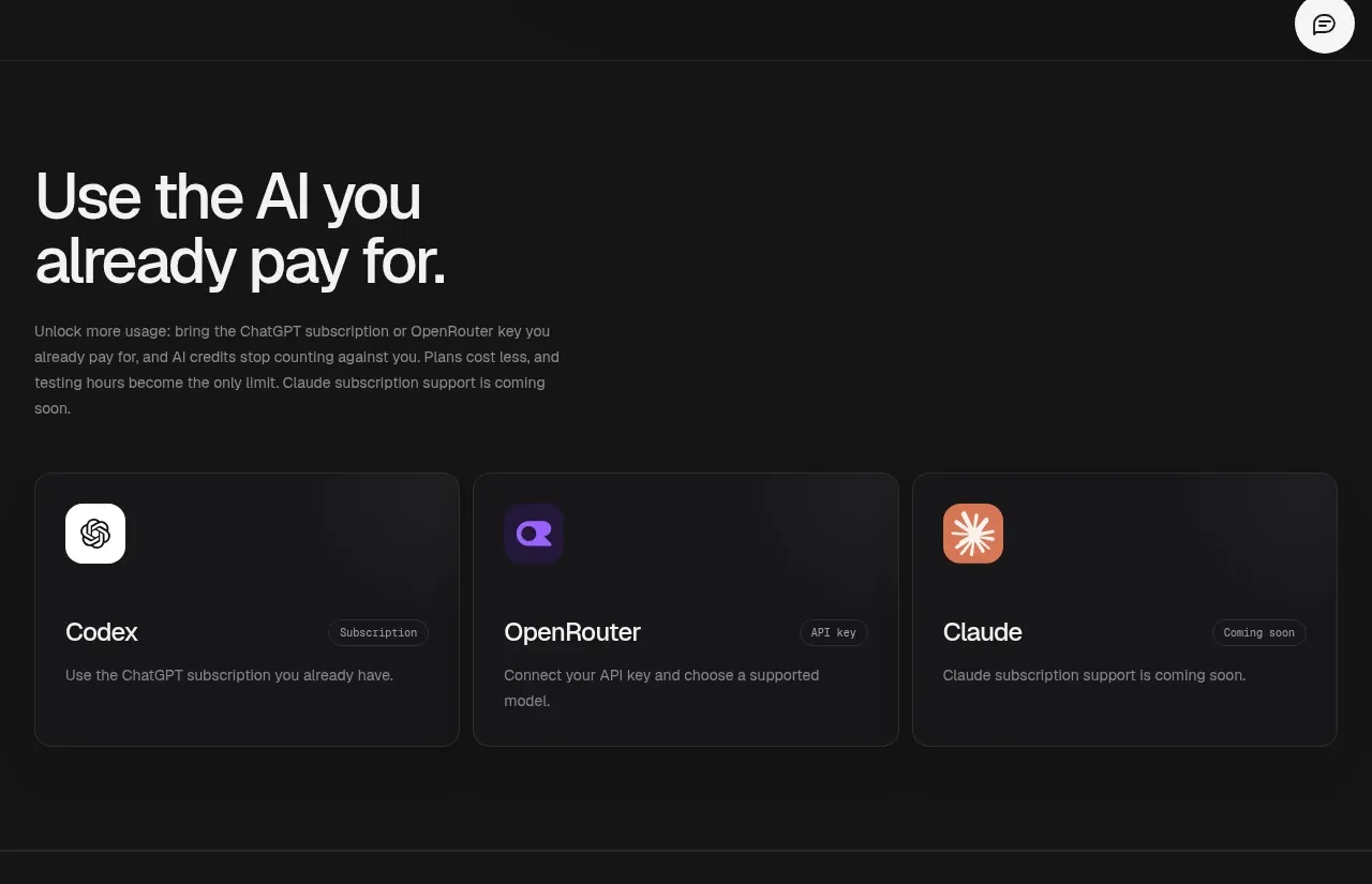
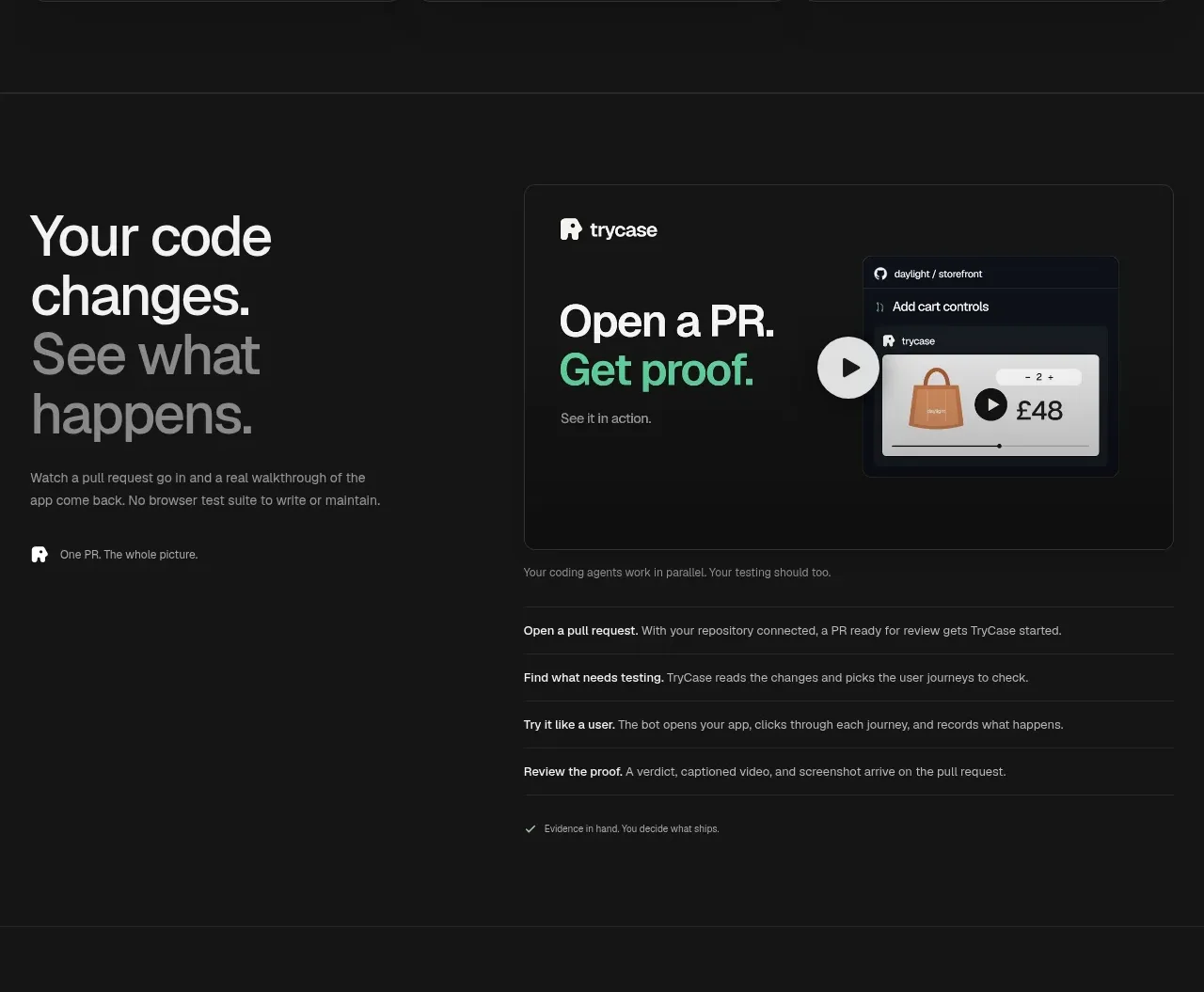
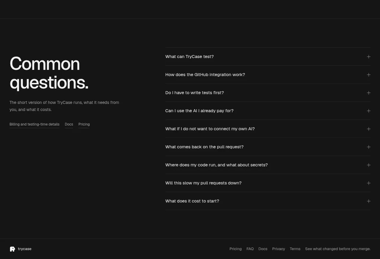
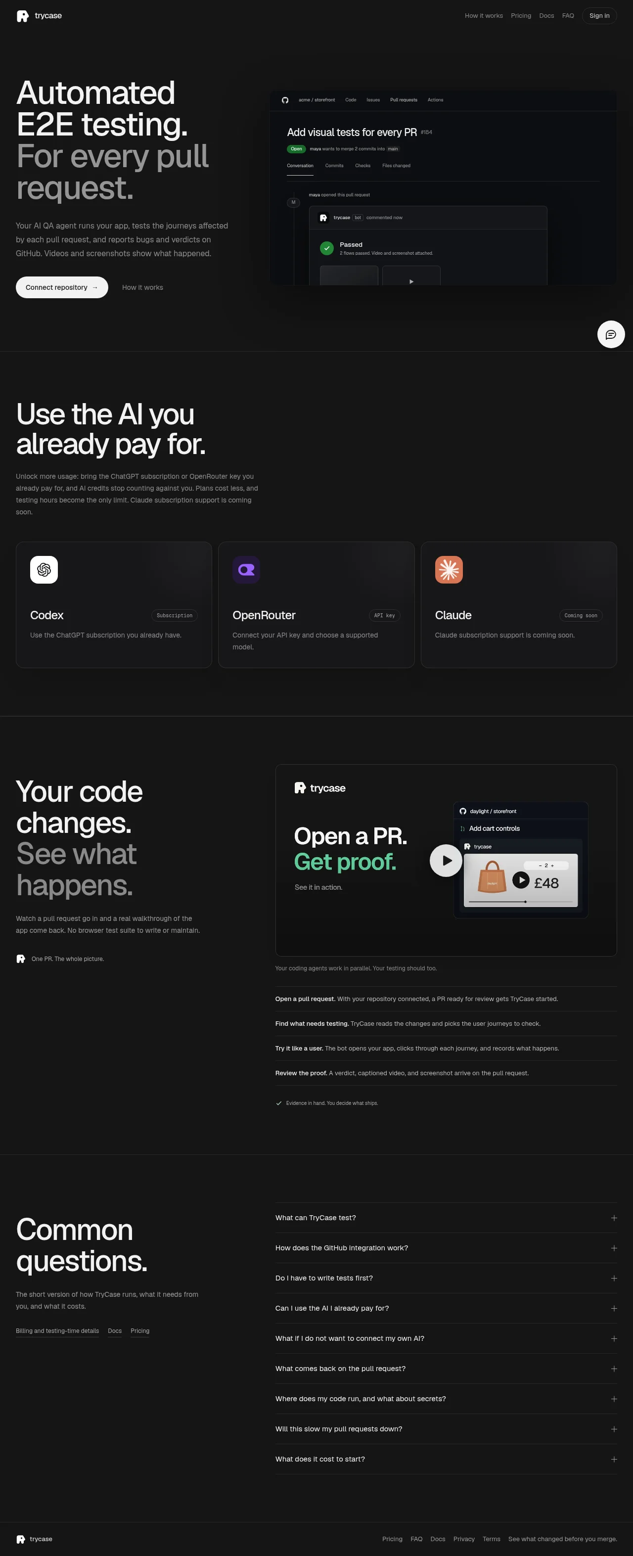
A near-black, type-led landing page built on a repeating asymmetric grid: every section pairs an oversized left-aligned headline — whose final phrase drops to ~50% white — with a denser artifact on the right, whether that is a cropped GitHub PR mockup, three integration cards, a demo card with play button, or a hairline-divided FAQ accordion. Rhythm comes from subtle surface-tone shifts between full-bleed bands and from the contrast between airy display type and dense 14px lists with bold lead-ins. Colour is strictly monochrome with a single mint-green accent reserved for success states and the phrase 'Get proof.', leaving white pill buttons as the only other strong signal.
Prompt preview
## Reference images

Study these alongside the description below: hierarchy, rhythm, spacing, colour. Build for the product you are asked about, using this design language.

- Full page: https://kage-design-assets.t3.tigrisfiles.io/screenshots/trycase/bc7fc0fa-2eda-4dd0-a163-94201d1f5c68-1789452104312-full.webp
- Above the fold: https://kage-design-assets.t3.tigrisfiles.io/screenshots/trycase/bc7fc0fa-2eda-4dd0-a163-94201d1f5c68-1789452101213.webp
- Design on Kage: https://kage.design/designs/trycase-landing-page

## Before you start
Ask the user what product they are building, who it is for, and what brand assets they already have (name, logo, colours, typefaces). Wait for the answers before writing any code — everything below is a design language to apply to *their* product, not a page to recreate from the reference.

## Page structure
1. **Top nav** — slim single row on the page background: wordmark + mark left; 4–5 quiet text links right, ending in one small pill button (e.g. Sign in). No border under the nav; the page background simply continues.
2. **Hero** — two-column split (~45/55). Left: a 3–4 line display headline where the opening phrase is white and the trailing phrase is muted gray; below it a short 2–3 sentence paragraph at reduced opacity; then a primary white pill CTA with an arrow plus a plain text link beside it. Right: a realistic product-artifact mockup (for this kind of product, a PR-check card with repo path, status badge, bot comment, green pass indicator and video/screenshot thumbnails) that bleeds off the right edge of the viewport, slightly cropped.
3. **Integrations band** — full-bleed section on a subtly lighter surface tone with hairline top/bottom borders. Big 2-line headline top-left, short paragraph beneath it, then a 3-column row of equal cards: app icon tile, product name, small bordered status pill (e.g. 'Subscription' / 'API key' / 'Coming soon') right-aligned on the name row, and a one-line description in muted text.
4. **Proof / how-it-works band** — back to the darker tone. Left column: two-tone headline ('Your code changes. See what happens.' pattern), short paragraph, and a small lockup line with the mark and a 5-word tagline. Right column: one large demo card containing the wordmark, a headline where one phrase is the accent colour ('Open a PR. **Get proof.**'), a play-button over a light product screenshot mockup; below the card, a short bold sentence, then a 4-step list where each row is a bold lead-in followed by a regular-weight explanation, separated by hairline rules; close the list with a final row carrying a green check and a one-line summary.
5. **FAQ** — two-column again. Left: large headline, one short paragraph, and 2–3 inline text links to related pages. Right: ~9 accordion rows, each a full question with a plus icon on the right, divided by hairlines, all collapsed by default.
6. **Footer** — one quiet row: wordmark left; text links (Pricing, FAQ, Docs, Privacy, Terms) right, followed by a muted one-line tagline. Optionally a floating circular chat bubble bottom-right.

## Design language
- **Canvas**: near-black page background (~#0a0a0b). Alternate full-bleed sections between ~#101012 and ~#17171a surface bands, each separated by a 1px border of rgba(255,255,255,0.06–0.08). Depth comes from surface tone and hairlines, never from drop shadows.
- **Cards**: 14–16px radius, background one step lighter than the band (~#1b1b1e), 1px hairline border, generous inner padding (~32px). Content inside cards is left-aligned with a lot of breathing room above and below.
- **Type**: one grotesque sans throughout (Inter-like). Display headlines at clamp(3rem, 6vw, 4.75rem), weight ~650, letter-spacing −0.02em to −0.03em, line-height ~1.05. The signature move: render the final phrase of each headline in rgba(255,255,255,0.45–0.55) so the sentence reads as emphasis-then-echo. Body copy 14–15px, line-height 1.6, at rgba(255,255,255,0.6), max-width ~40ch. Bold lead-ins at 600 for list items and step rows.
- **Colour**: everything monochrome except one mint-green accent (~#4ade80). Reserve it exclusively for success/proof: the checkmark, the pass badge, and one highlighted phrase. Primary CTA is a white pill (fully rounded, white bg, near-black text, ~13–14px medium); everything else is a plain text link at body opacity.
- **Badges**: tiny pills — 1px hairline border, transparent fill, 10–11px text, lowercase or sentence case, used to mark status or plan type on cards.
- **Grid & rhythm**: every section repeats the same asymmetric split (narrative column left ≈ 40–45%, artifact or list right), which makes long pages feel systematic rather than decorated. Down the page, density alternates: airy hero → medium card row → dense step list → dense FAQ rows (~56px tall) → minimal footer. Section headlines always sit top-left of their band with the paragraph tight beneath.
- **Mockups over abstractions**: represent the product with believable UI fragments (real-looking titles, statuses, prices) rendered in the same dark card language, and let one artifact bleed off the viewport edge in the hero to create momentum.
- **Motion**: restrained — play buttons imply video proof; accordion plus icons imply expansion; hovers limited to slight border/opacity lifts. No gradients, no glow, no parallax.

## Never
Do not copy the reference product's name, wordmark, logo mark, taglines, or any of its copy. Do not reproduce the GitHub PR mockup content, the storefront illustration, or the specific FAQ questions verbatim. Do not present the result as that product — build the same design language around the user's own brand, name, and content.