kage
kage
uini.io

Design analysis
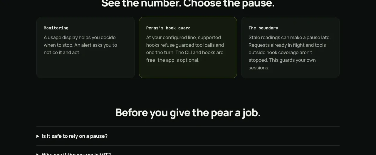
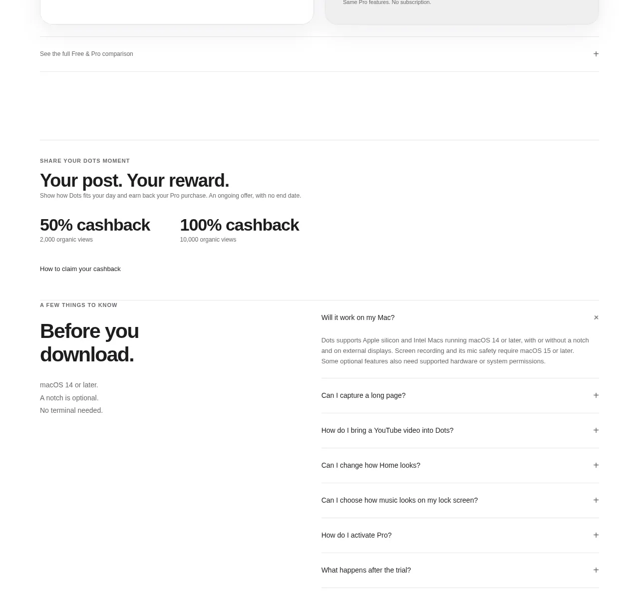
A spacious FAQ accordion sits above a playful pixelated transition into a high-contrast conversion panel. The restrained questions and generous whitespace keep utility clear while the textured divider and bold CTA provide a memorable end-of-page landing moment.
Prompt preview
## Reference images

Study these alongside the description below: hierarchy, rhythm, spacing, colour. Build for the product you are asked about, using this design language.

- Component: https://kage-design-assets.t3.tigrisfiles.io/components/uini-io/ef5b466a-1fe9-4cb6-9300-79049ee31244-1789059863-10.webp
- Full page it was cut from: https://kage-design-assets.t3.tigrisfiles.io/screenshots/uini-io/ef5b466a-1fe9-4cb6-9300-79049ee31244-1789059824-full.webp
- Component on Kage: https://kage.design/component/uini-faq

## Before you start
Ask the user what their product does, who it is for, and what brand personality, colours, typography, and conversion goal should guide the work. Then apply the principles below to create an original FAQ-to-CTA section for that product—do not reproduce the reference literally.

## Build this section
Create a responsive FAQ section that transitions into a strong closing call-to-action panel. The FAQ should feel calm, editorial, and highly scannable; the lower panel should feel warmer, more energetic, and clearly signal the next action.

### Layout and alignment
- Use a centered page container with a maximum width around 1100–1200px and generous horizontal padding: approximately 24px on mobile, 48–64px on desktop.
- Divide the FAQ into two visual columns on desktop: a compact left area for an optional small category marker or heading, and a wider right area for the accordion. On smaller screens, stack these areas vertically.
- Align every accordion row to the same left and right edges. Keep the question text on the left and a small chevron on the far right.
- Use a generous empty area between the final FAQ row and the transition graphic so the section does not feel crowded.
- Add a full-width pixel-inspired or modular texture band between the FAQ and CTA. It should gradually become denser toward the lower edge, visually acting as a bridge rather than a separate illustration.
- Place the CTA content in a full-width coloured panel with centered alignment. Include a two-line headline, supporting sentence, primary button, and a small reassurance line beneath it.
- Let decorative elements sit near the edges of the CTA panel, but keep them secondary and never let them compete with the headline or button.

### Typography hierarchy
- Use a clean, friendly sans-serif with rounded or humanist details.
- FAQ questions should be medium-weight, approximately 16–18px, with comfortable line height and strong readability.
- Use a large CTA headline around 48–60px on desktop and 34–42px on mobile, with tight but readable line height. Allow two intentional lines with distinct emphasis if that suits the product’s message.
- Supporting CTA copy should be approximately 16px, with a relaxed line height and reduced contrast.
- Keep reassurance text smaller, around 13–14px.

### Spacing and structure
- Give each FAQ row approximately 64–72px of vertical space, with a 1px divider underneath.
- Keep the FAQ block narrow enough to scan quickly, while allowing long questions to wrap naturally on mobile.
- Give the CTA panel generous vertical padding, approximately 110–150px on desktop and 72–96px on mobile.
- Maintain at least 24px between headline, supporting copy, button, and reassurance text.

### Colour and visual language
- Use an off-white or near-white page background, approximately `#FDFCF9`.
- Use a very dark, warm text colour, approximately `#171716`.
- Use subtle warm-gray dividers, approximately `#DEDCD6`.
- Choose one brand accent for the CTA panel; a lively coral-orange around `#EE7048` is a useful starting point, but adapt it to the user’s brand.
- Use a contrasting light colour such as `#FFF8ED` for one line of the CTA headline or a key emphasis.
- The primary button should be near-black, approximately `#171716`, with light text and a small directional arrow or equivalent affordance.
- Build the transition texture from small square blocks using a few related tints of the CTA accent, with lower-opacity pale blocks fading upward into the background. Keep it lightweight and CSS- or DOM-generated rather than relying on a large image.

### Borders, radius, and interaction
- Keep FAQ rows mostly flat and editorial: use horizontal dividers rather than boxed cards.
- Use a small or moderate button radius, approximately 4–8px, unless the product brand calls for another shape.
- Make each FAQ row a keyboard-accessible disclosure control using semantic buttons and `aria-expanded`/`aria-controls`.
- On hover, slightly darken the question or divider and make the chevron more visible; preserve a quiet visual tone.
- On open, rotate the chevron smoothly and reveal the answer with a short height/opacity transition. Ensure only the intended rows are exclusive or collapsible according to the product’s needs.
- Give the CTA button a clear hover and focus state: modest lift or colour shift, visible focus ring, and no distracting animation.
- Respect reduced-motion preferences.

### Responsive and accessibility requirements
- On mobile, use one column, reduce decorative density, and prevent the pixel texture from causing horizontal overflow.
- Maintain touch targets of at least 44px for accordion rows and the CTA button.
- Ensure colour contrast meets WCAG AA, especially for text placed over the accent panel.
- Use real text, semantic headings, buttons, and links; do not bake text into artwork.

## Never
- Never use logos, product names, or copy from the reference.
- Never reproduce the reference page’s exact layout, wording, pixel objects, decorative characters, or artwork.
- Never use the reference’s illustrations or imagery; create a fresh texture treatment appropriate to the user’s brand.
- Never make the accordion inaccessible, dependent on hover, or impossible to operate with a keyboard.
- Never let decorative pixels overpower the FAQ content or primary conversion action.