kage
useit.im

Design analysis
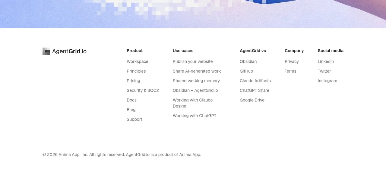
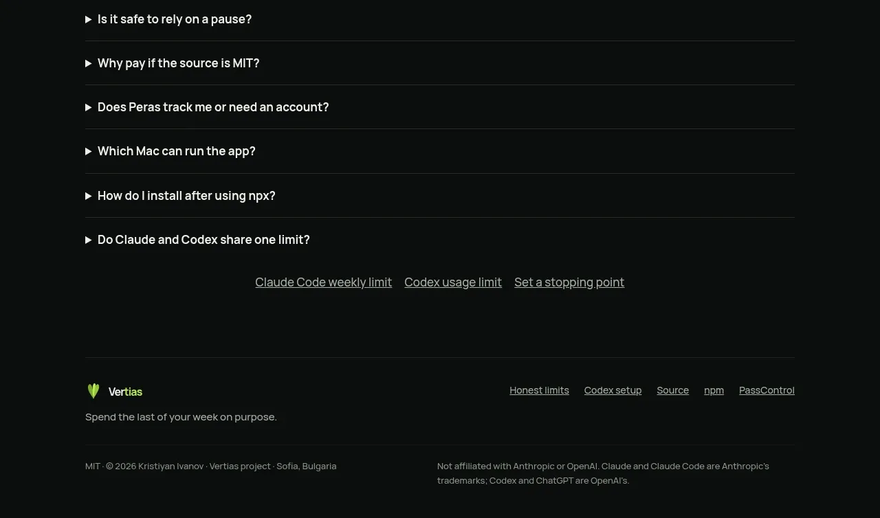
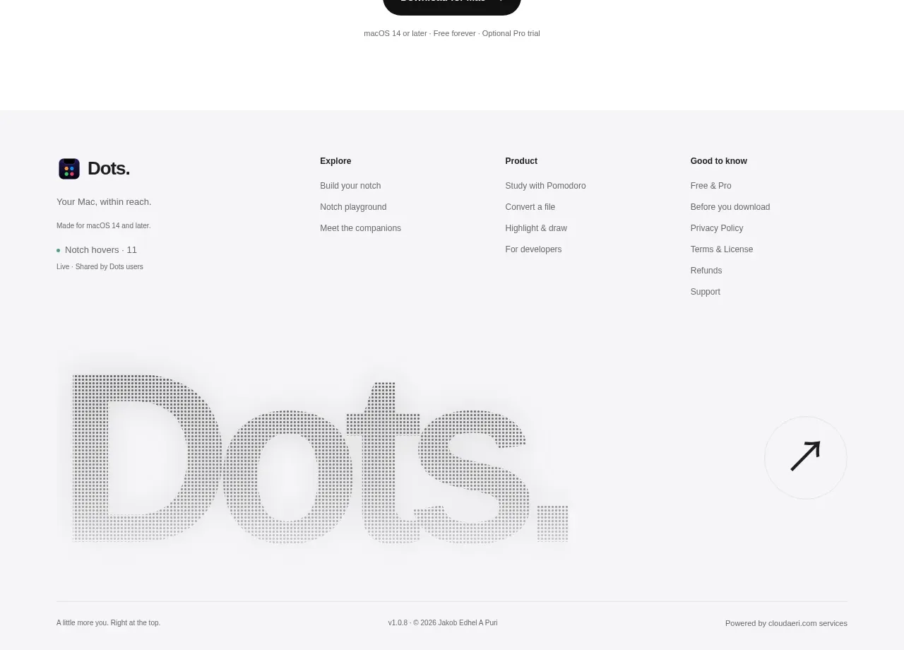
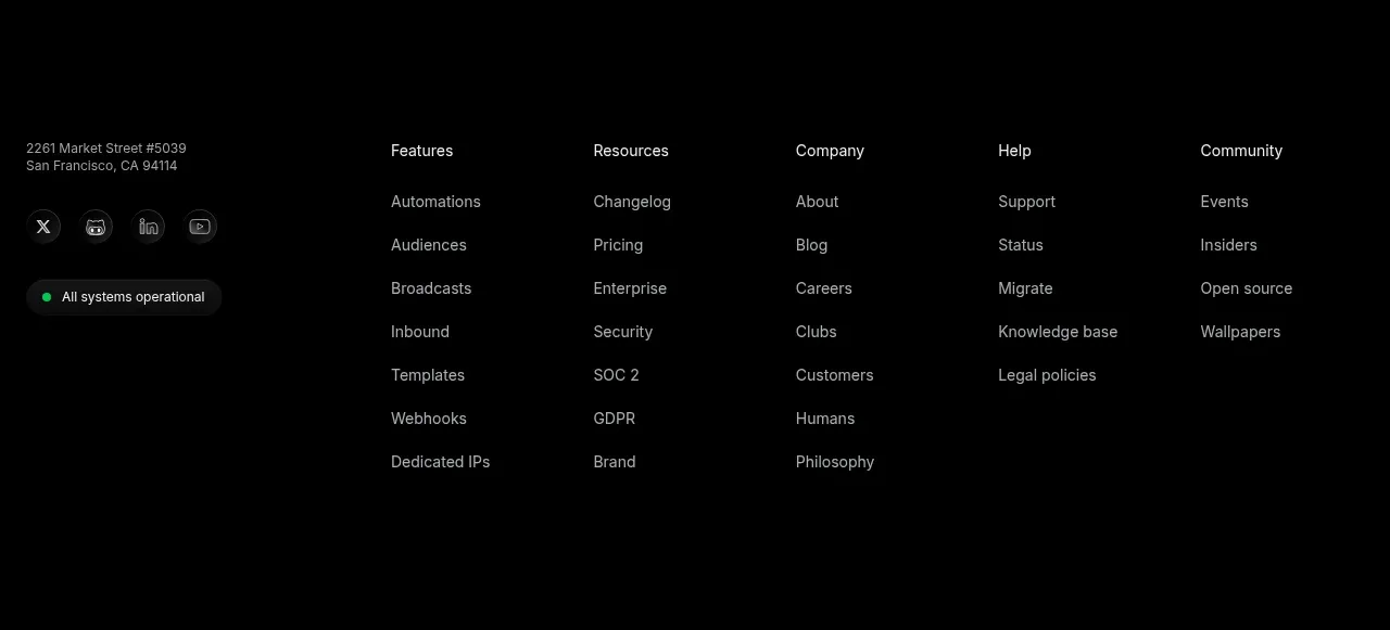
The footer continues the dark visual language with a short brand statement, grouped utility links, legal links, a copyright row, and an oversized low-contrast typographic finish.
Prompt preview
## Reference images

Study these alongside the description below: hierarchy, rhythm, spacing, colour. Build for the product you are asked about, using this design language.

- Component: https://kage-design-assets.t3.tigrisfiles.io/components/useit-studio/292486c5-265b-4687-bbec-a08df326a6fd-1792648912-7.webp
- Full page it was cut from: https://kage-design-assets.t3.tigrisfiles.io/screenshots/useit-studio/292486c5-265b-4687-bbec-a08df326a6fd-1792648867851-full.webp
- Component on Kage: https://kage.design/component/useit-footer

## Before you start
Ask what essential destinations, support resources, legal links, and brand statement the user's product needs. Use the following organization without copying the reference content.

Create a dark footer on #121212 with a constrained max-width and generous top padding. Use a four-column upper area: a short brand/value statement on the left and three compact link groups to the right. Make group headings small and bright, links smaller and muted, with comfortable 14–22px vertical gaps. Add a lower utility row containing copyright text on the left and a subtle back-to-top control on the right. Finish with a huge cropped wordmark-like typographic treatment in a slightly lighter charcoal (#222222), using only the user's own brand name or a generic decorative shape generated for their brand. Use warm white #F3F0E8, gray #96938C, and low-contrast borders. Add visible hover/focus states, maintain accessible contrast for all functional links, and collapse columns into an accordion or stacked groups on mobile.

Never:
- use logos, product names, copy, illustrations, or imagery from the reference
- reproduce the reference oversized wordmark or exact footer links
- use the decorative bottom treatment as a substitute for real navigation