kage
useit.im
Design analysis
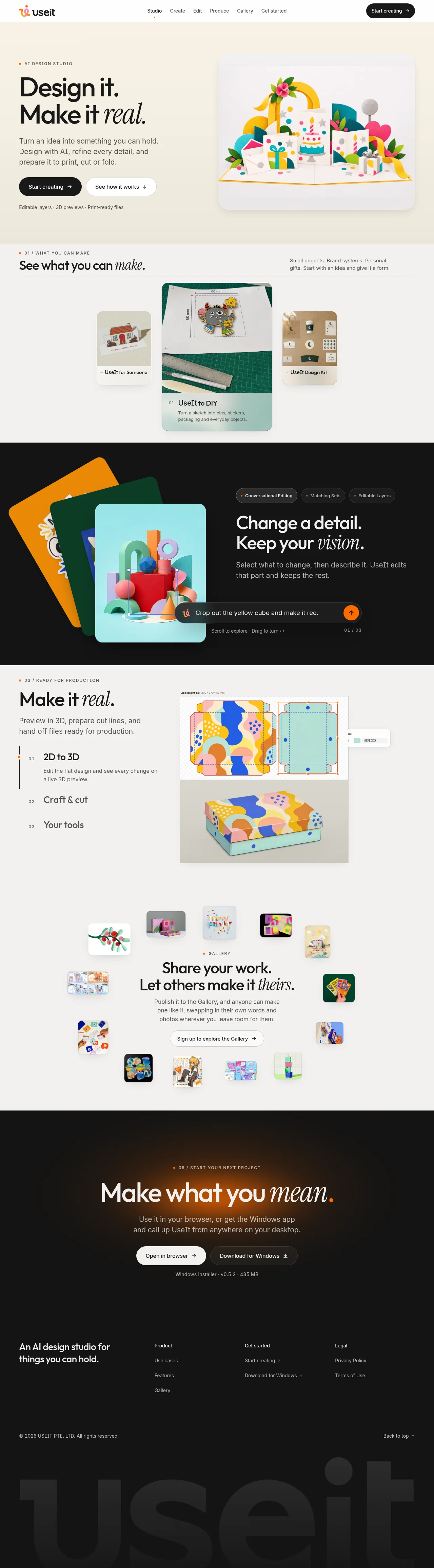
The design uses a high-contrast approach, pairing bold, clean typography on light backgrounds with dynamic, abstract illustrations. The layout utilizes a strong rhythmic flow, transitioning from a large, declarative hero section to smaller, feature-focused modules that break up the density with colorful visuals. Large negative space is used throughout to emphasize key messaging and calls to action.
Prompt preview
## Reference images

Study these alongside the description below: hierarchy, rhythm, spacing, colour. Build for the product you are asked about, using this design language.

- Full page: https://kage-design-assets.t3.tigrisfiles.io/screenshots/useit-studio/292486c5-265b-4687-bbec-a08df326a6fd-1792648867851-full.webp
- Above the fold: https://kage-design-assets.t3.tigrisfiles.io/screenshots/useit-studio/292486c5-265b-4687-bbec-a08df326a6fd-1792648864336.webp
- Design on Kage: https://kage.design/designs/useit-landing-page

## Before you start
Tell the user what they are building, who it is for, and what brand assets (name, colors, type) they already have. Wait for the answers before proceeding. All instructions below are applied to the user's defined project, not this reference.

## Page structure
1. **Header/Navigation:** A minimalist, sticky header featuring the brand logo on the left and essential navigation/action links (e.g., sign up) on the right.
2. **Hero Section:** A large, high-impact section with a bold, concise headline and supporting subtext. A primary CTA button is placed immediately below the text. To the right, a vibrant, abstract illustration or high-fidelity mockup showcases the product's output.
3. **Feature Showcase Blocks (Modular):** Subsequent sections introduce specific features. These are highly visual, using small, colorful snippets or illustrative components. They are laid out modularly, mixing text blocks with visual elements to maintain a quick, rhythmic pace.
4. **Community/Integrations Section:** A section utilizing a grid of small, stylized icons or avatars to subtly suggest social proof, integrations, or diverse uses.
5. **High-Contrast CTA:** A dedicated section using a dark, high-contrast background (like black or deep gray) to house a powerful, final call-to-action, encouraging the user to take the next step.
6. **Footer:** A simple footer area for secondary links and final branding.

## Design language
* **Hierarchy:** Hierarchy is established through extreme contrast. Large, bold sans-serif type is reserved for headlines and CTAs, while body copy remains clean and medium-weight. The visual flow is driven by pairing large text blocks with vivid, dense illustrations.
* **Rhythm and Density:** The page rhythm moves from high-density impact (Hero) to medium-density showcase modules, which then quickly transition to high-contrast low-density CTAs. Whitespace is used aggressively to prevent visual clutter.
* **Color Palette:** The primary palette is white/light gray background (e.g., #FFFFFF) and dark text (e.g., #000000). Accent colors are extremely saturated and varied (e.g., vibrant blues, oranges, pinks, teals) and are used exclusively within illustrations and small interaction elements.
* **Typography:** A contemporary, geometric sans-serif typeface is used. Headlines are set in very large sizes with significant letter spacing for maximum impact.
* **Shapes and Aesthetics:** The overall style is minimal, but softened by highly stylized, abstract, and colorful illustrations that appear to be constructed from geometric or organic blobs.
* **Borders and Shadow:** Borders are minimal or nonexistent. Subtle shadows are used to lift illustrative elements off the background, adding depth without weight.

## Never
Do not use any logos, wordmarks, specific product names, unique copy, illustrations, or photography from the reference. Do not present the final result as 'UseIt Studio'.
Components from this page
All components
 Studio navigation bar
UseIt Studio · Navigation
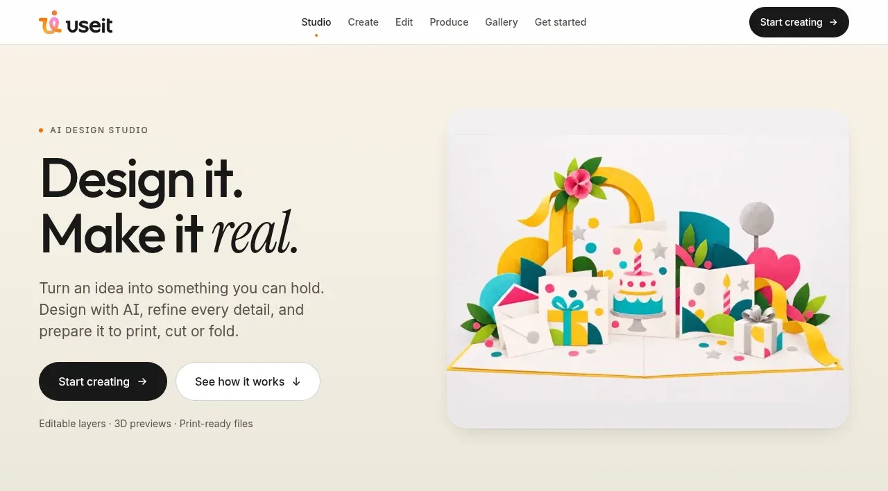 AI design studio hero
UseIt Studio · Hero
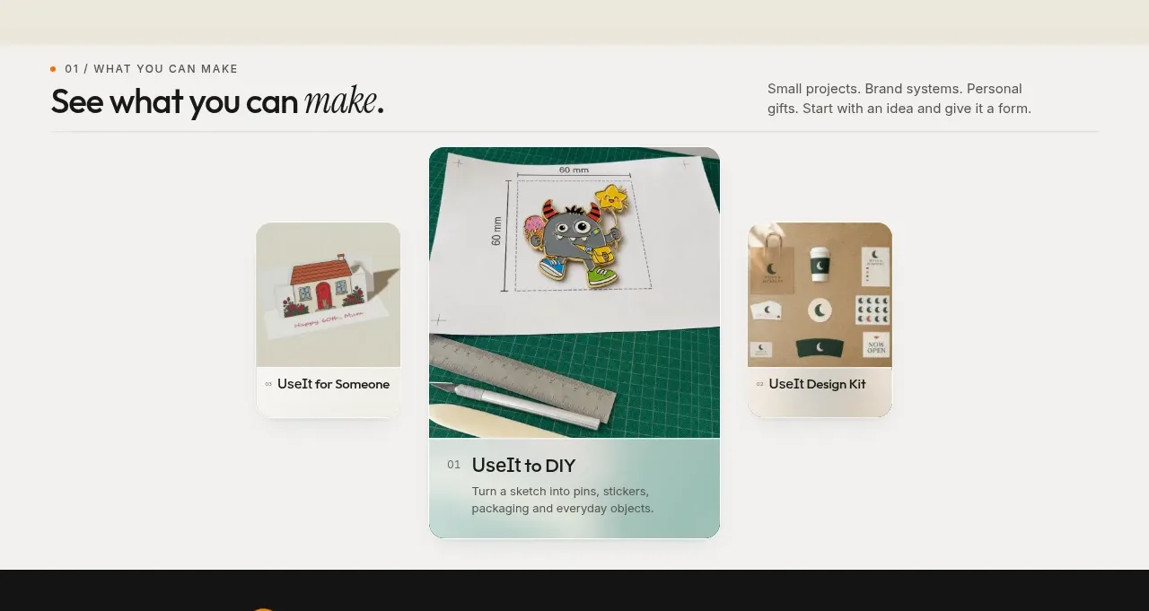 What you can make showcase
UseIt Studio · Feature grid
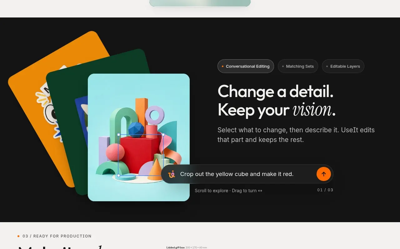 Conversational editing feature
UseIt Studio · Feature grid
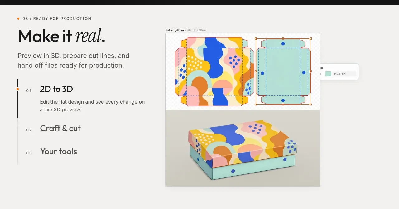 Production workflow feature
UseIt Studio · Feature grid
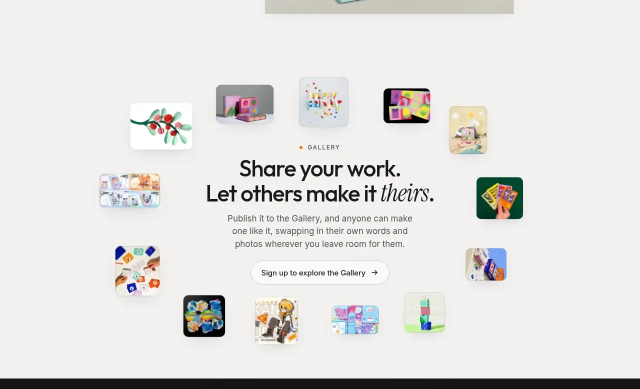 Community gallery invitation
UseIt Studio · Gallery
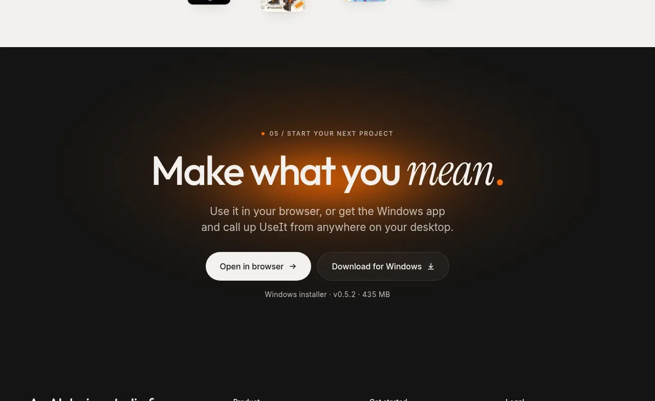 Start your next project CTA
UseIt Studio · Call to action
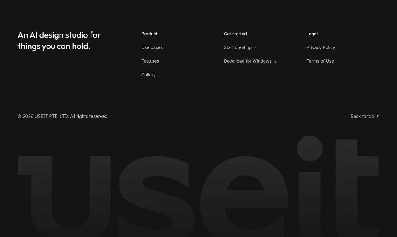 Dark multi-column footer
UseIt Studio · Footer