 kage
kage
viso.ai

Design analysis
A clear two-column pricing comparison that frames two different customer paths without forcing a feature-by-feature matrix. The contrast between a light self-serve card and a dark enterprise card creates hierarchy, while concise benefits and distinct calls to action make the next step obvious.
Prompt preview
## Reference images

Study these alongside the description below: hierarchy, rhythm, spacing, colour. Build for the product you are asked about, using this design language.

- Component: https://kage-design-assets.t3.tigrisfiles.io/components/viso-now/0aea1f2c-e643-44c4-ac70-db26df0b3931-1789106576-4.webp
- Full page it was cut from: https://kage-design-assets.t3.tigrisfiles.io/screenshots/viso-now/0aea1f2c-e643-44c4-ac70-db26df0b3931-1789106536289-full.webp
- Component on Kage: https://kage.design/component/viso-now-pricing-table

# Before you start
Ask me what my product is, who it is for, and what my brand looks and sounds like. Then apply the principles below to create an original pricing comparison section for my product—not a visual copy of the reference.

## Build this section
Create a responsive pricing-choice section that helps visitors choose between two distinct product paths, plans, or engagement models. Use a short eyebrow, a large centered headline, and an optional muted second line above two equal-width cards. The cards should explain the audience and outcome of each option, summarize the value, list a small set of benefits, and end with a clear action.

## Design language

### Layout and alignment
- Place the section on a warm white or near-white background with generous vertical breathing room.
- Center the eyebrow and headline within a constrained content width of roughly 1100–1200px.
- Use a two-column grid for the cards with equal widths, a gap of approximately 24–32px, and aligned top and bottom edges where practical.
- Give each card a strong internal padding of approximately 48px on desktop; reduce this to 24–28px on small screens.
- Keep the product label and compact status badge on the same top row, with the badge aligned to the opposite edge.
- Stack cards vertically below roughly 760px, preserving consistent spacing and comfortable reading width.
- Let the content determine card height, but align the action area near the bottom when possible so the two choices feel comparable.

### Typography hierarchy
- Use a modern geometric or humanist sans-serif with a confident, clean feel.
- Set the eyebrow in uppercase or small caps at approximately 11–12px, with increased letter spacing and subdued gray colour.
- Use a bold, centered headline around 48–60px on desktop, with tight line height around 0.98–1.08; scale to 34–42px on mobile.
- Emphasize the second headline line with a softer gray or another restrained brand colour if the brand supports it.
- Use card labels around 19–22px and card headlines around 28–32px with a tight line height.
- Keep descriptions at 15–17px with a line height around 1.45–1.6.
- Render benefits at approximately 15–16px with comfortable vertical spacing and medium-weight text.

### Colour
- Use an off-white page background near #FCFCFB or #FFFFFF.
- Make the primary card light, using white or #FEFEFE with dark text near #111217.
- Make the contrasting card a very dark navy-black around #10101B or #12111F, with white headings and muted lavender-gray body text around #AAA7B8.
- Use a vivid pink-to-purple accent for primary actions, approximately #D94AB4 through #8E5BD2; adapt it to the brand rather than copying these exact values.
- Use soft pink or purple tints for benefit check icons and subtle accent details.
- Ensure all body text and controls meet accessible contrast requirements.

### Borders, radius, and depth
- Give both cards a generous rounded radius of approximately 28–32px.
- Use a thin, low-contrast border around the light card, approximately #E7E7E8; the dark card can use a subtly lighter edge such as #252433.
- Keep shadows minimal and atmospheric. A very soft accent glow beneath the call-to-action buttons is acceptable, but avoid heavy elevation.
- Style status badges as compact pill shapes with a thin border, muted fill, and 12–13px text.

### Content and interaction
- Use one concise paragraph per card followed by approximately four benefit rows.
- Begin each benefit row with a small circular check or tick marker, keeping icon treatment consistent across both cards.
- Give each card one primary button with action language appropriate to its path, such as starting, exploring, contacting, or booking.
- Use rounded pill buttons with approximately 14–16px vertical padding and 18–22px horizontal padding.
- On hover, slightly brighten or deepen the button gradient, add a restrained glow, and translate it upward by 1–2px; preserve a clear keyboard focus ring.
- Keep the section usable without animation, and respect reduced-motion preferences.
- Make the cards and buttons fully responsive, keyboard accessible, and easy to scan on mobile.

## Never
- Never reuse logos, product names, plan names, or brand-specific copy from the reference.
- Never copy the exact headline, descriptions, benefit text, button labels, or badge wording.
- Never include the reference product's illustrations, imagery, icons, or decorative artwork.
- Never reproduce the reference pixel-for-pixel; use the structure and design principles to create a distinct version for my product.
- Never sacrifice readability or accessibility for visual similarity.
More components
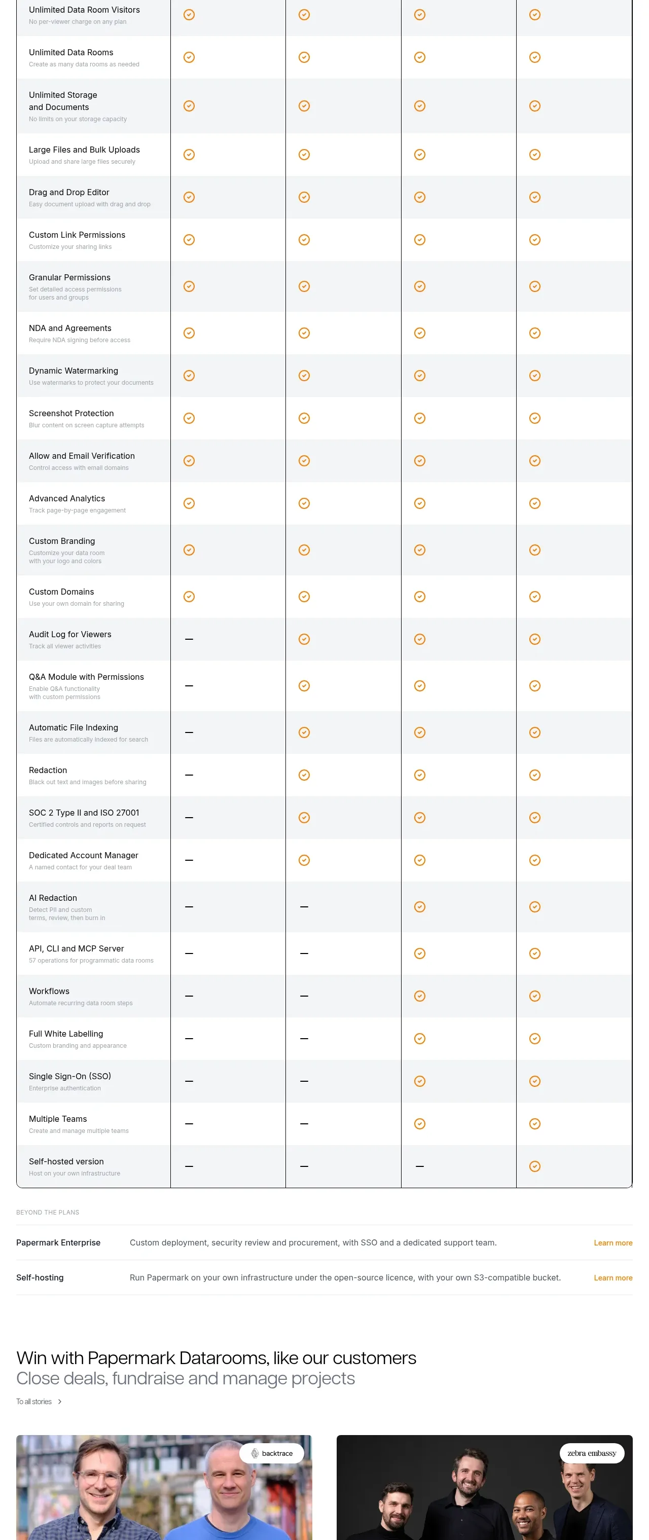
 Plan comparison table
Papermark Data Rooms · Pricing table
Plan comparison table
Papermark Data Rooms · Pricing table
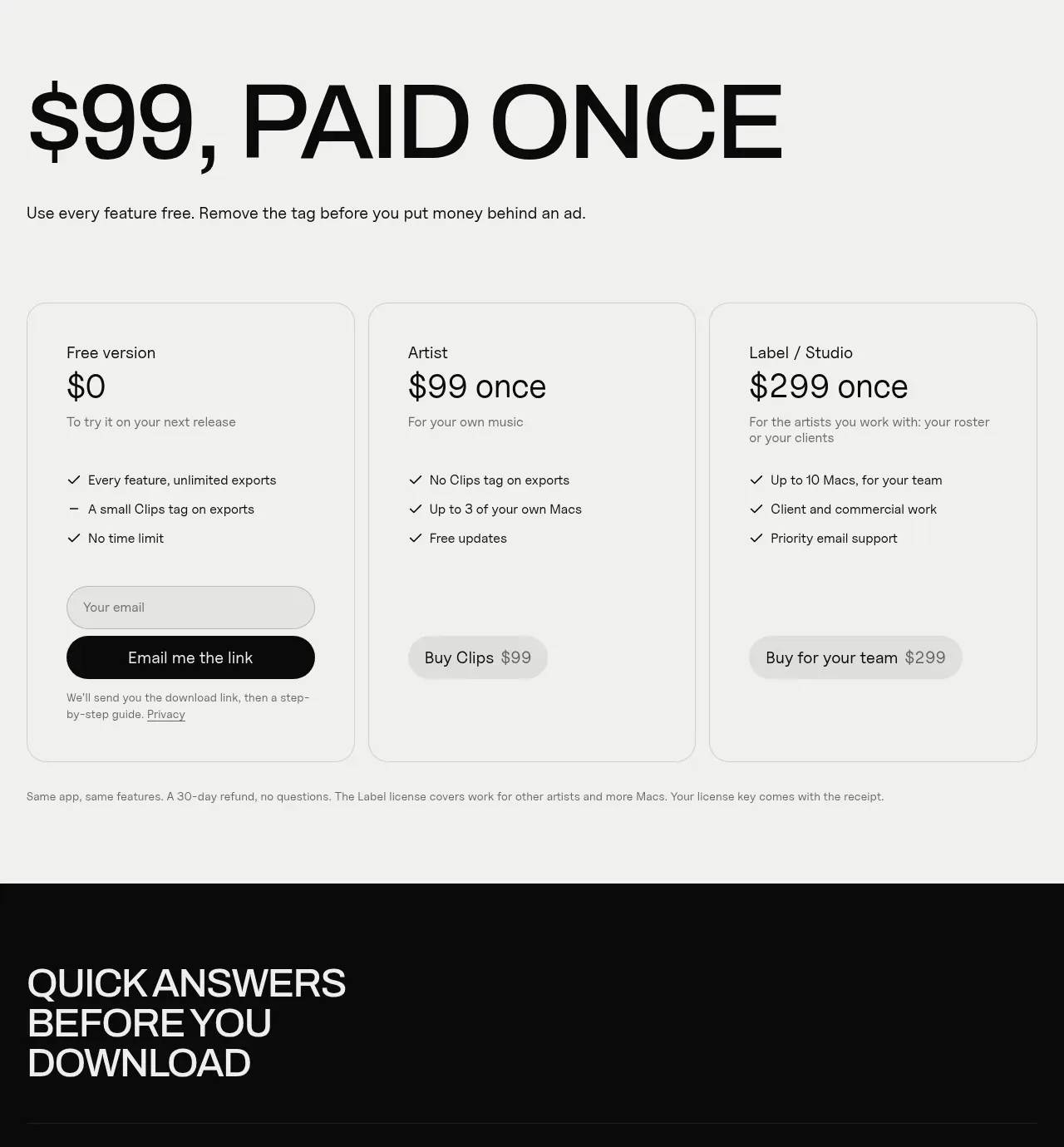
 One-time purchase pricing
Clips by Plastic · Pricing table
One-time purchase pricing
Clips by Plastic · Pricing table
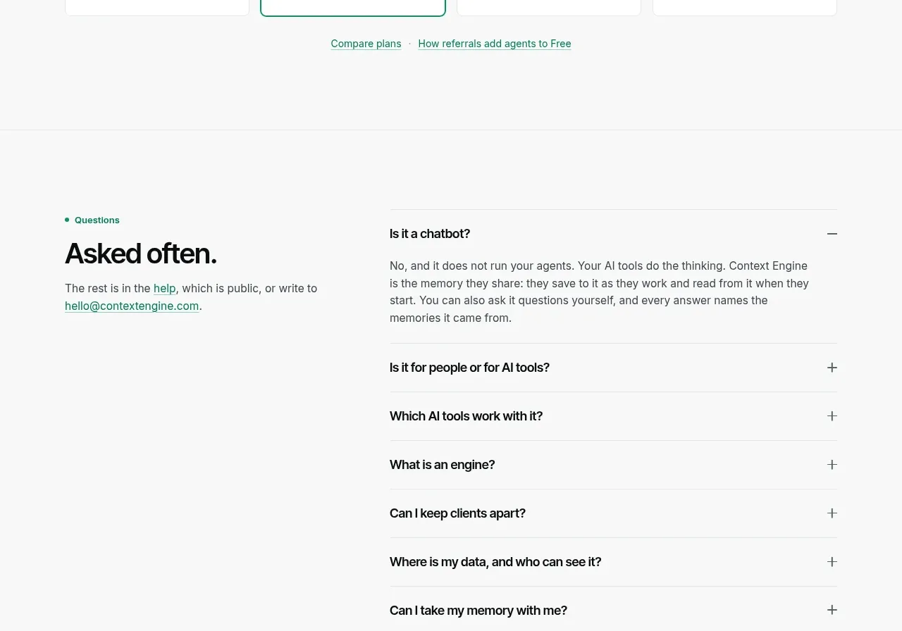
 Per-unit pricing table
Context Engine · Pricing table
Per-unit pricing table
Context Engine · Pricing table
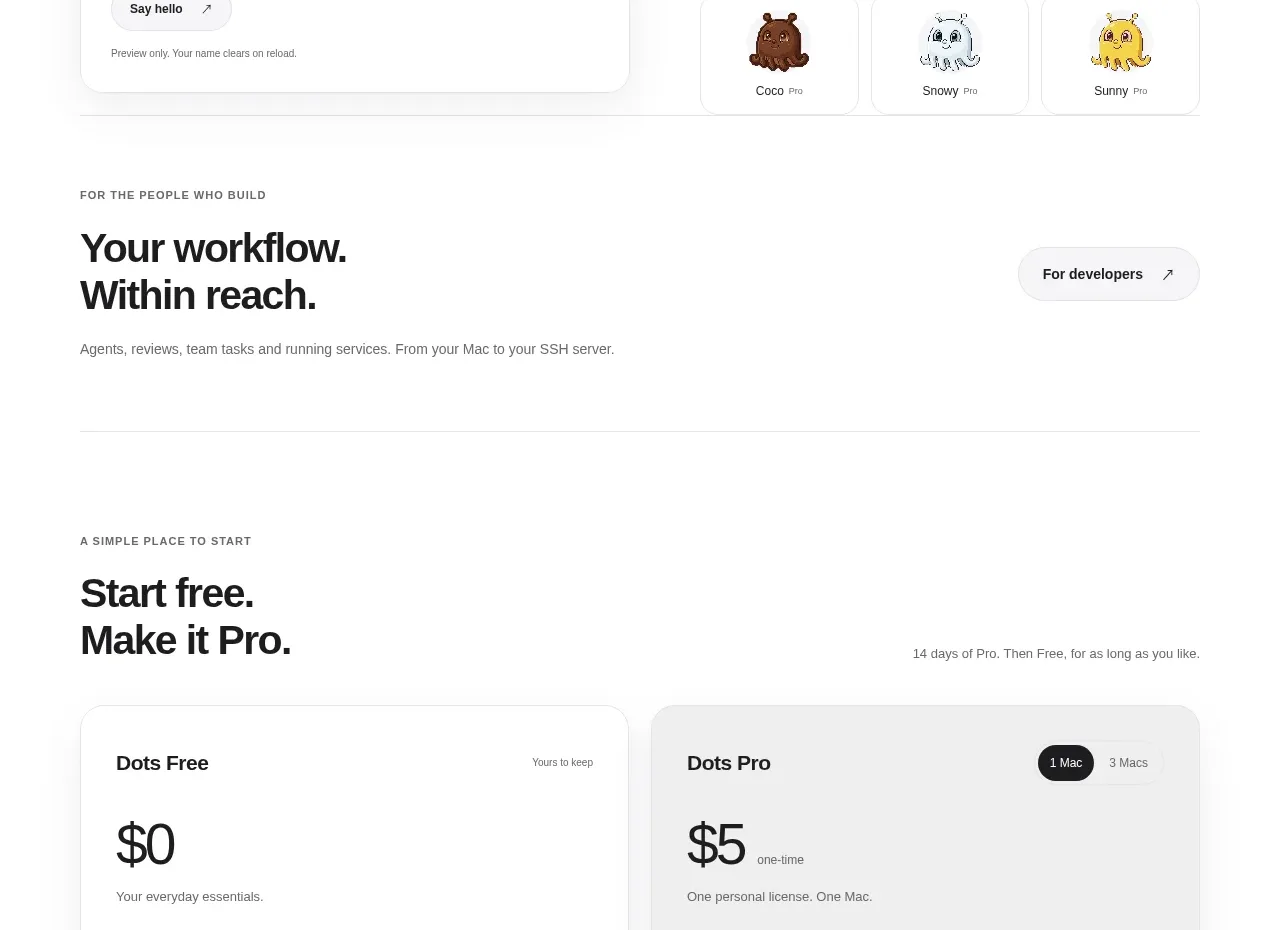
 Free and pro pricing cards
Dots · Pricing table
Free and pro pricing cards
Dots · Pricing table
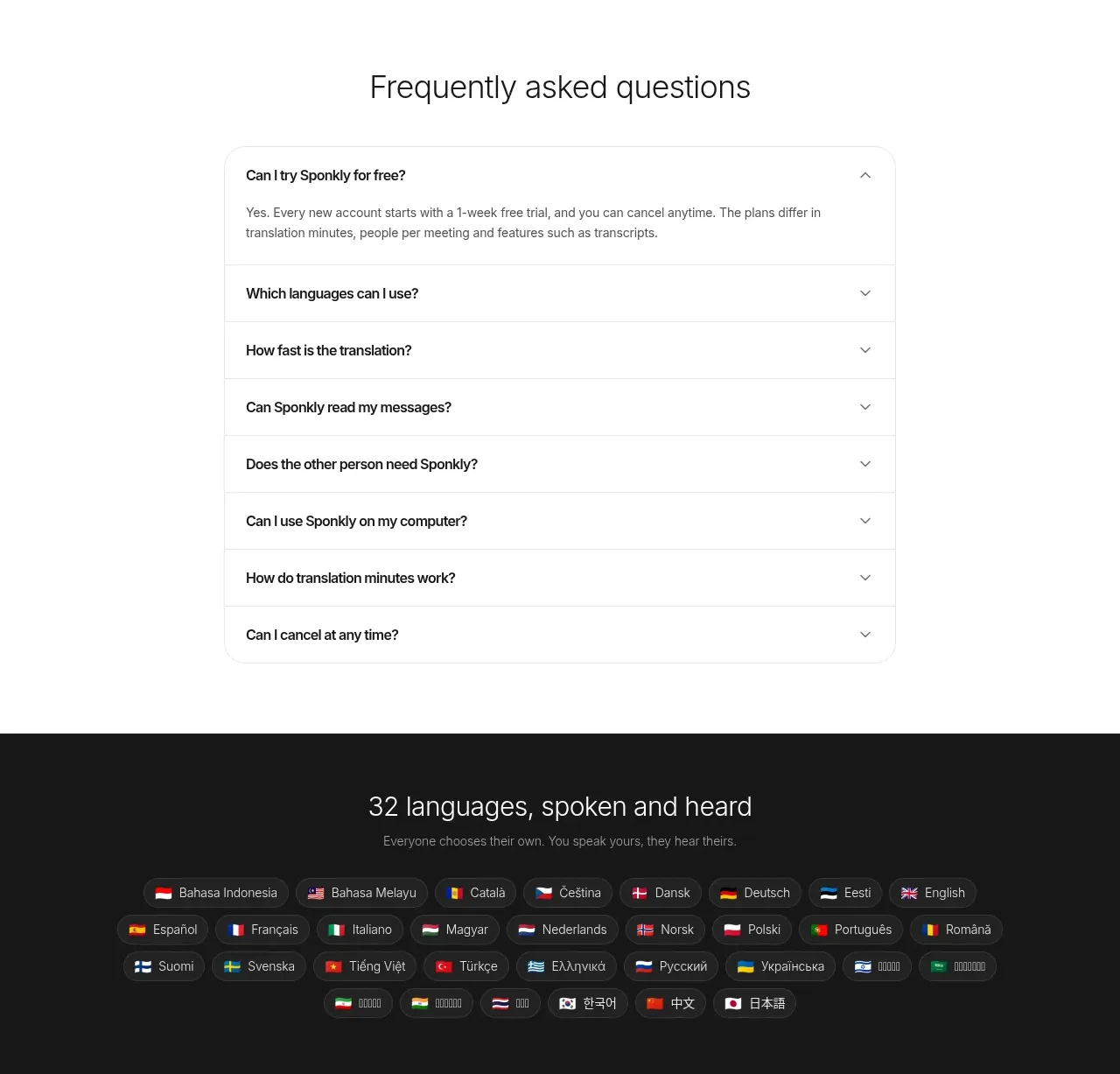
 Transparent multi-tier pricing
Sponkly · Pricing table
Transparent multi-tier pricing
Sponkly · Pricing table
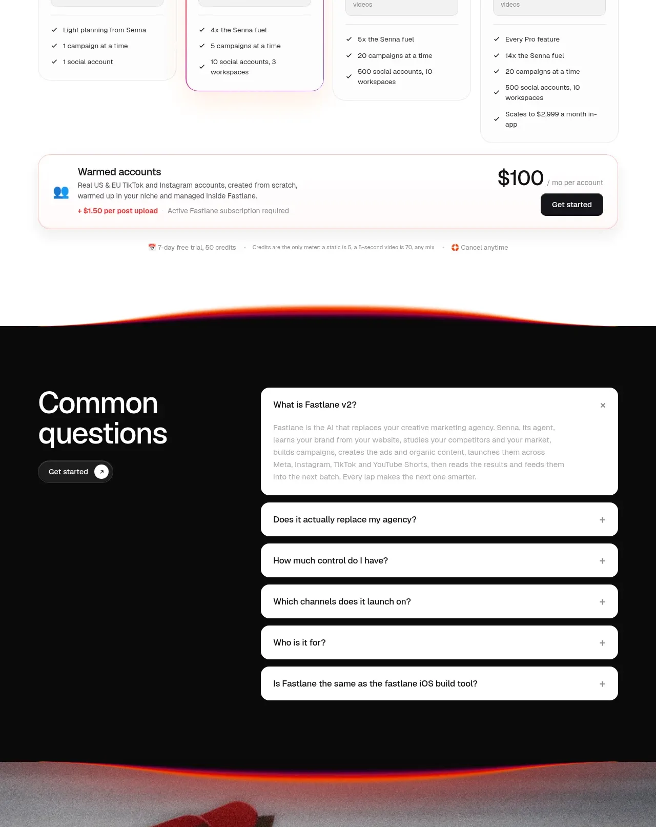
 Four-tier pricing table
Fastlane 2.0 · Pricing table
Four-tier pricing table
Fastlane 2.0 · Pricing table