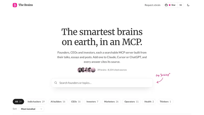
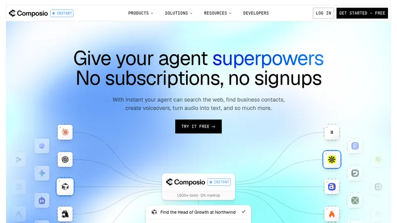
kage
kage
viso.ai

Design analysis
A computer-vision platform page that opens with a full-bleed dark aerial photo and a glassmorphic prompt-to-build input, then settles into an airy white editorial rhythm: pink-dot uppercase eyebrows, oversized grotesque headings, and photo-led card grids for templates and stories. The accent system is disciplined — one magenta for dots, checks and CTAs, one purple reserved for the enterprise tier — while hierarchy swings between dense 4-column photo grids, a white-vs-black dual product split, and giant 54%/24/7/10×/90% numerals. The page closes dark: a purple-gradient CTA panel and a black multi-column footer with certification badges.
Prompt preview
## Reference images

Study these alongside the description below: hierarchy, rhythm, spacing, colour. Build for the product you are asked about, using this design language.

- Full page: https://kage-design-assets.t3.tigrisfiles.io/screenshots/viso-now/0aea1f2c-e643-44c4-ac70-db26df0b3931-1789106536289-full.webp
- Above the fold: https://kage-design-assets.t3.tigrisfiles.io/screenshots/viso-now/0aea1f2c-e643-44c4-ac70-db26df0b3931-1789106531894.webp
- Design on Kage: https://kage.design/designs/viso-now-landing-page

## Before you start
Ask the user what product they are building, who it is for (self-serve users, enterprises, or both), and what brand assets they already have (name, logo, colours, typeface). Wait for the answers before writing any code — everything below is applied to their product, not to the reference site.

## Page structure
Build a single scrolling landing page with these sections, top to bottom:

1. **Transparent top nav over the hero** — small wordmark left; five centred text links (Product, Solutions, Resources, Pricing, Company equivalents); right side: two quiet text links plus one pill CTA in the accent colour.
2. **Full-bleed photo hero** — dark aerial/industrial photography edge-to-edge; huge centred white headline (two lines); below it a glass panel (blurred, semi-transparent) that is the product's core interaction: a drag-and-drop upload zone on top and an AI prompt input underneath with a small mode toggle and a round accent submit button. Add subtle carousel arrows at the sides.
3. **Template strip inside the hero** — a small "Try a template" label above three photo thumbnails with caption labels underneath; clicking one pre-fills the prompt. This sits on the photo, not on white.
4. **Trust bar** — white strip immediately after the hero: "Trusted by Fortune 500"-style microcopy left, five desaturated grey customer logos in a row.
5. **Platform intro** — left-aligned oversized heading plus a two-line sub-paragraph at ~45% width; below, three equal cards each with a soft pink/violet gradient surface holding a small UI mockup, then a bold card title and two lines of body text.
6. **Template gallery** — pink-dot eyebrow label, big heading left, quiet pill button right; a 4×2 grid of photo-topped cards, each with a title and a one-line description. Photos are real-world scene footage, slightly desaturated.
7. **Dual product split** — centred eyebrow and a two-line heading where the second line is grey; two large side-by-side cards: a white self-serve card (name, "Free · No Credit Card" badge, benefit headline, short paragraph, four accent-check bullet lines, filled pill CTA) and a near-black enterprise card ("For Enterprise" badge, scale-focused headline, four check bullets including compliance certs, purple pill CTA).
8. **Customer story + stats** — eyebrow; left column: a large pull-quote with exactly one figure highlighted in the accent colour, then avatar + name + role attribution; right column: a 2×2 grid of oversized black numerals (54%, 24/7, 10×, 90%) each with a one-line grey caption.
9. **Resources grid** — eyebrow; heading left, pill button right; six article cards in a 4+2 layout: image, one or two tiny uppercase tag pills, title, "Read more →" link.
10. **Customer stories carousel** — eyebrow; heading with a grey continuation line; short intro paragraph and pill button top-right; a horizontally scrolling row of photo cards with story titles, two-line summaries, client wordmark and "Read more →".
11. **Closing CTA panel** — full-width dark rounded panel with a purple-to-black gradient and subtle glow: small pill eyebrow, three-line huge white headline, one paragraph, and two buttons (accent-filled pill + dark outline pill).
12. **Footer** — black; left: wordmark, one-line tagline, two pill buttons; right: five link columns (Get started, Industries, Resources, Blog, Company); bottom row: certification badges, social icons, legal links, copyright.

## Design language
- **Two-world rhythm.** Start dark (photo hero), then run a long light middle, then close dark (gradient CTA + black footer). Sections in the light middle alternate between airy text-led blocks and dense photo grids so the page breathes as it scrolls.
- **Hierarchy via scale, not weight.** Eyebrows are ~11px uppercase with a 6px accent dot; H1 ~64–72px and H2 ~48–56px in a tight geometric grotesque; body text is small (14–15px) and grey, so the headings do all the talking.
- **One accent, strictly rationed.** Pick a single hot accent (approx. `#EC4899`) for eyebrow dots, check icons, primary buttons and one highlighted stat; reserve a second colour (approx. `#7C5CFC`) only for the enterprise/premium tier. Everything else is white `#FFFFFF`, near-black `#0B0B0F`, section grey `#F7F7F8`, text grey `#6B7280`, hairline `#E5E7EB`.
- **Cards are quiet containers.** 16–20px radius, 1px light border, near-invisible shadow; photo-topped cards let the image fill the top half with no padding. Gradient mock surfaces use soft pink→violet washes, never saturated blocks.
- **Numbers are the loudest element.** In the stats block, numerals are ~64px black; captions are ~12px grey. Keep one figure in the pull-quote tinted with the accent for a single point of colour.
- **Pills everywhere.** All buttons and category tags are fully rounded (radius 999px); buttons are small (~40px) with short labels; secondary buttons are outlined or ghost.
- **Glass only where the product lives.** Use one blurred glass panel (white at ~10–15% opacity, backdrop-blur ~16px) for the hero's interactive input — nowhere else — so it reads as the product itself.
- **Dark sections glow, they don't flatten.** Dark panels use a very dark purple-black gradient (approx. `#16091F → #0A0A12`) with a faint radial glow; text stays white/off-white.
- **Motion is minimal.** Hover = slight card lift or underline; carousels move by arrow clicks; the prompt input gets a focus ring in the accent colour. No parallax, no autoplaying video.

## Never
Do not reuse the reference product's name, wordmark, logo, taglines, copy, CCTV/aerial photography, blog imagery, or certification badges. Do not recreate Viso or present the result as Viso.ai — apply this layout and visual system to the user's own product and brand.
Components from this page
All components
 Immersive AI workflow hero
Viso Now · Hero
Immersive AI workflow hero
Viso Now · Hero
 Trusted-by logo strip
Viso Now · Logo cloud
Trusted-by logo strip
Viso Now · Logo cloud
 Three-card feature grid
Viso Now · Feature grid
Three-card feature grid
Viso Now · Feature grid
 Template discovery gallery
Viso Now · Gallery
Template discovery gallery
Viso Now · Gallery
 Two-path product pricing cards
Viso Now · Pricing table
Two-path product pricing cards
Viso Now · Pricing table
 Testimonial proof panel
Viso Now · Testimonials
Testimonial proof panel
Viso Now · Testimonials
 Editorial resource card gallery
Viso Now · Gallery
Editorial resource card gallery
Viso Now · Gallery
 Customer story card carousel
Viso Now · Gallery
Customer story card carousel
Viso Now · Gallery
 Dark gradient conversion CTA
Viso Now · Call to action
Dark gradient conversion CTA
Viso Now · Call to action
 Dark multi-column conversion footer
Viso Now · Footer
Dark multi-column conversion footer
Viso Now · Footer