kage
kage
wabi.ai

Design analysis
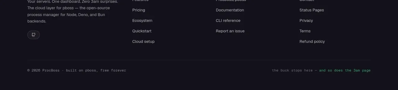
A thin footer places legal links in a low-contrast row and social icons at the opposite edge, preserving the minimalist visual language.
Prompt preview
## Reference images

Study these alongside the description below: hierarchy, rhythm, spacing, colour. Build for the product you are asked about, using this design language.

- Component: https://kage-design-assets.t3.tigrisfiles.io/components/wabi/178ae01c-68f8-4ebc-a83a-f929389d1aa9-1791439262-3.webp
- Full page it was cut from: https://kage-design-assets.t3.tigrisfiles.io/screenshots/wabi/178ae01c-68f8-4ebc-a83a-f929389d1aa9-1791439245752-full.webp
- Component on Kage: https://kage.design/component/wabi-footer

## Before you start
Ask what legal links, social destinations, and brand details the user's product needs. Build the footer around those requirements rather than copying the reference.

Build a slim, full-width footer separated from the content by a faint 1px top border. Align legal and company links in a compact horizontal row on the left, using small muted sans-serif text and dot or spacing separators. Align a small set of social icons or secondary actions on the right. Use generous but restrained horizontal padding, a white background, and a neutral palette: text `#6F6F6F`, border `#ECECEC`, icon gray `#777777`. Keep the row vertically centered and make every link keyboard accessible with visible focus states. On narrow screens, allow the links to wrap or stack without clipping and preserve comfortable tap targets.

Never: copy the reference's legal copy, company name, logo, social icons exactly, illustrations, imagery, or brand assets.