kage
kage
wabi.ai
Design analysis
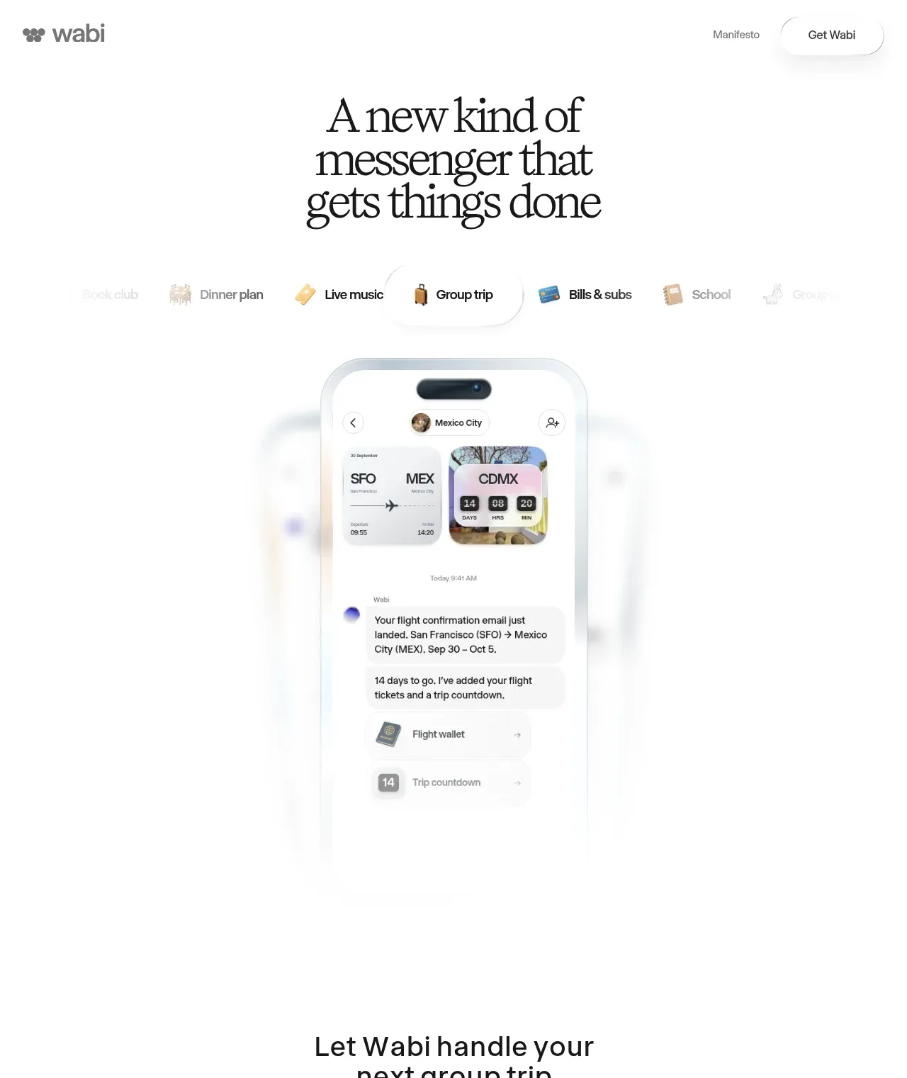
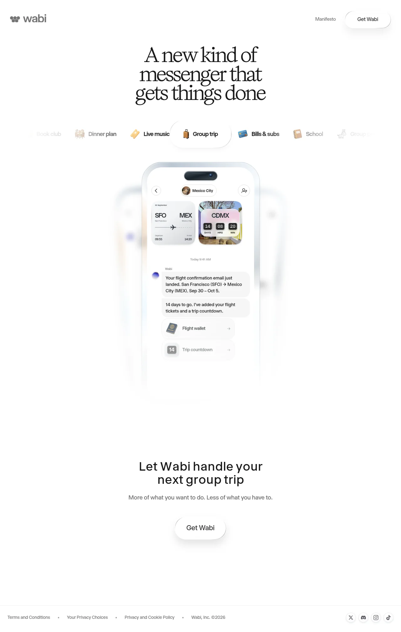
A highly restrained, white landing page pairs an oversized editorial serif headline with a compact gray sans-serif navigation and a centered product phone mockup. The hero moves from category pills into a softly faded device demonstration, then opens into a sparse conversion section with a short heading, subtitle, and pill CTA before ending in a thin, low-contrast footer; the long vertical gaps create a calm, premium rhythm.
Prompt preview
## Reference images

Study these alongside the description below: hierarchy, rhythm, spacing, colour. Build for the product you are asked about, using this design language.

- Full page: https://kage-design-assets.t3.tigrisfiles.io/screenshots/wabi/178ae01c-68f8-4ebc-a83a-f929389d1aa9-1791439245752-full.webp
- Above the fold: https://kage-design-assets.t3.tigrisfiles.io/screenshots/wabi/178ae01c-68f8-4ebc-a83a-f929389d1aa9-1791439235845.webp
- Design on Kage: https://kage.design/designs/wabi-landing-page

## Before you start
Ask the user what they are building, who it is for, and what brand assets they already have, including the product name, colours, typography, logo, and imagery. Wait for their answers before designing. Apply every instruction below to that product rather than reproducing the reference.

## Page structure
1. **Minimal top navigation:** Place a small gray brand mark at the upper left, a single understated text link near the upper right, and a rounded outlined primary button beside it. Keep the header wide, quiet, and generously padded.
2. **Editorial hero headline:** Center a large, tightly leading serif headline across several short lines. Use the headline as the main visual anchor with ample white space around it.
3. **Use-case/category selector:** Below the headline, add a horizontally arranged row of compact use-case labels with small contextual symbols or emoji. Make one central item active using a white pill with a subtle border/shadow, while neighboring items fade toward the edges.
4. **Product demonstration:** Center a tall mobile product mockup beneath the selector. Show a realistic but simplified in-product conversation or workflow with cards, media, and actionable items; let the device and its glow gradually fade into the white page rather than ending with a hard rectangle.
5. **Conversion section:** After a large vertical pause, introduce a centered secondary heading, a one-line muted supporting sentence, and a rounded CTA button. Keep this section deliberately sparse so it feels like a conclusion rather than another content block.
6. **Footer:** Finish with a thin horizontal divider and a compact footer row. Put legal and privacy links on the left, a small copyright item alongside them, and understated social icons on the right; use small gray type and minimal visual weight.

## Design language
- Build hierarchy through contrast in scale and type: use an expressive, high-contrast serif for the hero and section heading, paired with a neutral sans-serif for navigation, labels, body copy, and controls.
- Keep the palette nearly monochrome: use white or off-white around `#FFFFFF`/`#FAFAFA`, near-black text around `#171717`, and quiet gray UI text around `#6F6F6F`; reserve stronger colour for product content or small contextual symbols.
- Make the page feel airy and premium by increasing vertical whitespace between the hero, device demonstration, conversion block, and footer. The top is focused and visual, the middle is product-led, and the ending is sparse and transactional.
- Use a centered, narrow reading width for headlines and supporting copy, with a full-width page frame and generous horizontal margins for navigation and footer content.
- Treat controls as soft pills: use thin gray borders, fully rounded corners, white fills, and diffuse low-opacity shadows such as `0 10px 24px rgba(0,0,0,.08)`. Avoid heavy cards, hard drop shadows, and dense borders.
- Let the device mockup carry most of the visual detail. Use subtle blur, white fades, gentle glow, and layered rounded cards to integrate it into the page rather than isolating it as a flat screenshot.
- Keep interaction understated: category items can change opacity and activate through a smooth pill transition; buttons should lift or deepen their soft shadow slightly on hover; avoid noisy animation.
- Scale the hero headline prominently for desktop with tight line-height, then reduce it responsively while preserving the centered multi-line composition. Keep utility text and footer links small and calm.

## Never
- Do not use the reference's logos, wordmarks, product name, copy, illustrations, photography, screenshots, or icon set.
- Do not present the result as Wabi or imply an affiliation with the reference product.
- Create original brand assets, product-specific copy, interface content, and imagery for the user's product while preserving only the reusable layout and design principles.