kage
kage
warp.dev

Design analysis
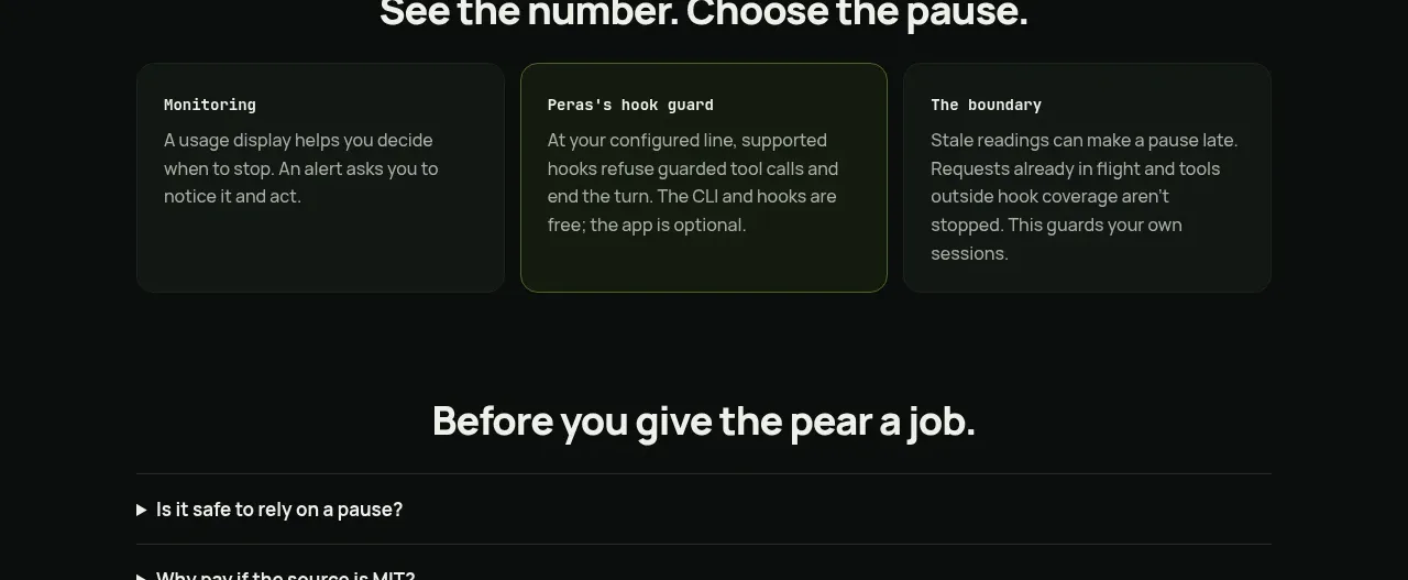
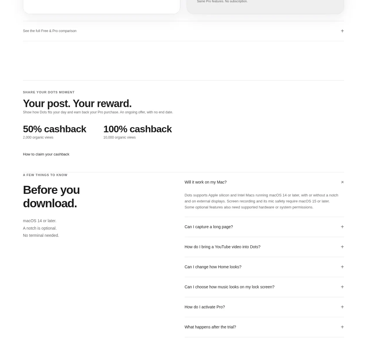
A full-width, terminal-inspired FAQ list that uses a faint technical grid, monospaced questions, and compact expand affordances to make support content feel native to a developer-focused product. Strong horizontal rules and generous whitespace keep the dense list easy to scan.
Prompt preview
## Reference images

Study these alongside the description below: hierarchy, rhythm, spacing, colour. Build for the product you are asked about, using this design language.

- Component: https://kage-design-assets.t3.tigrisfiles.io/components/warp-dev/0d3838c7-307f-484a-8c23-3188eaa6f6f5-1789060391-10.webp
- Full page it was cut from: https://kage-design-assets.t3.tigrisfiles.io/screenshots/warp-dev/0d3838c7-307f-484a-8c23-3188eaa6f6f5-1789060312-full.webp
- Component on Kage: https://kage.design/component/warp-faq

## Before you start
Ask me what my product is, who it is for, and what its brand identity should feel like. Then apply the principles below to create an original FAQ section for that product—not a visual copy of any reference.

## Design goal
Build a developer-oriented FAQ section that feels like a calm, precise terminal interface. The component should make many questions scannable at once while leaving answers collapsed by default. Use the visual language of structured technical documentation: restrained colour, monospace labels, a quiet grid, and highly predictable interaction.

## Structure and layout
- Create a full-width FAQ section inside the page’s main content flow.
- Use a centered content container with a generous maximum width, approximately 1120–1180px on desktop. Let the horizontal rules extend to the container edges.
- Stack questions in a single column; each row should span the full available width.
- Give each row a comfortable desktop height of roughly 52–66px and reduce it proportionally on mobile without making the tap target smaller than 48px.
- Align the question text to the left and an expand indicator to the far right on the same baseline.
- Prefix each question with a small terminal-style prompt character, such as `>` or another symbol suited to the product’s brand. Keep it visually distinct but subtle.
- Keep the FAQ list visually separate from surrounding content with generous top and bottom spacing. If a footer follows, preserve a clear breathing zone between the last row and the footer.
- On small screens, use a fluid container with 20–24px side padding; avoid horizontal scrolling.

## Typography hierarchy
- Use a monospaced or technical-looking font for the questions and controls, or a carefully selected brand font with similar mechanical clarity.
- Questions should be approximately 14–16px on desktop, regular weight, with a line height around 1.5. Do not over-emphasize them with heavy bolding.
- The prompt symbol may be slightly smaller or coloured as an accent.
- Answer content, when opened, should use a highly readable sans-serif or the same mono family at 14–16px, with relaxed line height around 1.6.
- Keep labels and metadata understated; the FAQ should feel functional rather than promotional.

## Colour and surface
- Use a warm or neutral near-white background, approximately `#FAFAF8` or a brand-appropriate equivalent.
- Add an extremely subtle technical grid behind the section: thin vertical and horizontal lines around `#E8E8E4`, with a low-opacity dotted or stippled pattern layered over it. The pattern must remain quiet enough that text has strong contrast.
- Use near-black text around `#171717` or `#202020`.
- Use one restrained accent colour for the prompt and active state, such as an electric violet around `#5546D8`, but adapt it to the user’s brand.
- Keep the expand indicator lower contrast than the question, around `#777777`, until hover or focus.

## Borders, radius, and visual language
- Separate rows with 1px solid borders in a low-contrast neutral such as `#DCDCD8`.
- Avoid cards, shadows, gradients, and excessive rounded corners. This is a flat, editorial system rather than a collection of floating panels.
- Use square corners or a very small radius, approximately 0–4px, if the surrounding product system requires it.
- Keep the grid and rules aligned to the same container geometry so the section feels engineered and precise.

## Interaction
- Make every FAQ row a real button or an accessible disclosure control, not a clickable decorative container.
- Clicking or pressing Enter/Space should expand and collapse the answer. Only one item may be open at a time unless the product calls for independent disclosures.
- Use a compact `[+]`-style indicator or a simple plus icon that rotates or changes to `[-]` when open. Do not rely on colour alone to communicate state.
- Add a subtle hover state: slightly darker text, a faint surface tint, or an accent-coloured prompt. Keep transitions fast and restrained, around 150–220ms.
- Provide a clearly visible keyboard focus ring using the brand accent with sufficient contrast.
- Animate answer expansion with a gentle height/opacity transition, respecting `prefers-reduced-motion`.
- Ensure correct ARIA relationships between each trigger and its answer panel, and make the full row comfortably touchable on mobile.

## Responsive behaviour
- Preserve the single-column rhythm at all breakpoints.
- Allow long questions to wrap naturally while keeping the expand control aligned to the top or end of the row without overlap.
- Reduce decorative grid density or opacity on small screens if it interferes with readability.
- Maintain consistent row borders and generous vertical padding across mobile and desktop.

## Content guidance
- Use the user’s own product-specific questions and answers. Questions should be short, direct, and written in sentence case.
- Keep answers concise enough for an accordion, with links or structured lists only where useful.
- Do not invent claims, pricing, capabilities, or policies without asking for the product context first.

## Never
- Never copy logos, product names, proprietary wording, or exact FAQ copy from the reference.
- Never reuse the reference’s brand identity, illustrations, imagery, icons, or distinctive assets.
- Never reproduce the reference page as a pixel-perfect clone.
- Never use decorative visuals that compete with the questions or reduce accessibility.
- Never hide essential information only behind an inaccessible interaction or make the entire component depend on hover.