kage
kage
nimbleway.com
Design analysis
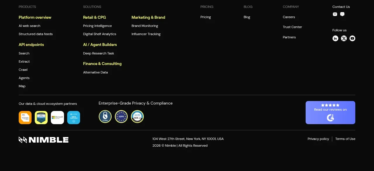
A large dark footer organizes product, solution, company, pricing, blog, and contact links into columns, then closes with partner badges and legal details.
Prompt preview
## Reference images

Study these alongside the description below: hierarchy, rhythm, spacing, colour. Build for the product you are asked about, using this design language.

- Component: https://kage-design-assets.t3.tigrisfiles.io/components/web-search-agents-by-nimble/b9f88c51-9261-49a4-af5a-25ccd481000c-1789452129-8.webp
- Full page it was cut from: https://kage-design-assets.t3.tigrisfiles.io/screenshots/web-search-agents-by-nimble/b9f88c51-9261-49a4-af5a-25ccd481000c-1789452077081-full.webp
- Component on Kage: https://kage.design/component/web-search-agents-by-nimble-footer

## Before you start
Ask what the user's product, audience, and brand identity are, then apply the principles below to that product rather than reproducing the reference.

Create a full-width dark footer using #090909 or #0B0B0B with a max-width inner container. The upper area should be a responsive multi-column link directory: group links under concise uppercase or small muted headings, use bright text for important links and gray #A5A5A5 for secondary links, and leave generous horizontal spacing. Include a contact/social column with compact circular or rounded icon buttons. Separate the lower utility area with a thin #2A2A2A rule; include partner/ecosystem marks, privacy/compliance cues, a compact review or trust action, brand treatment, address or legal text, and policy links. Use 13–14px body text, 11–12px metadata, 24–32px column gaps, and 56–72px vertical padding. Stack groups cleanly on mobile and ensure all links have clear hover and focus states.

Never use the reference logo, product name, exact navigation labels, company names, addresses, social icons, badges, review widget, copy, or imagery.