kage
kage
xem.email
Design analysis
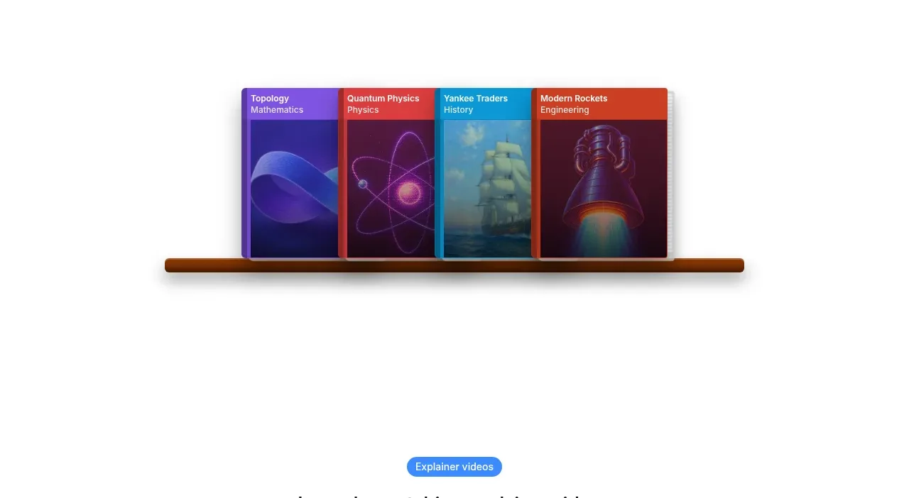
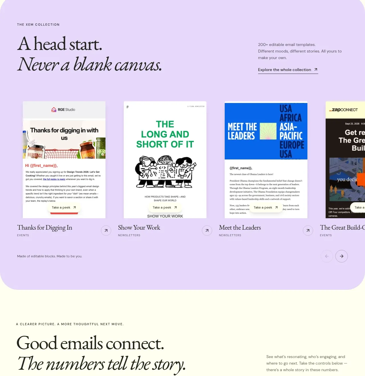
A lavender rounded gallery presents a collection promise above a horizontally arranged set of template cards, giving visitors immediate visual variety and a reason to explore further.
Prompt preview
## Reference images

Study these alongside the description below: hierarchy, rhythm, spacing, colour. Build for the product you are asked about, using this design language.

- Component: https://kage-design-assets.t3.tigrisfiles.io/components/xem/cfdda217-53f8-4a81-998a-9d07a076ba78-1790143672-6.webp
- Full page it was cut from: https://kage-design-assets.t3.tigrisfiles.io/screenshots/xem/cfdda217-53f8-4a81-998a-9d07a076ba78-1790143376275-full.webp
- Component on Kage: https://kage.design/component/xem-gallery

## Before you start
Ask what kinds of reusable assets the user's product offers, who uses them, and whether the gallery should scroll, filter, or open previews. Build an original collection section.

Create a large rounded lavender panel around #e7d5ff with a heading on the left, italic emphasis, a short collection description and exploration link on the right. Below, show a horizontal row of 3–5 tall preview cards with varied layouts, captions, and small arrow affordances. Let the row overflow horizontally or become a carousel on smaller screens, with accessible controls and optional drag/keyboard support. Use 24–32px panel padding, 24px radius, thin translucent borders, cream or white card surfaces, and restrained purple accents #6338cf. Keep the cards visually distinct but consistent in width and metadata hierarchy.

Never use the reference's logo, product name, copy, illustrations, or imagery.