kage
kage
zellahq.com
Design analysis
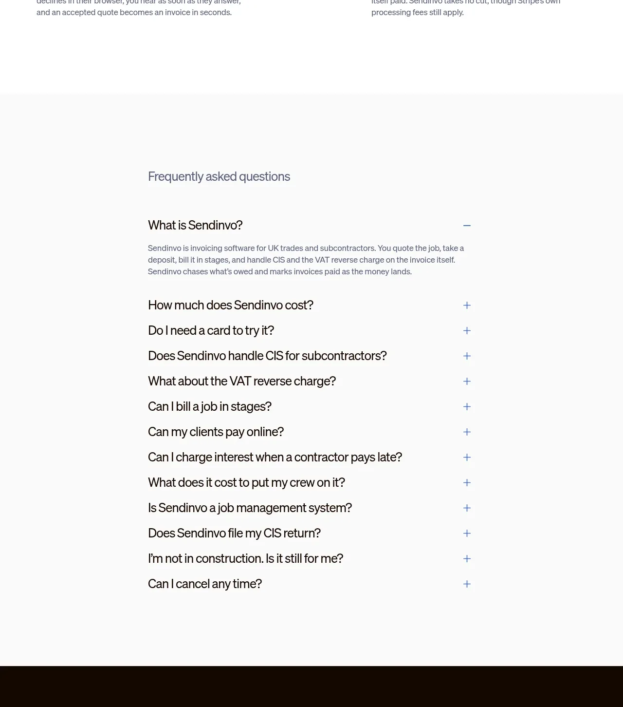
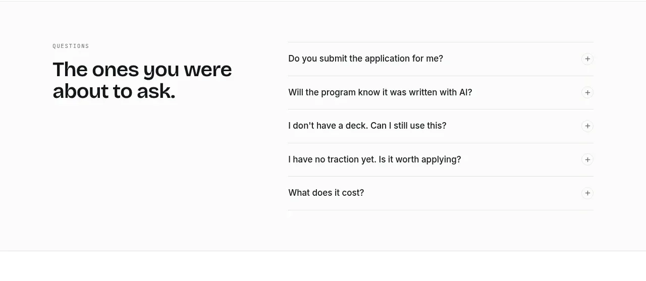
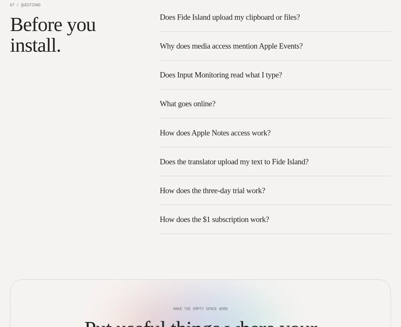
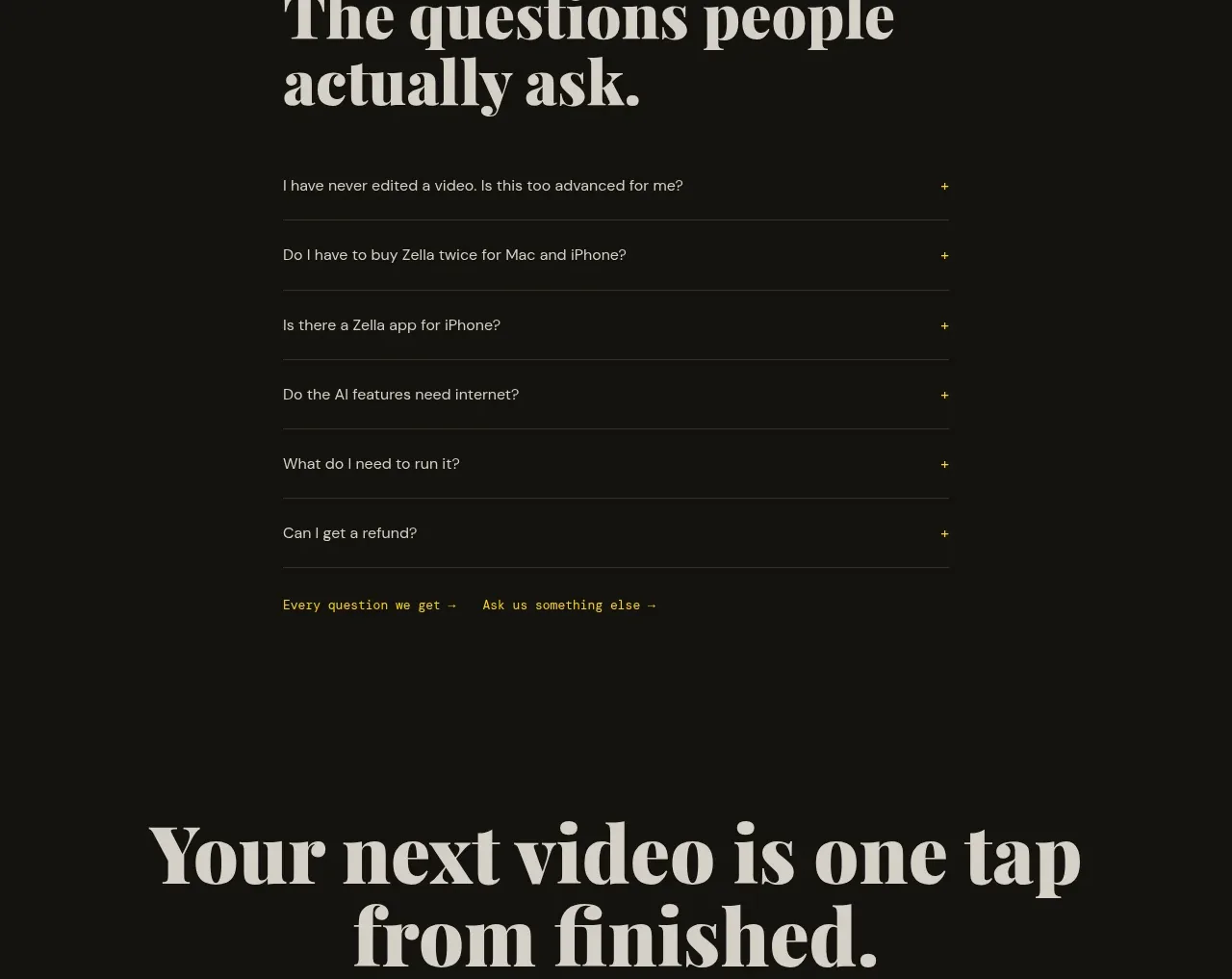
A narrow FAQ layout uses a strong heading and simple ruled accordion rows with visible plus controls, keeping support content easy to scan.
Prompt preview
## Reference images

Study these alongside the description below: hierarchy, rhythm, spacing, colour. Build for the product you are asked about, using this design language.

- Component: https://kage-design-assets.t3.tigrisfiles.io/components/zella/1ad8c25d-9254-4564-a81b-c4a3a0594691-1789711358-10.webp
- Full page it was cut from: https://kage-design-assets.t3.tigrisfiles.io/screenshots/zella/1ad8c25d-9254-4564-a81b-c4a3a0594691-1789711295290-full.webp
- Component on Kage: https://kage.design/component/zella-faq

## Before you start
Ask what the user's product and brand are, then apply the principles below to that product rather than copying the reference.

Build an FAQ section in a constrained content column. Put a small uppercase eyebrow above a large serif heading, then render six or more full-width accordion rows with concise questions, thin bottom borders, and a yellow plus icon at the far right. Closed rows should be visually quiet; an open row should reveal an answer with slightly increased padding and a rotated plus/minus control. Use a dark #121310 background, warm ivory heading, gray question text, and yellow-green accent. Add two small text links beneath the list for broader help. Support keyboard navigation, focus rings, and smooth height transitions.

Never: use logos, product names, copy, illustrations, or imagery from the reference.