kage
kage
zellahq.com

Design analysis
A long dark landing page that pairs an oversized italic serif display face with tiny monospaced uppercase eyebrows, on a warm near-black canvas with a single butter-yellow accent. The page opens with a statement hero beside a product-window mockup, then alternates airy serif statements with dense grids: a four-question objection grid, a pipeline diagram over a waveform, a 3×3 feature-card wall, a competitor comparison table with a tinted own-column, grouped use-case text lists, and a closing full-width serif CTA. Restraint comes from treating yellow as currency — CTAs, inline highlights and checkmarks only — while rhythm comes from mono label → big serif headline → quiet body copy repeating down the page.
Prompt preview
## Reference images

Study these alongside the description below: hierarchy, rhythm, spacing, colour. Build for the product you are asked about, using this design language.

- Full page: https://kage-design-assets.t3.tigrisfiles.io/screenshots/zella/1ad8c25d-9254-4564-a81b-c4a3a0594691-1789711295290-full.webp
- Above the fold: https://kage-design-assets.t3.tigrisfiles.io/screenshots/zella/1ad8c25d-9254-4564-a81b-c4a3a0594691-1789711291940.webp
- Design on Kage: https://kage.design/designs/zella-landing-page

# Design language brief: dark editorial landing page with serif-italic display and mono labels

## Before you start
Ask the user:
1. What product are you building and what does it do in one sentence?
2. Who is it for (creators, engineers, businesses…) and what job does it do for them?
3. What brand assets exist — name, logo, colours, fonts — and what tone should the copy carry (plain-spoken, technical, playful)?
Wait for the answers. Everything below is applied to *their* product, their copy and their palette; the reference page is only the source of the visual system.

## Page structure
Reproduce this section order and rhythm, adapting content:
1. **Top nav** — slim bar on the page background: small wordmark left (square glyph + uppercase logotype), centre links in tiny mono uppercase, one solid yellow pill CTA on the right. No dropdowns needed.
2. **Hero (split)** — left: a mono uppercase eyebrow line with `·` separators, a huge three-word serif-italic headline stacked one word per line, each ending in a period; one short paragraph of plain copy; a yellow pill primary button + a ghost/outline secondary button; a micro-print reassurance line underneath. Right: a dark app-window mockup (traffic-light dots, title bar, canvas, waveform footer) sitting directly on the background with no drop-shadow theatrics.
3. **Availability strip** — two quiet mono rows (platform + where to get it), then a full-width audio-waveform bar graphic as a decorative divider.
4. **Objection grid ("before anything else")** — four equal columns, each: mono uppercase question eyebrow, bold short answer headline, 3–4 lines of small copy. Thin 1px column separators.
5. **Core feature statement + pipeline diagram** — centred eyebrow, centred big serif headline with a period, short centred copy. Below: a horizontal flow diagram — yellow "1 tap" pill → chained outlined step chips → green "Ready to post" pill — floating over a waveform line. Below that: a 4×2 grid of feature cards, each with a yellow-highlighted keyword title and two lines of copy.
6. **Mechanism/"why it works" section** — centred statement headline. Two diagram rows comparing "everyone else" (grey dashed boxes, an ✕, ends in a cost) versus the product (yellow-tinted boxes, ends in "no bill to pass on"). Two short paragraphs and a trust line under it.
7. **Pricing statement** — centred serif headline, copy with one yellow inline highlight, a full-width bordered callout box for the introductory offer, then yellow pill + outline button pair.
8. **Feature wall** — centred headline + subcopy, then a 3×3 grid of cards; each card tops with a small dark UI vignette or motif, then a mono eyebrow label, a serif title, 2–3 lines of copy and a text link with an arrow. Outline pill button ("see every feature") centred below.
9. **Second-platform section (split)** — left: eyebrow, serif headline, copy, an en-dash bullet list of 6–7 capabilities, a store badge; right: a phone-shaped mockup of the same UI language.
10. **Comparison table** — centred headline, then a table: first column feature names in quiet copy, own product's column tinted yellow with checkmarks, competitor columns with dashes/marks in grey. Text link to full write-ups below.
11. **Use-case index** — centred headline, then 4–5 columns of plain text links grouped under mono uppercase headers; centred outline button ("all use cases").
12. **FAQ accordion** — centred headline, narrow single column of divider-separated rows, each with a question in copy-size serif/sans and a `+` toggle; two small text links under it.
13. **Closing CTA** — full-width centred, giant serif-italic statement headline with a period, two lines of copy, one yellow pill button, a mono small-print line about requirements.
14. **Footer** — wordmark + tagline left with a bordered community-help card and a newsletter input + yellow subscribe button; four mono-headed link columns (product, use cases, company, legal); social icons and store badges; copyright line with the domain right-aligned.

## Design language
- **Two-typeface system, maximum contrast.** Pair an editorial serif with true italics for display (headlines 56–96px, tight leading, sentence-style periods) against a monospace for eyebrows, nav links, table headers and small print (10–12px, uppercase, +0.15em tracking). Body copy is 14–16px in the serif or a quiet sans, line-height ~1.6, in a muted warm grey.
- **Hierarchy is built by type scale jumps, not size alone.** Mono eyebrow → serif headline → muted paragraph → smaller mono details is the repeating unit of every section. Headlines are short declarative statements that end in a period.
- **Colour: warm near-black canvas, one yellow.** Background ≈ `#0e0c08`, panels ≈ `#171310`, borders ≈ `#2b251c`, primary text ≈ `#ece5d8`, muted text ≈ `#a39885`, accent yellow ≈ `#f0c34e`, success green ≈ `#8fd694`. Yellow is spent only on CTAs, inline text highlights, key checkmarks and waveform art — if more than ~5% of a viewport is yellow, it is wrong.
- **Borders, radius, shadow.** 1px hairline borders everywhere; cards and mockup windows use 10–14px radius; buttons are fully rounded pills. No drop shadows — depth comes from a panel being one step lighter than the background. Dashed borders mean "the other guys" in diagrams.
- **Waveform motif.** Repeat a simple audio-waveform/bar graphic as dividers, under diagrams and inside mockups; it ties product story to decoration.
- **Rhythm down the page.** Airy split hero → dense 4-column grid → diagram section → dense 3×3 card wall → dense table → airy text-link index → single-column FAQ → huge airy closing statement. Alternate dense and breathing sections so no two dense sections touch.
- **Diagram language.** Small labelled boxes + arrows in mono type, grey/dashed for the status quo, solid yellow-tinted for your product; always resolves to a benefit chip.
- **Tables.** Monospaced uppercase headers, generous row height, hairline dividers, own column highlighted with a yellow tint at ~8% opacity.
- **Motion.** Restrained: link arrows nudge on hover, accordions expand, mockup screens may show a subtle blinking record dot or waveform pulse. No parallax, no gradient glows.
- **Copy tone.** Plain-spoken, concrete numbers ("$89 once", "2 minutes", "145 MB"), second person, no exclamation marks. Lead with the objection the buyer already has.

## Never
- Never reuse the reference product's name, wordmark, logo glyph, screenshot content, UI copy, or its "Record. Polish. Ship." formulation.
- Never copy its pricing numbers, plan names, competitor names or comparison rows.
- Never use yellow-on-black with a different product's identity uncritically — derive the accent from the user's brand, keep the *system*.
- Never fill the feature wall or diagrams with stock illustrations, emoji icon sets or photography; keep vignettes abstract and UI-like.
- Never present the result as the reference product or imply any affiliation.
Components from this page
All components
 Minimal product navigation
Zella · Navigation
Minimal product navigation
Zella · Navigation
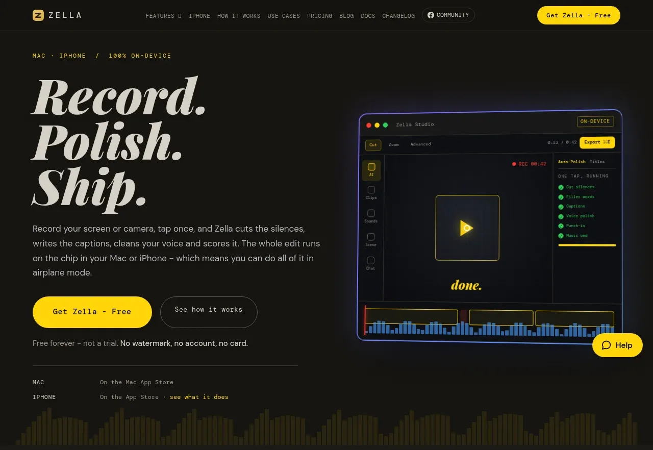 Record, polish, ship hero
Zella · Hero
Record, polish, ship hero
Zella · Hero
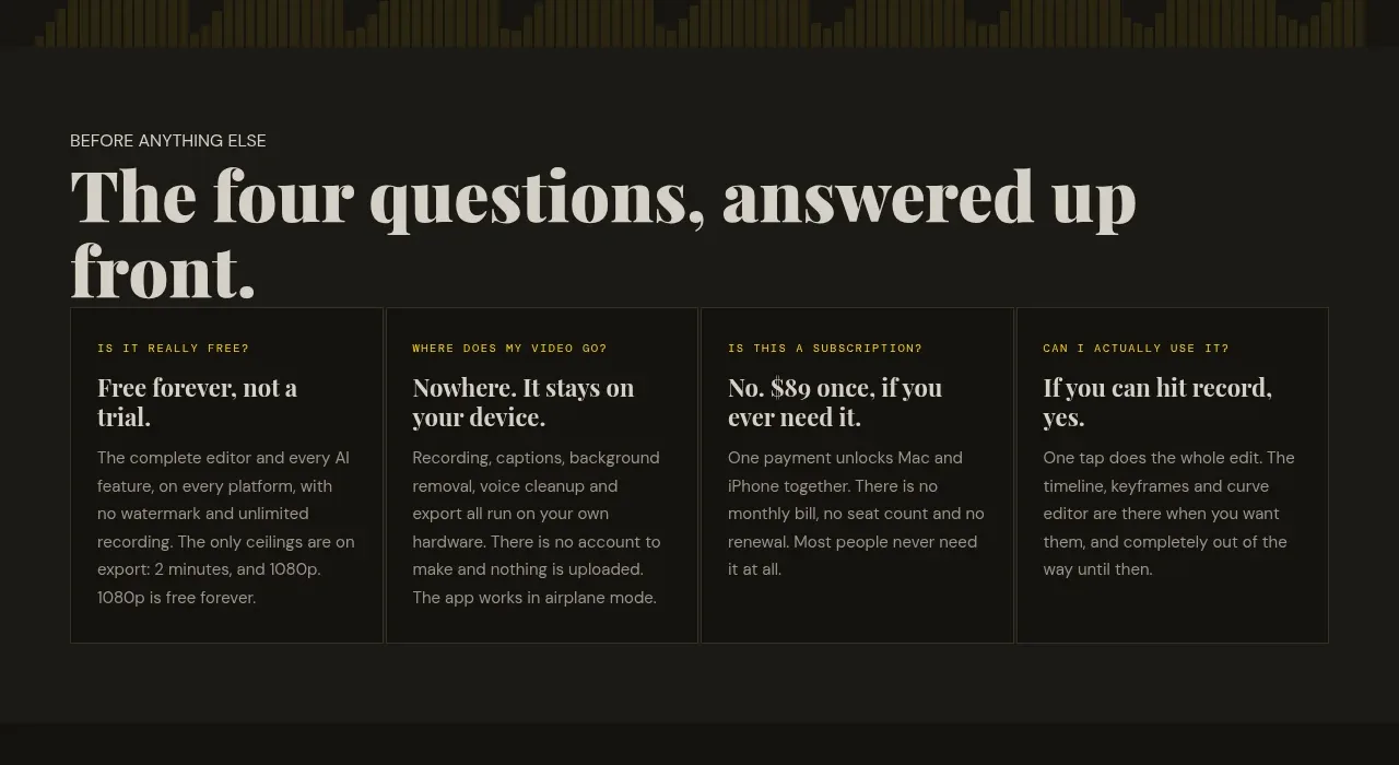 Four questions answered upfront
Zella · Feature grid
Four questions answered upfront
Zella · Feature grid
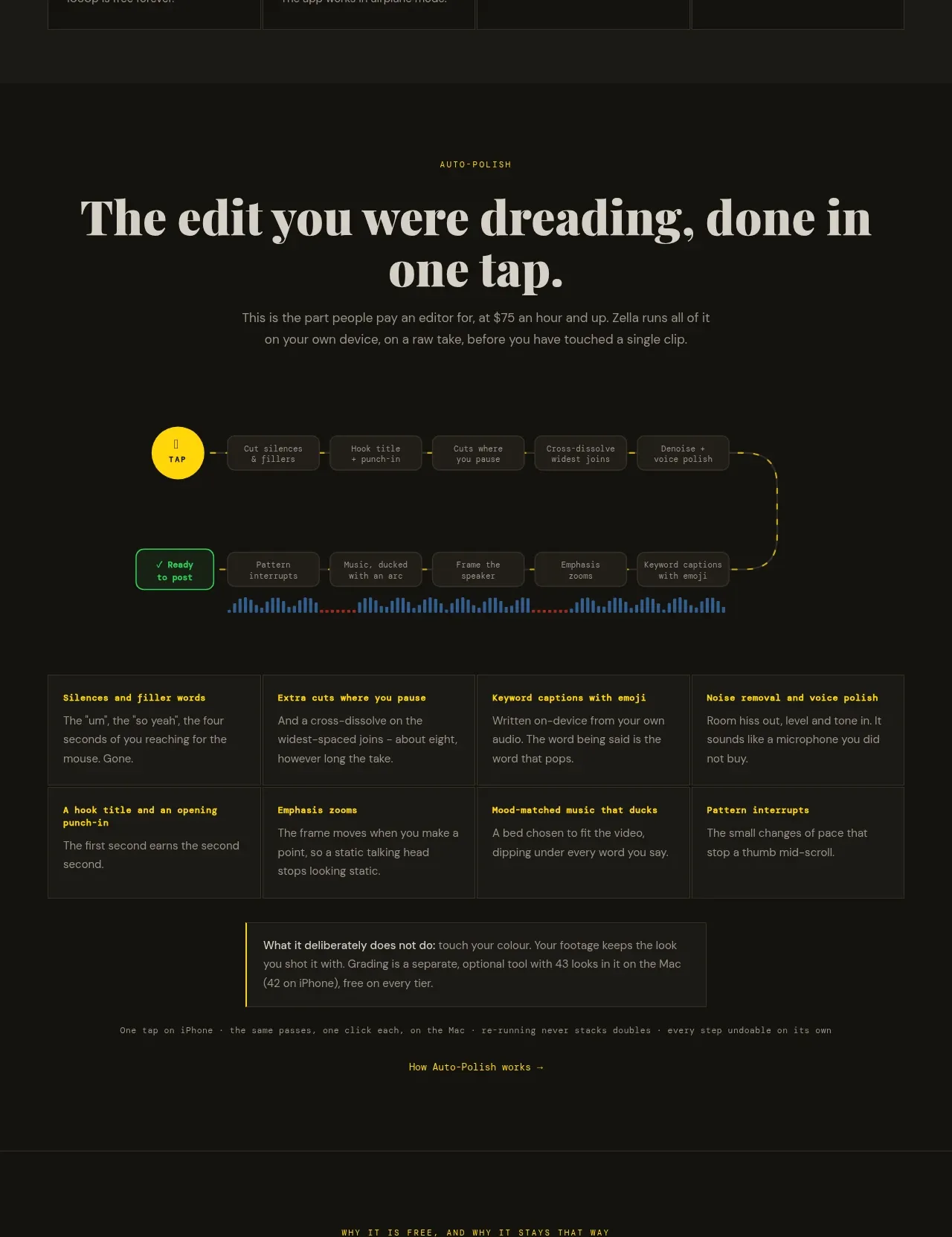 One-tap editing workflow
Zella · Feature grid
One-tap editing workflow
Zella · Feature grid
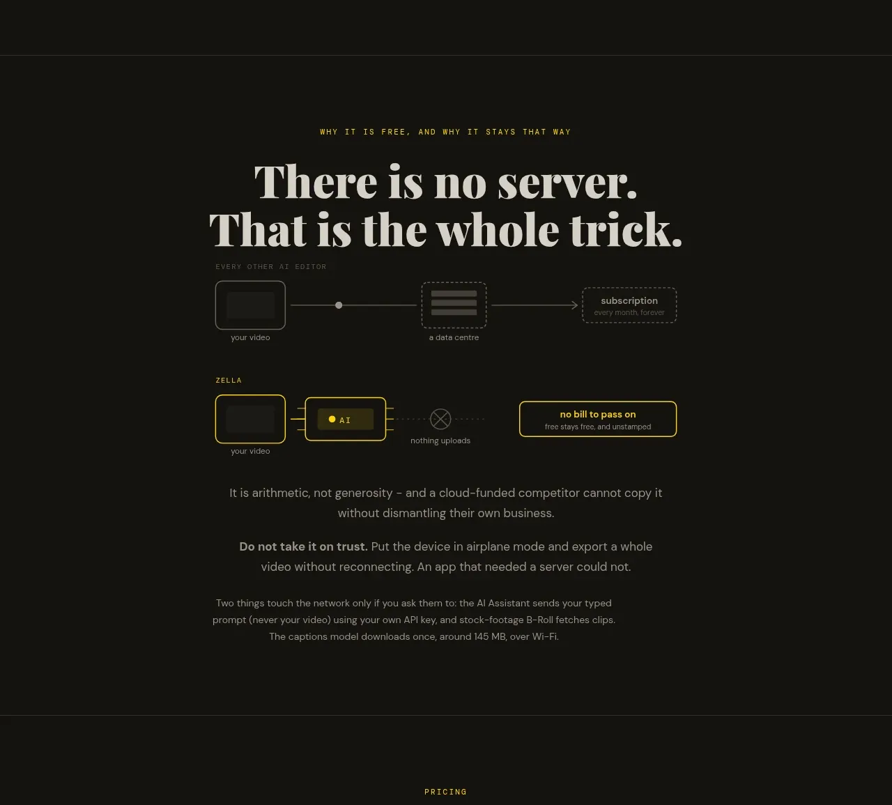 On-device privacy explanation
Zella · Feature grid
On-device privacy explanation
Zella · Feature grid
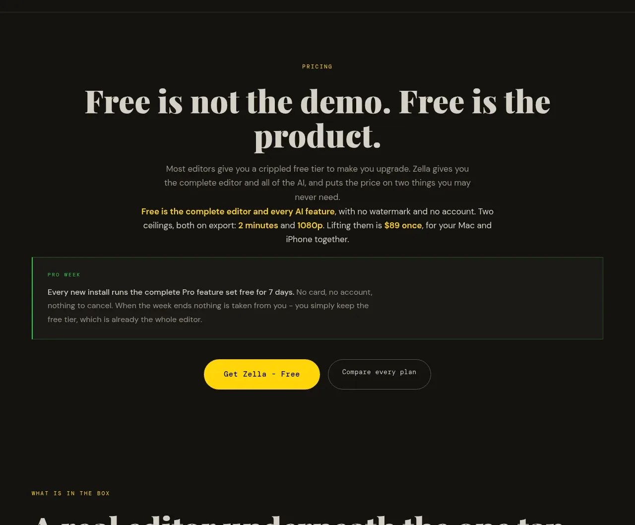 Free product pricing message
Zella · Call to action
Free product pricing message
Zella · Call to action
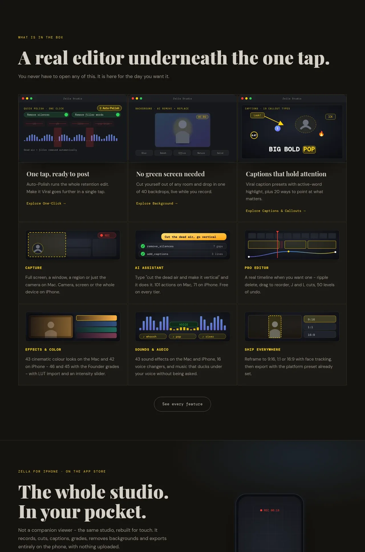 Product features gallery
Zella · Feature grid
Product features gallery
Zella · Feature grid
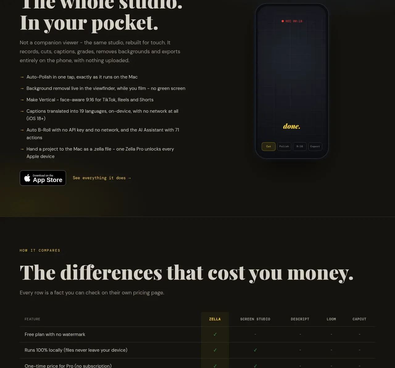 Mobile companion section
Zella · Feature grid
Mobile companion section
Zella · Feature grid
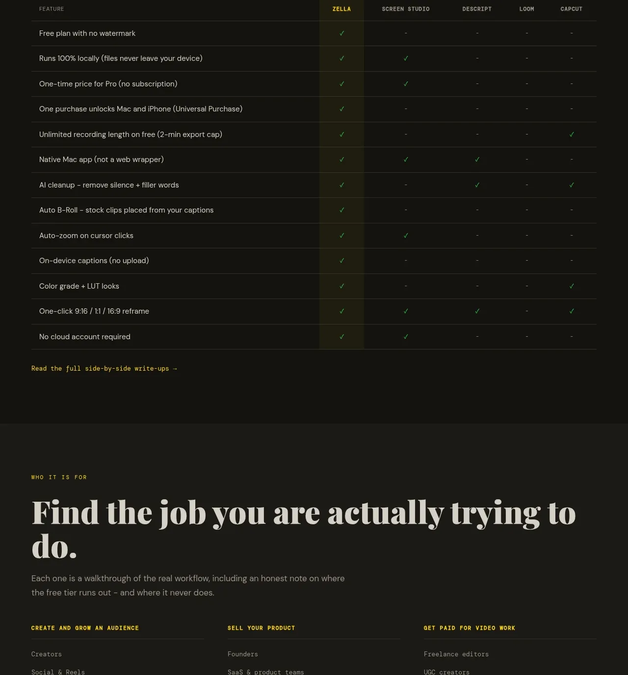 Feature comparison table
Zella · Table
Feature comparison table
Zella · Table
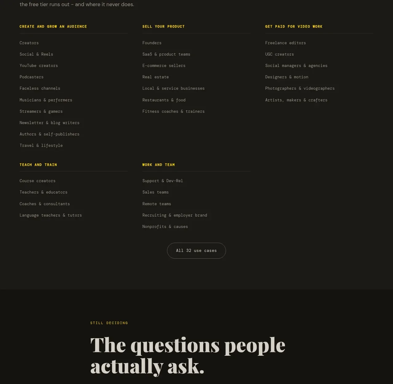 Use-case directory
Zella · Feature grid
Use-case directory
Zella · Feature grid
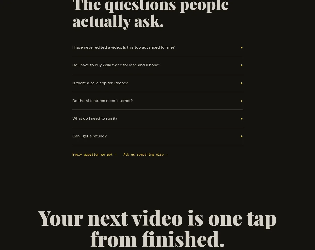 Frequently asked questions
Zella · FAQ
Frequently asked questions
Zella · FAQ
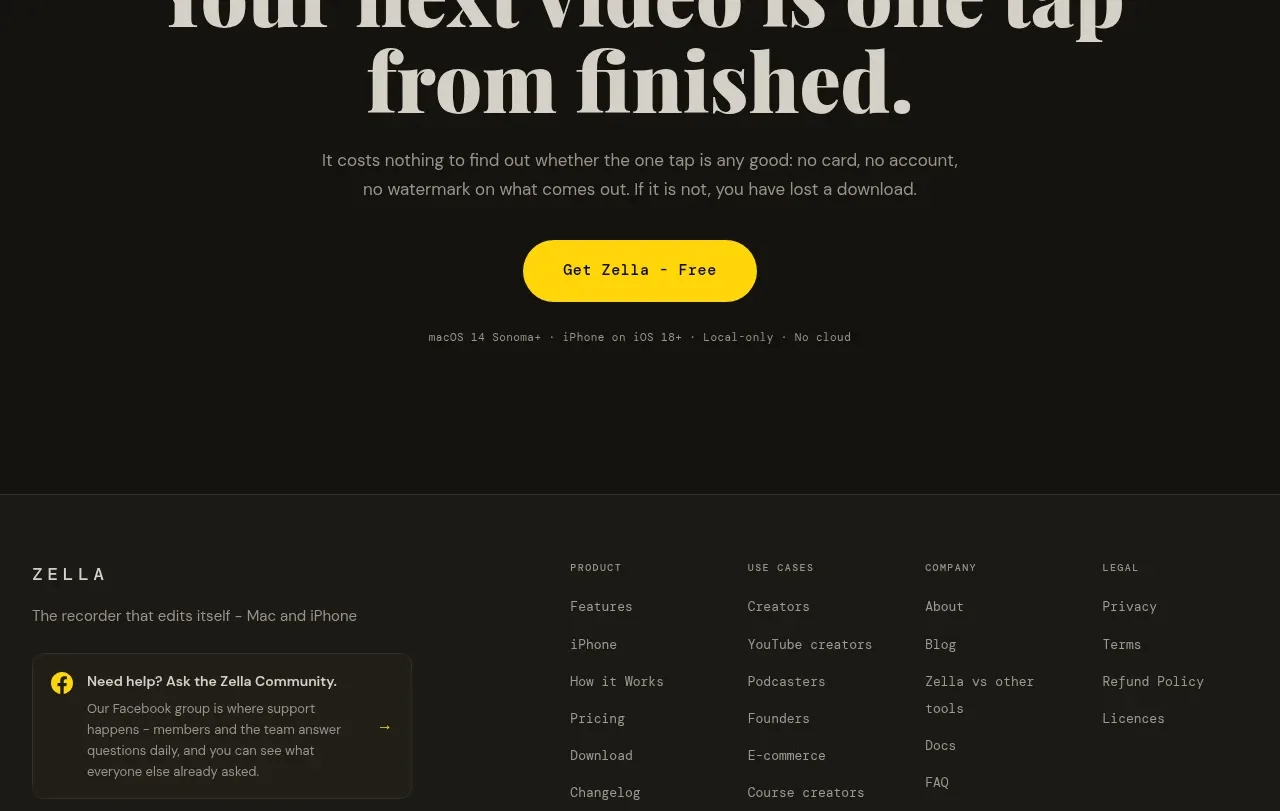 Final conversion call to action
Zella · Call to action
Final conversion call to action
Zella · Call to action