 kage
kage
adscope.live

Design analysis
A long-form SaaS landing page uses a restrained white and pale-gray canvas, near-black typography, thin rounded borders, and a highlighter-lime accent for actions, badges, checks, and the closing CTA. The page moves from a spacious split hero into compact integration cards, a two-column problem/solution comparison, an accordion-and-product-preview feature section, detailed pricing, FAQ rows, and a high-contrast lime conversion band; density increases in the middle sections and relaxes again around the final CTA and footer.
Prompt preview
## Reference images

Study these alongside the description below: hierarchy, rhythm, spacing, colour. Build for the product you are asked about, using this design language.

- Full page: https://kage-design-assets.t3.tigrisfiles.io/screenshots/adscope/d628eaa8-0259-4816-ad11-db69e3ce98d4-1789106621890-full.webp
- Above the fold: https://kage-design-assets.t3.tigrisfiles.io/screenshots/adscope/d628eaa8-0259-4816-ad11-db69e3ce98d4-1789106618752.webp
- Design on Kage: https://kage.design/designs/adscope-landing-page

## Before you start
Ask the user what they are building, who it is for, and what brand assets they already have (name, colours, type). Wait for their answers before proceeding. Apply everything below to their product, not to the reference product.

## Page structure
1. **Top navigation:** Create a slim white header with a small brand mark and name at left, centered text links for the main sections, and compact outlined login plus solid primary CTA buttons at right.
2. **Hero:** Use a pale gray full-width hero with a two-column layout: a small eyebrow, oversized multi-line headline, short explanatory paragraph, bright accent CTA, and muted trial reassurance on the left; place a product/dashboard preview on the right.
3. **Channel integrations:** On a white section, center a light-weight heading above three equal integration cards. Each card contains a small platform tile, title, description, divider, and an integrated/not-yet-available status row with a toggle or badge.
4. **Manual versus product comparison:** Switch to a pale gray section with a centered headline and supporting line, followed by two large side-by-side cards. Contrast the manual process with the product workflow using red negative markers on one side and lime check markers on the other.
5. **Feature overview:** Return to white and introduce a centered section title. Build a large rounded split panel: a stacked list of feature rows and one expanded feature with icon, description, and circular arrow control on the left; a bright light-blue product visualization with floating metric cards on the right.
6. **Pricing:** Use a pale gray pricing section with centered title and explanatory copy, a pill-shaped annual/monthly billing switch, and two tall plan cards. Make the primary plan visually stronger with a launch-price badge, large price, CTA, feature checklist, and support line; make the secondary plan communicate that features are still in design and offer a feedback CTA.
7. **Pricing follow-up contact card:** Place a centered white rounded card below the plan grid with a short question-led message and a black pill CTA for prospects who need help deciding.
8. **FAQ:** Use a white section with a large centered heading and a vertical stack of wide, low-height rounded accordion rows. Keep each question on the left and a small downward chevron on the right, with generous spacing and thin borders.
9. **Final conversion band:** Add a full-width fluorescent lime section with a very large centered headline, short supporting copy, black CTA, and small reassurance text. Add only faint oversized abstract geometric line shapes in the background.
10. **Footer:** Finish with a pale gray footer containing the brand lockup and copyright at left, plus separate Social and Legal link columns at right.

## Design language
- Build hierarchy with a very large, light-to-regular sans-serif headline, medium section headings, and compact neutral body copy; use generous whitespace around section titles and tighter spacing inside cards.
- Keep the page mostly white and pale gray, approximately `#ffffff` and `#f3f3f1`, with near-black text around `#0b0b0b` and muted gray copy around `#666666`.
- Reserve a vivid highlighter-lime accent around `#d9ff3f` for primary hero actions, launch labels, check circles, selected states, and the final CTA band. Use a pale cyan/blue around `#c9f1ff` only for the feature visualization panel; use soft red around `#ef6363` for negative comparison markers.
- Use a consistent restrained sans-serif pairing: one clean grotesk family for all text, with weight and size doing the work rather than decorative type. Scale hero text dramatically, section headings large but calmer, card titles medium, and metadata small.
- Treat cards as quiet product surfaces: thin black or gray 1px borders, mostly 14–22px corner radii, white fills, and little or no shadow. Use stronger borders for comparison and pricing cards; use subtle dividers for lists and accordions.
- Alternate white and pale-gray section backgrounds to create rhythm. Start spacious and image-led, become denser through integrations, comparisons, features, and pricing, then open back up for FAQ, the bright CTA, and footer.
- Use rounded black pill buttons with white text for primary actions and lime or outlined secondary controls. Keep button labels direct and compact; include reassurance copy immediately beneath trial CTAs.
- Make feature and FAQ rows feel interactive through chevrons, circular arrow controls, toggles, and active/inactive states. The visible interaction model is restrained: use short colour and opacity transitions, smooth accordion height changes, and a subtle active-row highlight rather than dramatic animation.
- Use product UI previews as structured evidence: dashboard cards, metric chips, ad thumbnails, and floating white panels should be legible but subordinate to the page headline.
- Keep the footer simple and asymmetric: brand/copyright block on the left and grouped utility links on the right, with small uppercase category labels.

## Never
- Do not reuse the reference logo, wordmark, product name, copy, pricing, platform names, dashboard screenshots, illustrations, photography, or icon set.
- Do not present the result as AdScope or imply an affiliation with it.
- Do not add decorative complexity that conflicts with the sparse SaaS layout; create new product-specific content and visuals using the user’s brand assets.
Components from this page
All components
 Minimal SaaS navigation bar
AdScope · Navigation
Minimal SaaS navigation bar
AdScope · Navigation
 Product-led analytics hero
AdScope · Hero
Product-led analytics hero
AdScope · Hero
 Integration status card grid
AdScope · Logo cloud
Integration status card grid
AdScope · Logo cloud
 Manual versus unified workflow feature grid
AdScope · Feature grid
Manual versus unified workflow feature grid
AdScope · Feature grid
 Tabbed feature showcase
AdScope · Feature grid
Tabbed feature showcase
AdScope · Feature grid
 Launch pricing comparison table
AdScope · Pricing table
Launch pricing comparison table
AdScope · Pricing table
 Centered rounded CTA panel
AdScope · Call to action
Centered rounded CTA panel
AdScope · Call to action
 Minimal accordion FAQ
AdScope · FAQ
Minimal accordion FAQ
AdScope · FAQ
 FAQ-to-CTA transition
AdScope · Call to action
FAQ-to-CTA transition
AdScope · Call to action
 CTA and utility footer
AdScope · Footer
CTA and utility footer
AdScope · Footer
Related designs
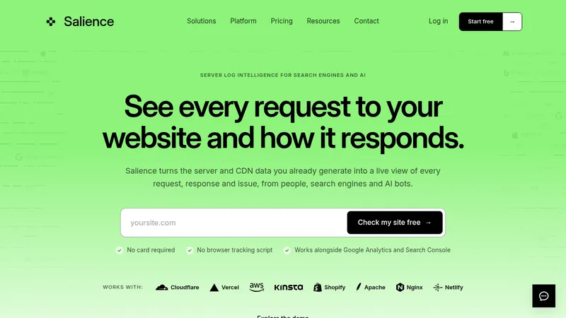

 Salience
Landing page · Analytics & data
Salience
Landing page · Analytics & data
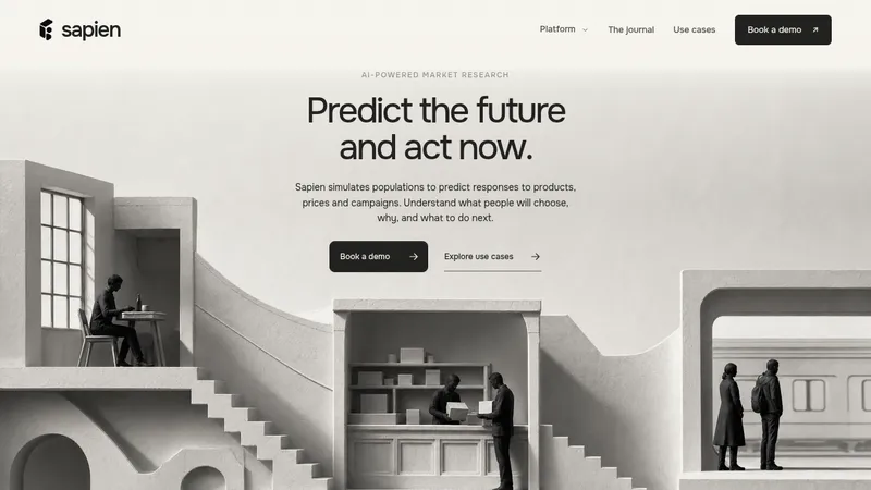

 Sapien
Landing page · Analytics & data
Sapien
Landing page · Analytics & data
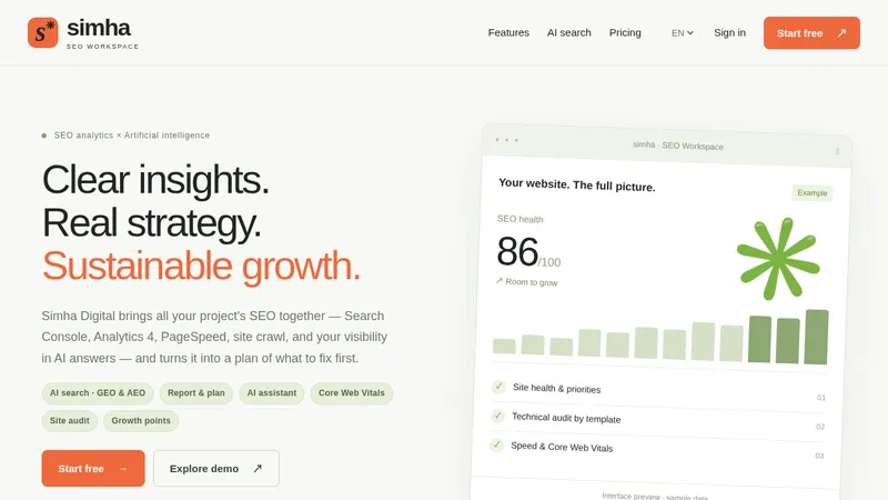

 Simha Digital
Landing page · Analytics & data
Simha Digital
Landing page · Analytics & data
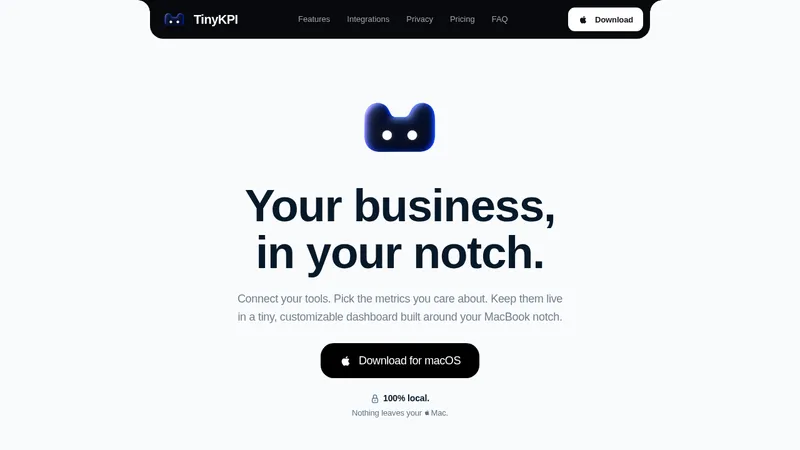

 TinyKPI
Landing page · Analytics & data
TinyKPI
Landing page · Analytics & data


 Basedash in Español Français & Português
Landing page · Analytics & data
Basedash in Español Français & Português
Landing page · Analytics & data


 AI Observability by OpenObserve
Landing page · Analytics & data
AI Observability by OpenObserve
Landing page · Analytics & data