kage
kage
adscope.live

Design analysis
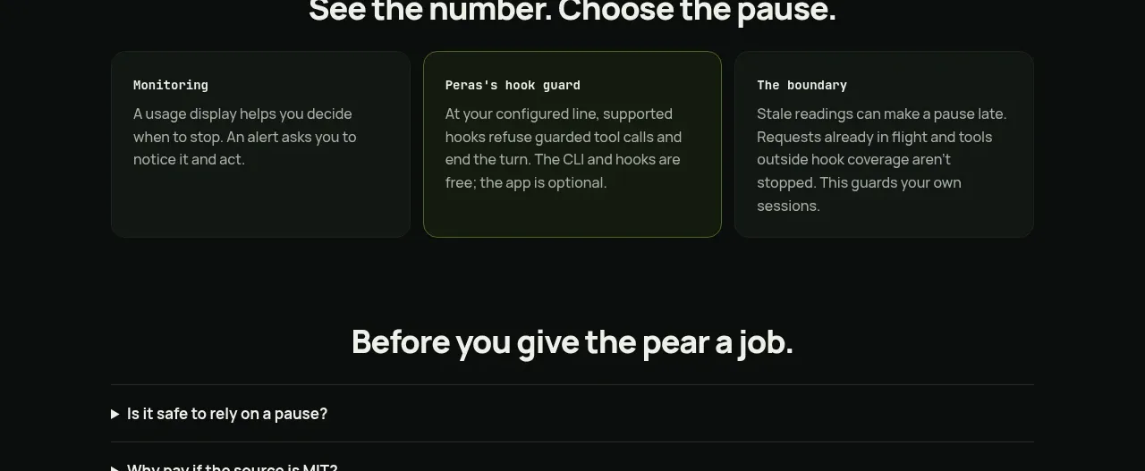
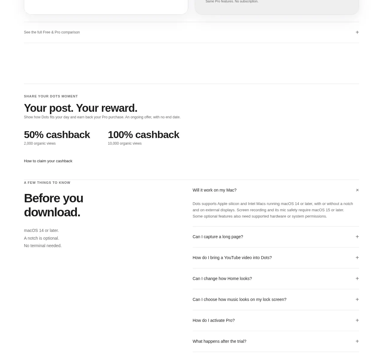
A spacious, high-clarity FAQ section pairs a centered editorial heading with a full-width stack of outlined accordion rows. Generous spacing, restrained typography, and a small accent chevron make the component feel calm, trustworthy, and easy to scan.
Prompt preview
## Reference images

Study these alongside the description below: hierarchy, rhythm, spacing, colour. Build for the product you are asked about, using this design language.

- Component: https://kage-design-assets.t3.tigrisfiles.io/components/adscope/d628eaa8-0259-4816-ad11-db69e3ce98d4-1789106704-7.webp
- Full page it was cut from: https://kage-design-assets.t3.tigrisfiles.io/screenshots/adscope/d628eaa8-0259-4816-ad11-db69e3ce98d4-1789106621890-full.webp
- Component on Kage: https://kage.design/component/adscope-faq

## Before you start
Ask the user what their product is, who it serves, and what visual brand direction they want. Then apply the principles below to create an original FAQ section for that product—not a copy of the reference.

## Design language

Build a calm, editorial FAQ section for a modern software or service website. The component should make a long list of practical questions feel easy to scan and low-friction to explore.

### Layout and alignment
- Use a full-width section on a clean, very light background, with a centered content container.
- Keep the container wide but bounded, approximately `min(100% - 48px, 1200px)` on desktop.
- Place a large, centered section heading above the questions. Allow the heading to wrap naturally into two lines when its length requires it.
- Add a generous vertical gap between the heading and the accordion list.
- Stack accordion items vertically with consistent gaps of roughly 16px.
- Make every row span the content width and align its question text on the left with a compact expand indicator on the right.
- On smaller screens, reduce side padding to around 20–24px and scale down the heading while preserving generous breathing room.

### Typography hierarchy
- Use a modern neutral sans-serif with clean, highly legible forms.
- Set the heading in a large regular or book weight, approximately 52–60px on desktop with a tight line height around 1.1; use approximately 32–40px on mobile.
- Set accordion questions around 22–24px on desktop and 18–20px on mobile, using regular or medium weight rather than bold.
- Keep copy black or near-black with comfortable line height. Avoid decorative type treatments.

### Colour
- Use an almost-white or white page background, approximately `#FFFFFF` or `#FCFCFB`.
- Use near-black text, approximately `#0A0A0A`.
- Use subtle cool-gray borders, approximately `#D4D4D4` to `#DEDEDE`.
- Use a restrained lavender or violet accent for the chevron, approximately `#B56BC7` or a brand-appropriate equivalent.
- If an item is open, use only a very subtle background tint or accent change; preserve the quiet visual hierarchy.

### Borders and radius
- Give each accordion row a thin 1px border.
- Use a large, soft corner radius around 18–22px so the rows feel approachable without appearing like pills.
- Keep borders light and consistent; do not add heavy shadows.
- Maintain a comfortable row height, approximately 92px on desktop, with horizontal padding around 32px. Use 22–24px padding on mobile.

### Interaction
- Implement each row as an accessible button or disclosure control with a clearly associated answer panel.
- Clicking or keyboard-activating a row should expand its answer and rotate or change the chevron direction smoothly.
- Decide whether multiple answers may remain open based on the product context, but keep the behavior predictable; a single-open accordion is a good default.
- Animate expansion with a short, gentle ease-out transition around 180–240ms. Do not rely on colour alone to communicate state.
- Add visible, tasteful keyboard focus styles using the brand accent or a dark outline.
- Ensure touch targets are at least 44px high and the entire row is interactive.
- Include meaningful `aria-expanded`, `aria-controls`, and answer-panel relationships.
- Support reduced-motion preferences.

### Content guidance
- Write questions that address the audience’s highest-friction concerns, such as what the product does, setup effort, integrations, mobile access, security, pricing, trial terms, and what happens next.
- Keep each question direct and conversational. Answers should be concise, specific, and useful.
- Use the user’s actual product terminology and claims; do not invent guarantees, integrations, certifications, or pricing details.

## Never
- Never use logos, product names, copy, illustrations, screenshots, or imagery from the reference.
- Never reproduce the reference questions verbatim.
- Never make the accordion rows look like dense cards with strong shadows, gradients, or excessive decoration.
- Never sacrifice keyboard accessibility, responsive behavior, or readable contrast for visual similarity.