kage
kage
latitude.so
Design analysis
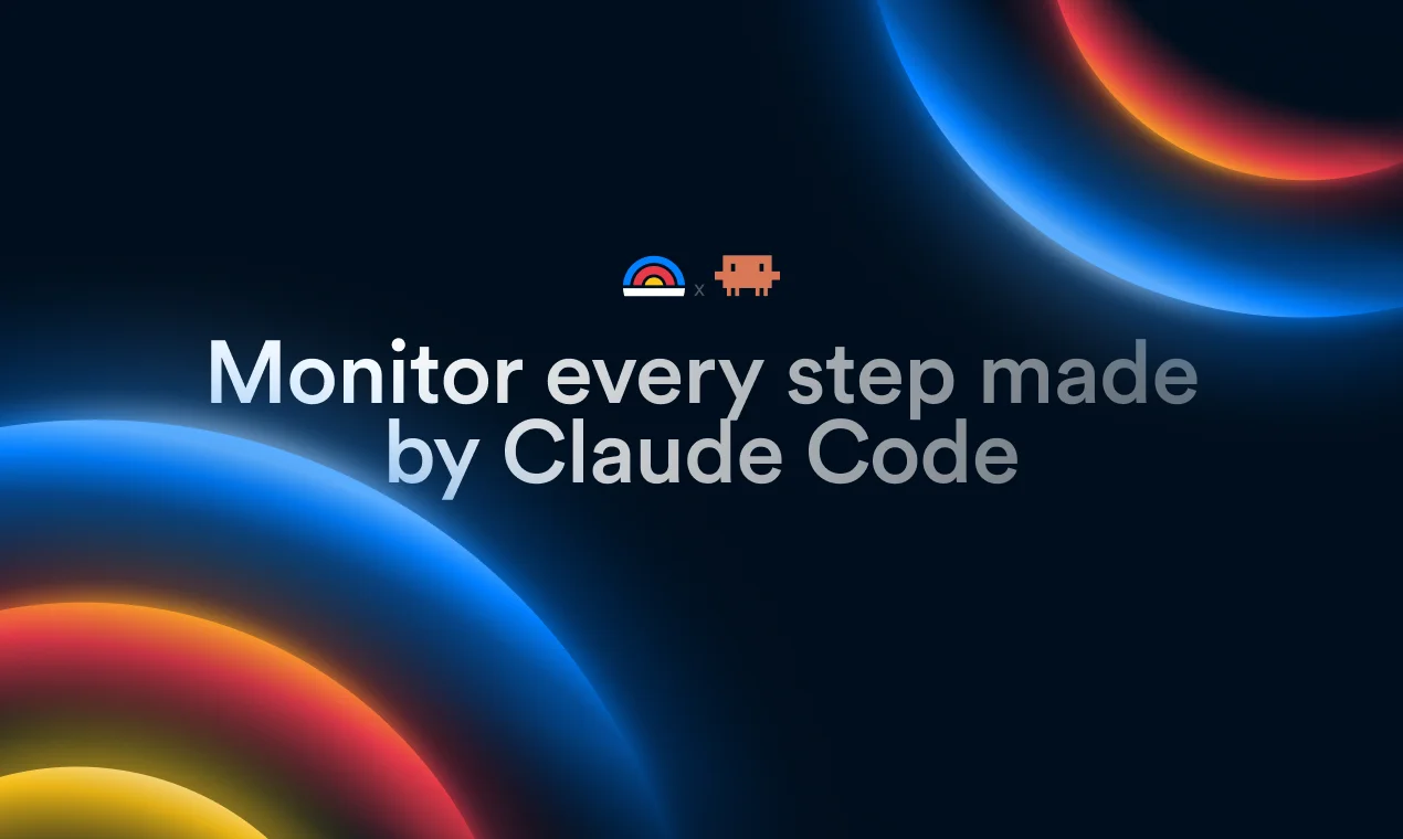
A roughly 1200×630 social card uses a deep navy-black canvas with oversized cropped glowing orbital forms entering from the top-right and bottom-left corners. A small centered symbol pairing sits above a large two-line light-gray headline, creating a clear focal hierarchy; saturated blue, orange, red, and yellow gradients remain confined to the peripheral imagery so the typography stays legible.
Prompt preview
## Reference images

Study these alongside the description below: hierarchy, rhythm, spacing, colour. Build for the product you are asked about, using this design language.

- Screenshot: https://kage-design-assets.t3.tigrisfiles.io/screenshots/agentscore/62aafa4a-f0f2-403a-982a-5f7631c3f3fd-1790229688722.webp
- Design on Kage: https://kage.design/designs/agentscore-og-image

## Before you start
Ask the user what they are building, who it is for, and what brand assets they already have (brand name, colours, typefaces, logo or other assets). Wait for their answers before proceeding. Apply everything below to their product, not to the reference product.

## Page structure
- **1200×630 social-card canvas:** Create a fixed-ratio Open Graph image, rendered as HTML/CSS to PNG or as an SVG, with a dark full-bleed background.
- **Peripheral abstract imagery:** Place large cropped glowing circular or orbital forms in the top-right and bottom-left corners, leaving the middle of the canvas relatively open; use the user's own abstract motif rather than literal product imagery.
- **Brand mark row:** Add a small centered placeholder brand symbol or compact mark above the headline, with a restrained separator or secondary mark if the product needs one.
- **Primary headline:** Set a short placeholder message in one or two centered lines across the middle, with the largest type on the card and generous horizontal margins.
- **Safe-area finish:** Keep all important branding and copy within the central safe area so the card remains readable when cropped or displayed at smaller sizes.

## Design language
- **Build hierarchy through scale and placement:** Make the headline the dominant element, centered slightly below the vertical midpoint; keep the mark row small and visibly subordinate above it.
- **Use negative space as structure:** Preserve a calm, dark central field around the copy while allowing the corner forms to provide framing and depth.
- **Treat colour as edge energy:** Use a near-black navy base around `#020D1B` or `#031426`; concentrate luminous blue around `#087BFF`, with controlled transitions through cyan, orange `#FF9A2E`, red `#E9434F`, and yellow `#FFD34A`. Add blurred bloom and subtle dark falloff so gradients feel illuminated rather than flat.
- **Pair a clean geometric sans with restrained weight:** Use a contemporary sans-serif fallback stack such as Inter, Geist, or Arial. Set the headline large, approximately 64–78px at 1200×630, with medium-to-semibold weight, tight but readable line-height around 0.98–1.05, and light gray-white text around `#E8EDF2` rather than pure white.
- **Keep the composition simple:** Use one focal text block and no extra cards, panels, UI screenshots, or decorative copy. Scale the abstract forms beyond the canvas so only partial arcs are visible.
- **Use soft light, not hard decoration:** Apply broad Gaussian-like blurs, layered radial gradients, and subtle glow halos; avoid drop shadows, outlines, complex textures, or visible grid lines.
- **Make rendering deterministic:** Produce an exact 1200×630 output with no scrolling, responsive reflow, or interactive controls. Verify that the headline has sufficient contrast against the central background and that the corner artwork does not obscure it.
- **Motion and interaction:** There is no interaction in a social card; if prototyping in HTML, keep the artwork static and render the final frame to PNG.

## Never
- Do not copy the reference product's logos, wordmarks, symbols, product names, headline, or exact icon pairing.
- Do not reuse the reference's literal copy, including references to Claude Code or AgentScore.
- Do not import the reference's exact abstract artwork; create a new orbital or gradient composition appropriate to the user's product.
- Do not add illustrations, photography, UI screenshots, or icon sets unless the user provides them as brand assets.
- Never present the result as the reference product; use placeholder branding and placeholder copy until the user's product details are known.