kage
kage
art4.app
Design analysis
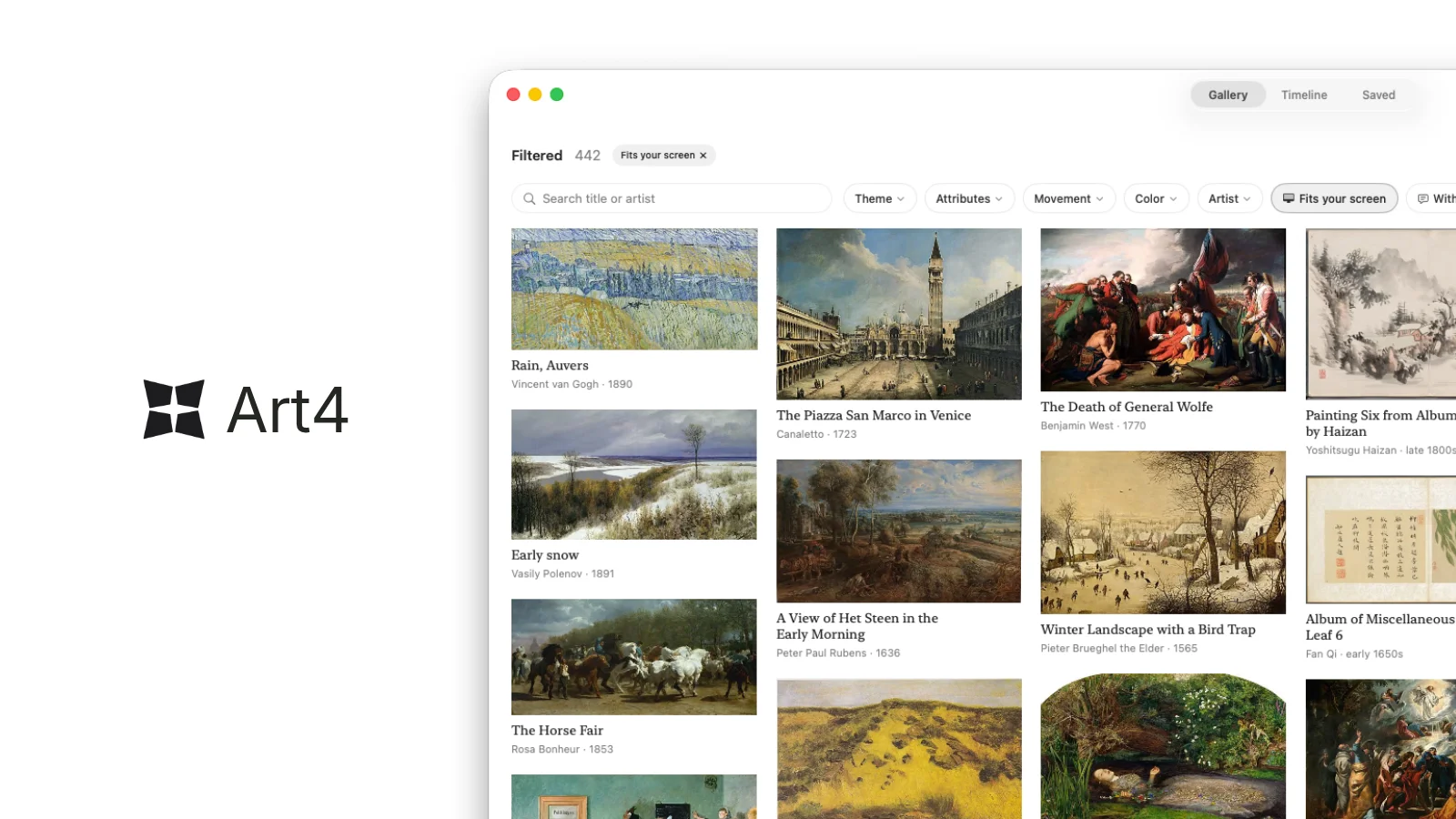
A 1200×630 share card built on a split of calm and dense: the left third is empty off-white space holding only the black Art4 wordmark at vertical centre, while the right two-thirds is a macOS app window that bleeds off the right and bottom edges. The window chrome is entirely monochrome — traffic lights, a segmented Gallery/Timeline/Saved control, a search field and filter pills — so the only colour on the card comes from the masonry grid of artworks inside it, each captioned with a small dark title and a lighter artist · year line. The composition sells the product by scale contrast: one quiet wordmark against a window already full of art.
Prompt preview
## Reference images

Study these alongside the description below: hierarchy, rhythm, spacing, colour. Build for the product you are asked about, using this design language.

- Screenshot: https://kage-design-assets.t3.tigrisfiles.io/screenshots/art4/0374b7b0-06cd-445a-9490-ce40797e5725-1791180183505.webp
- Design on Kage: https://kage.design/designs/art4-og-image

## Before you start
Ask the user what product they are building, who it is for, and what brand assets they already have (name, logo mark, colours, typeface). Wait for their answers. Everything below is a composition template applied to **their** product, not to the reference.

## Page structure
Produce a **single static social card at exactly 1200×630** (render HTML/CSS to PNG at 2x for sharpness, or output an SVG with an equivalent PNG). Two zones, no other sections:

1. **Canvas** — flat off-white background (`#F7F7F5`), no border, no pattern. Keep all critical content ≥48px inside the edges since platforms crop card borders slightly.
2. **Left zone (~35% width)** — the brand lockup alone: a small geometric logo mark next to the product wordmark in near-black (`#1A1A1A`), semibold, ~64px, positioned in the left margin at vertical centre. Nothing else here; the emptiness is the point.
3. **Right zone (~65% width)** — a macOS-style app window mockup, white (`#FFFFFF`), 20–24px corner radius, one large soft ambient shadow (`0 30px 80px rgba(0,0,0,0.12)`), deliberately **cropped by the right and bottom card edges** so it reads as a real window peeking into frame. Inside, top to bottom:
   - **Title bar**: three traffic-light dots (red `#FF5F57`, yellow `#FEBC2E`, green `#28C840`) at left; a right-aligned segmented control of three short tab labels with the active one in a light gray pill (`#ECECEA`).
   - **Toolbar**: a results-count line (bold word + gray number) with one active filter chip; below it a rounded search input with magnifier icon plus 4–6 small dropdown pills (label + chevron) and one filled/highlighted button. Let this row run off the cropped edge.
   - **Content grid**: four masonry columns of image thumbnails with varied heights; under each, a one-line title in near-black 13px medium and a second line of metadata in gray (`#8A8A8A`) 11px. The grid continues past the bottom crop.

## Design language
- **Density contrast is the composition**: one calm, near-empty zone against one dense, content-filled zone. Do not add text, badges or decoration to the empty side.
- **Monochrome chrome, colour from content only**: keep every UI element (text, icons, chips, inputs) black/gray so any imagery inside the window carries all the colour on the card.
- **Hierarchy by size and two-tone captions**: wordmark largest and semibold; app labels 11–13px; grid captions pair a dark title with a lighter `artist · year`-style metadata line.
- **Radius scale**: window 20–24px, pills/inputs 6–10px, thumbnails 2–4px. Hairline borders (`#E5E5E3`) on inputs and chips only.
- **One shadow**: the big soft window shadow is the single depth cue; nothing else floats.
- **Type**: a single neutral grotesque sans (system UI / Inter class) throughout; differentiate with weight and size only, no second family.
- **Static by design**: no animation — this is an exported image. If rendering via HTML, fix the viewport to 1200×630 and screenshot it.

## Never
- Never use the reference product's name, wordmark, logo mark, or its gallery UI copy; build the lockup from the user's own brand assets or clearly generic placeholders.
- Never reproduce the famous paintings or artist names visible in the reference; use original abstract placeholder imagery (CSS gradients, generated shapes) with invented titles and metadata.
- Never present the result as the reference product or imply any affiliation with it.