kage
kage
dockfix.app
Design analysis
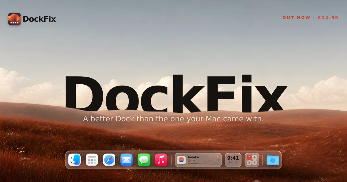
A 1200×630 social card built like an Apple keynote slide: a muted terracotta hillside under a pale blue sky, with a giant black wordmark layered so the horizon ridge slightly occludes its lower edge, giving flat type real depth. The product itself is rendered in place — a glassmorphic macOS-style dock with placeholder-sized icons and widgets sits on the bottom edge like a stage prop. Hierarchy is handled by extreme scale contrast (display wordmark vs. a tiny tracked-out red 'OUT NOW · €14.99' eyebrow) and by confining everything to three strict horizontal bands: metadata, headline, product.
Prompt preview
## Reference images

Study these alongside the description below: hierarchy, rhythm, spacing, colour. Build for the product you are asked about, using this design language.

- Screenshot: https://kage-design-assets.t3.tigrisfiles.io/screenshots/dockfix-5-0/10cc0a55-d8ec-4b37-97a0-1b4560c29af9-1789279361566.webp
- Design on Kage: https://kage.design/designs/dockfix-5-0-og-image

## Before you start
Ask the user what product the card is for, who it is for, and what brand assets they already have (name, logo/app icon, colours, typefaces, tagline, price or launch status). Wait for the answers. Everything below is applied to that product with placeholder branding, not to the reference.

## Deliverable
Produce a single 1200×630 social share card (Open Graph image). Build it as one HTML file with a fixed 1200×630 body and render it to PNG with a headless browser (e.g. Puppeteer, `page.screenshot({ clip: {0,0,1200,630} })`), or author it directly as an SVG with the same geometry. No scrolling, no responsive layout — one fixed frame.

## Page structure (layer order, bottom to top)
1. **Background (full bleed):** a landscape-style scene — a photographic or CSS-gradient terrain with a clear horizon line at roughly 58–62% of canvas height. Warm, low-saturation land tones below (#a8552f → #c47a4a range), cool pale sky above (#c3ccd4 → #dfe4e8). Keep it soft and out-of-focus so type stays legible.
2. **Top-left lockup (y ≈ 40–100px, left margin ≈ 40px):** small rounded app-icon tile (~48px, radius ~12px) next to the product wordmark in bold black sans, ~30px. This is the only small logo repeat.
3. **Top-right eyebrow (same baseline as lockup):** one short uppercase line — launch status · price or date — in the accent colour, ~15px, letter-spacing ~0.15em, right margin ≈ 40px.
4. **Hero wordmark (centered, vertically at ~40–55% height):** the product name as a single line of very heavy geometric sans, ~200–260px, near-black (#111). Layer it *behind* a foreground strip of the terrain so the horizon ridge occludes the bottom ~15% of the letters — this depth cut is the signature move. Implement by rendering the wordmark under a duplicated/clipped foreground terrain layer or an SVG mask.
5. **Subheadline (centered, just below the ridge):** one sentence, white or near-white, ~30–34px, regular-to-medium weight, max ~60 characters. It must sit on the darker land area for contrast.
6. **Product strip (anchored near the bottom edge, centered, ~40–48px from bottom):** a wide rounded glass bar (radius ~20–24px) containing a horizontal row of placeholder app-icon tiles (~44–52px each, 12–16px gaps), one divider, and one or two small glass widgets (e.g. a clock or status tile). Icons are abstract coloured rounded squares or simple generic glyphs — never real app icons.

## Design language
- **One focal element:** exactly one oversized element (the wordmark) carries the card; everything else is metadata or context. Scale contrast does the hierarchy — 240px display vs 15px eyebrow vs 30px subhead.
- **Three horizontal bands:** metadata band at top, headline band at center, product band at bottom. Keep all text on strict shared baselines; nothing floats diagonally.
- **Depth through occlusion:** type interacts with the background — the horizon cuts the wordmark. Type is never a flat overlay slapped on a photo if a layered clip is achievable.
- **Colour:** warm terracotta land (#a8552f–#c47a4a), pale cool sky (#c3ccd4–#dfe4e8), near-black type (#111) on sky, white (#fff) type on land, one saturated accent (red-orange, ~#e8492a) reserved for the eyebrow only.
- **Type:** a single heavy geometric sans family for wordmark and lockup; use weight and size for hierarchy, plus letter-spaced uppercase for the eyebrow. No more than three sizes on the card.
- **Glass surfaces:** product strip uses rgba(255,255,255,0.3–0.45) fill, backdrop-blur ~12–20px, 1px rgba(255,255,255,0.5) inner border, radius ~20px. No drop shadows heavier than a faint ambient blur.
- **Spacing:** ~40–48px safe margins on all sides; the bottom strip reads as sitting *on* the canvas edge without touching it.

## Never
- No Apple logo, macOS imagery, Finder/Safari/Messages/Music icons, or any real app iconography — use abstract placeholder tiles.
- No reference product name, wordmark, tagline, app icon, price, or copy; substitute the user's own branding or clearly generic placeholders.
- Never present the output as the reference product.