kage
kage
Design analysis
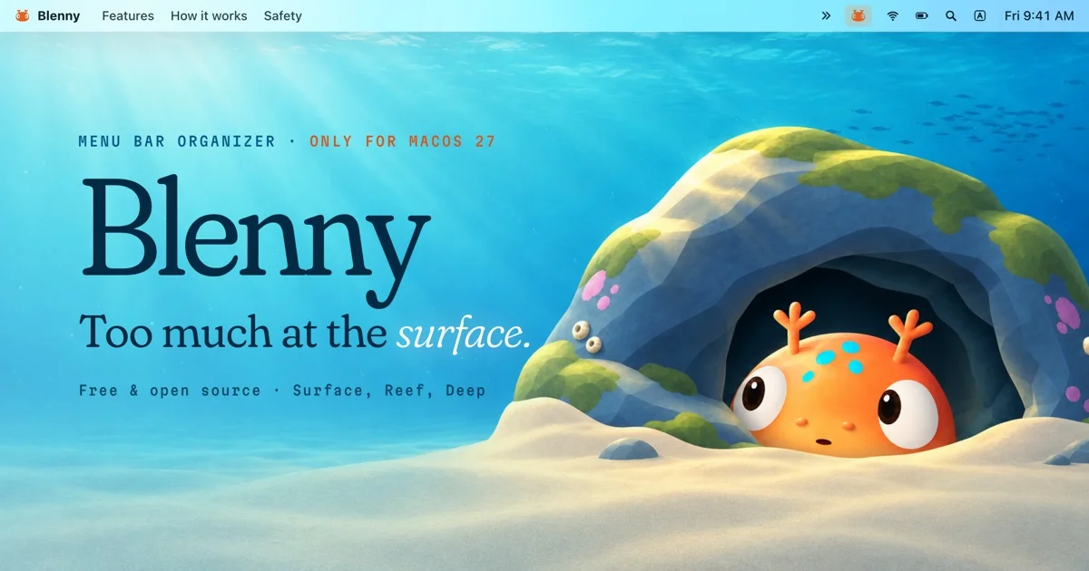
A 1200×630 social card built as a full-bleed underwater illustration with the typography overlaid on the left half. The composition reads bottom-left to top-right: light rays descend from the top onto a sandy floor, and a mossy rock cave on the right frames the mascot — an orange, wide-eyed fish peeking out — which balances the dense text block on the left. Hierarchy is strict: a small tracked-out teal uppercase kicker with an orange accent clause, a very large dark navy serif wordmark, a one-line serif headline with an italic highlighted word, and a final muted metadata row. Copy is kept dark against the bright water so no overlay panel is needed; the sky-to-water gradient, godrays and the horizontal menu-bar strip stitched along the top edge give the card its single gimmick without cluttering the centre.
Prompt preview
## Reference images

Study these alongside the description below: hierarchy, rhythm, spacing, colour. Build for the product you are asked about, using this design language.

- Screenshot: https://kage-design-assets.t3.tigrisfiles.io/screenshots/blenny/a5eb7c77-f26f-447d-9205-cde50ae5d88a-1791180159764.webp
- Design on Kage: https://kage.design/designs/blenny-og-image

## Before you start
Ask the user what product the card is for, who it is for, and what brand assets they already have (name, tagline, colours, typeface, mascot or illustration style). Wait for the answers. Everything below is a composition recipe to apply to *their* product, not a clone of the reference.

## Page structure
Produce a single **1200×630** social card image (HTML/CSS rendered to PNG at exactly 1200×630, or an SVG with that viewBox). Layer it as follows:

1. **Full-bleed scene background** — an illustrated environment (underwater, landscape, space, whatever fits the product) painted edge to edge with no margins. Build it from 3–4 radial/linear gradients (light source top, darker floor) plus simple shapes: a light-sourced terrain or foreground band along the bottom third, one large framing object (rock, hill, planet) on the right half, and faint speckles or particles for depth. If no illustration is available, a rich gradient field with soft light rays works too.
2. **Product-chrome strip along the top edge** (the signature move) — a ~32px horizontal band that looks like the UI surface the product lives in: small app dot + wordmark on the left, a few short menu items, and on the right a highlighted "active" chip plus 3–4 tiny status glyphs and a clock-like text. Keep it ~60% opacity white-on-light or subtle so it reads as context, not UI.
3. **Left text column** — vertically centred around the middle-left, max-width ~560px:
   - Kicker: uppercase, letter-spaced, small (~15px), dark teal or brand-dark, one segment + `·` + a second segment in the accent colour.
   - Wordmark: the product name as the dominant element, ~150px serif, very dark (near-navy), tight leading, slightly overlapping the kicker's line box.
   - Headline: one line, ~56px serif, dark; italicise or recolour a single key word for emphasis, end with a period.
   - Meta row: one small mono or sans line (~18px) of 2–3 facts separated by `·`, in a muted 55%-opacity dark.
4. **Focal illustration element** — position the hero object/mascot on the right half, partially tucked behind or emerging from the framing object, roughly 300–400px wide, with strong rim light and a cast shadow on the ground so it sits in the scene.
5. Optional: 2–3 tiny floating secondary elements near the focal object (pebbles, sparkles) for depth; keep the centre-left clear for text.

## Design language
- **Canvas**: fixed 1200×630, no border, full-bleed art; treat the card as a poster, not a cropped screenshot.
- **Focal hierarchy**: wordmark > headline > mascot > kicker/meta. The wordmark may be the biggest thing on the card even bigger than the illustration's subject.
- **Type pairing**: one high-contrast serif for wordmark and headline (e.g. a display serif with a true italic), one geometric sans or mono, uppercase with +0.15em tracking, for kicker and meta. Never more than those two families.
- **Colour**: derive a 3-stop environment gradient (e.g. #7CD4E8 → #2E9BC0 → #14536B), keep all text in one very dark desaturated navy (#0E2A33-ish) so it stays legible on mid-tone art without panels, and spend exactly one saturated accent (e.g. #F5811F orange) on one kicker clause, one italic word and the hero object. Ground the bottom with a warm sand/neutral (#E8D9A8) if the scene allows.
- **Light**: add 2–3 diagonal translucent light rays from the top-left or top-centre (white at 8–15% opacity, blurred), and rim-light the hero object from the same direction.
- **Legibility rules**: no text over the busiest part of the illustration; if contrast is tight, darken the water/gradient locally behind the text with a soft radial shadow instead of adding a box.
- **Texture**: subtle grain or dithered speckle over the whole card (3–5% opacity) to unify gradients and vector shapes.

## Never
No real brand names, wordmarks, mascots, taglines or copy from the reference (no fish characters, "Blenny", or "Too much at the surface"); invent placeholder branding for the user's product. Don't copy the underwater scene literally unless the user's product is aquatic — translate the composition (full-bleed scene + top chrome strip + left text column + right focal object) to their world. Never ship the card at any size other than 1200×630, and never present the result as the reference product.