kage
kage
Design analysis
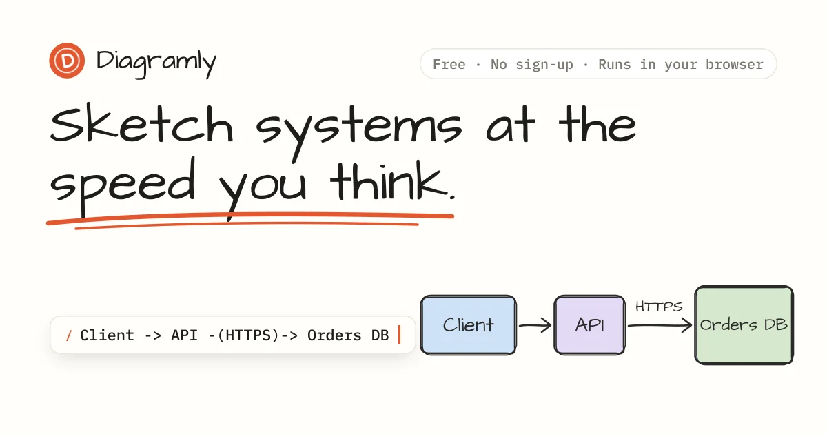
A 1200×630 social card on warm off-white paper that sells a text-to-diagram tool in three horizontal zones. The header row balances a small orange badge-plus-wordmark against a thin-bordered monospace pill of proof points; the focal weight sits in a two-line hand-lettered headline slashed through with a loose double brush underline in orange. The bottom third stages the product mechanic as a before/after: a shadowed white pill holding a slash-command DSL line (accent prompt glyph, solid cursor bar) flows left-to-right into three pastel, dark-outlined diagram nodes joined by sketched arrows with a handwritten HTTPS edge label. Flat colour throughout — the wit comes from the contrast between comic lettering and terminal monospace, not from effects.
Prompt preview
## Reference images

Study these alongside the description below: hierarchy, rhythm, spacing, colour. Build for the product you are asked about, using this design language.

- Screenshot: https://kage-design-assets.t3.tigrisfiles.io/screenshots/diagramly/b85d3a62-6b80-41c1-afc1-5611f8f25965-1792044069958.webp
- Design on Kage: https://kage.design/designs/diagramly-og-image

# OG social card — hand-sketched "type this → get this" composition

Produce a **single 1200×630 social card image** (Open Graph / Slack / X link preview). Build it as HTML/CSS sized exactly 1200×630 and render to PNG (Playwright, `wkhtmltoimage`, or a screenshot tool), or as a standalone SVG exported at 1200×630. Check it stays legible when scaled down to ~600px wide.

## Before you start
Ask the user, and wait for the answers before generating anything:

1. What product is this card for, and what is its one-sentence promise?
2. Who is it for and where will the link be shared most (X, Slack, LinkedIn, iMessage)?
3. What brand assets exist: name, logo mark, primary + accent hex values, and a display font plus a monospace font (or approve open substitutes)?

Everything below is applied to **their** product, with placeholder branding and copy where assets are missing.

## Card structure (1200×630, three horizontal zones)

- **Canvas**: warm off-white paper background filling the frame, flat, ~64px safe margin on all sides. No gradients, no textures heavier than the paper tone.
- **Header row** (top, full width): left — a small circular badge mark in the accent colour containing one letter, beside the product name in the display face at ~34px. Right — a fully rounded, thin-bordered pill holding 2–3 short proof points in monospace separated by middots (use the user's real claims, e.g. "Free · No sign-up · Runs in your browser"-shaped copy from *their* product).
- **Hero headline** (upper-left, ~35% of height): the promise broken over exactly two lines, oversized hand-lettered display type at ~110–120px, near-black, tight leading. Underline one key phrase with a loose double brush stroke in the accent colour, drawn slightly askew and overshooting the text ends so it reads as a marker stroke, not a CSS border.
- **Demo strip** (bottom ~40%, all elements on one baseline, reading left → right):
  - Left: a white rounded pill with a small soft shadow containing one monospace command or DSL line — an accent-coloured prompt glyph (`/` or similar), dark input text describing the user's core use case, ending in a solid accent cursor bar to suggest live typing.
  - Right: the "output" — three rounded nodes with pastel fills (blue, lavender, green families, mapped to the user's palette) and ~2px dark outlines with a subtle hand-drawn wobble, labelled in the handwritten face, connected by curved sketched arrows; label one arrow with a small handwritten technical term.
  - The two halves must read as "type this → get this". Nothing else joins them — no extra labels, footers or URL bars.

## Design language

- **Focal hierarchy**: headline first, accent underline second, demo strip third. Exactly three zones; if a fourth element wants in, delete it.
- **Colour**: one warm paper background (~#F7F4EE), one near-black ink (~#1C1B18), one saturated warm accent (~#E0512C) used *only* for the underline, prompt glyph and cursor, and 2–3 soft pastels (~#BED8F0, #DCD4F2, #C8E2BE) reserved exclusively for illustration fills. Everything else stays neutral.
- **Type pairing**: a hand-lettered/comic display face (open options: Caveat, Gochi Hand, Patrick Hand — or the brand's own) for wordmark, headline and node labels; a clean monospace for commands and pills. The human-vs-machine voice contrast is the core device. Scale: headline ~110–120px, wordmark ~34px, mono ~24–28px.
- **Shape and surface**: fully rounded pills and node boxes, thin dark outlines with slight irregularity, tiny soft shadows only on floating elements like the input pill. No gradients, no glass, no hard-cornered rectangles except the canvas itself.
- **Density and rhythm**: generous whitespace; the bottom strip is the densest band, everything above it breathes. Align input pill and node row to a single baseline so the eye travels straight across.
- **Liveness without motion**: imply activity with static devices — the cursor bar, overshooting brush underline, sketchy arrows. One frame only; if built in HTML, no animation in the exported capture.

## Never

- Do not use the reference product's name, badge, wordmark, tagline, DSL string or node labels; invent placeholder branding and copy for the user's product.
- Do not trace the reference's lettering or illustration; reproduce the *composition* (header / headline with brush underline / input→diagram strip) with the user's own type, colours and content.
- Never present the result as the reference product or imply any endorsement.