kage
kage
agentshrine.com
Design analysis
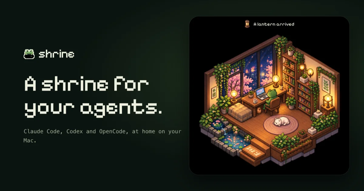
A 1200×630 social card split roughly in half: a text column on a near-black green field on the left, and a large rounded card on the right holding an isometric pixel-art interior. Hierarchy runs wordmark → two-line chunky pixel headline with a terminal period → small monospace subline, all in warm cream against the dark ground. The illustration card is framed like an in-game window with a tiny event notification ('A lantern arrived') along its top edge, and the only saturated colour — amber lantern glow, plant greens, blossom pink — lives inside that card, keeping the type column quiet and two-tone.
Prompt preview
## Reference images

Study these alongside the description below: hierarchy, rhythm, spacing, colour. Build for the product you are asked about, using this design language.

- Screenshot: https://kage-design-assets.t3.tigrisfiles.io/screenshots/shrine/5175c798-e4f8-4318-96d5-246d778a333c-1792130579254.webp
- Design on Kage: https://kage.design/designs/shrine-og-image

## Before you start
Ask the user what product or announcement this social card is for, who it is for, and what brand assets they already have (name, wordmark style, colours, any illustration or mascot). Wait for the answers before designing. Everything below is applied to their product, not to the reference.

## Page structure
Produce a single image, exactly 1200×630 (render an HTML/CSS page at that size and screenshot it to PNG with headless Chrome/Playwright, or emit an SVG with `viewBox="0 0 1200 630"`). No browser chrome, no URL, no buttons.

1. **Canvas** — one flat, very dark background filling the full 1200×630; ~64px safe margin on all sides; nothing else in the margins.
2. **Left text column** (~46% of width, vertically centred as a block):
   - Brand lockup: a small square glyph (~44px) followed by a lowercase wordmark in a pixel/bitmap display face, ~30px, sitting alone near the top of the column with generous empty space below it.
   - Headline: the largest element, a 2-line statement in the same pixel face at ~80px, line-height ~1.1, sentence case, ending in a period.
   - Subline: one short monospace sentence (~22px, max ~46 characters per line, may wrap to 2 lines) explaining the product in plain words, with clear space above it.
3. **Right visual card** (~600×520, corner radius 24–28px, vertically centred, sitting flush inside the right margin):
   - Top caption bar inside the card: a tiny icon plus a short event-style sentence (e.g. a status or achievement line) in pixel type, ~16px, centred — it frames the artwork like an in-game notification.
   - Below it, an illustrated scene filling the rest of the card: a cozy isometric interior built from simple vector shapes (walls, furniture, plants, warm light sources, a resting animal or figure), darker at the edges, glowing warm at the light points. If the user has no illustration, generate a simplified isometric room in SVG/CSS rather than a flat stock photo.
4. **No footer, no logo strip, no CTA.** Three text elements and one artwork card total.

## Design language
- **Base colour:** near-black green field (#0C110A); the illustration card's interior slightly darker (#060806) so the artwork lifts off the canvas without a drop shadow. Optional ≤4% radial vignette; no visible gradients.
- **Type colour:** warm cream #F2EEDF for wordmark and headline; desaturated sage #8FA08C for the subline. Never pure white — everything reads slightly warm.
- **Colour discipline:** the text column stays two-tone (cream on dark). All saturated colour — amber #E8A854 light glow, greens #6FA85C, pink #E5A8C4 — is confined to the illustration card, which makes the artwork the focal point.
- **Type pairing:** a chunky pixel/bitmap display face (e.g. Silkscreen, Pixelify Sans, or similar) for wordmark + headline; a monospace face (e.g. JetBrains Mono) for the subline. Only three type sizes on the whole card: display, subline, caption.
- **Hierarchy:** exactly three steps. The headline dominates; the wordmark is small and quiet; the subline is smaller still and lighter in colour. Space between wordmark and headline (~120px) is larger than between headline and subline (~48px).
- **Voice of copy:** short, lowercase-friendly, declarative; the headline ends with a period; the caption reads like a game event notification, not marketing copy. Keep total copy under ~25 words.
- **Shape and border:** one large rounded container (24–28px radius) with a hairline rim `rgba(255,255,255,0.06)` and no shadow; everything else is square or soft-rounded at most. No glass, no blur, no layered cards.
- **Balance:** the two halves have equal visual weight — the dense, glowing artwork offsets the sparse, quiet text. Align the text block's optical centre with the card's centre.
- **Contrast:** cream on the dark base must clear 4.5:1; check the subline colour specifically.

## Never
Do not reuse the frog glyph, the "shrine" wordmark, the "A lantern arrived" caption, or any copy from the reference. Do not reproduce the specific isometric room, koi pond, cat, or blossom scene — build a new scene from the user's own product idea. Do not name or imitate Claude Code, Codex or OpenCode. Never present the result as the reference product; use placeholder branding and copy drawn from the user's answers until they supply real ones.