kage
kage
polylane.com
Design analysis
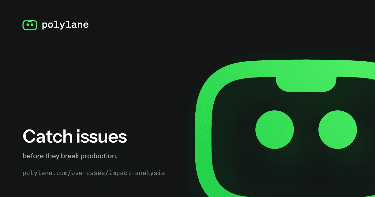
A 1200×630 social card on a near-black canvas with one vivid green accent. The top-left carries a small wordmark lockup, while the right half is owned by the brand mascot blown up to poster scale and cropped hard off the top, right and bottom edges, so only its round face and eyes remain in frame. The lower-left anchors the message with a three-step type ladder — oversized bold headline, muted one-line subhead, monospace URL slug — all left-aligned on a wide margin. The composition works because the quiet upper-left diagonal balances the heavy graphic mass on the right, and the mascot's green eyes sit near the optical centre, pulling attention across the card.
Prompt preview
## Reference images

Study these alongside the description below: hierarchy, rhythm, spacing, colour. Build for the product you are asked about, using this design language.

- Screenshot: https://kage-design-assets.t3.tigrisfiles.io/screenshots/polylane-impact-analysis/5e76fa91-4a69-4d77-a03f-812ebed9b7fb-1792130476535.webp
- Design on Kage: https://kage.design/designs/polylane-impact-analysis-og-image

## Before you start
Ask the user what they are building, who it is for, and what brand assets they already have (name, colours, logo/wordmark, typefaces). Wait for the answers before producing anything. Everything below is applied to *their* product as a 1200×630 social card (for X/Slack/LinkedIn link previews), with placeholder branding and copy if assets are missing — never the reference brand.

Deliver the card as either an SVG at exactly 1200×630, or an HTML/CSS file sized 1200×630 that can be rendered to PNG (e.g. with Playwright/Puppeteer at deviceScaleFactor 1–2). Text must be real text (web-safe or bundled fonts), not outlined images.

## Page structure
Card composition, top to bottom:

1. **Canvas** — a single 1200×630 rectangle in near-black with a faint tint of the brand accent. Wide safe margin (~80px) on the left; the right side has no margin because the hero graphic bleeds off.
2. **Top-left lockup** — a small logo mark (simple outlined shape, ~44px) beside a lowercase wordmark in the mono/technical face. Small, quiet, pinned to the top-left corner. This is the only branding on the card.
3. **Right graphic zone (roughly the right 45%)** — one flat brand character or emblem, scaled to poster size (~700–900px tall) and deliberately cropped off the right and bottom edges (and slightly at the top), so only part of it is visible. Flat solid fill, no gradients, no shadow, no background plate — the graphic sits directly on the canvas colour.
4. **Lower-left text block** — a three-line stack, left-aligned, baseline-anchored around 80–90% down the canvas:
   - Headline: 2–4 words, oversized (~110–130px), extra-bold, tight tracking, white.
   - Subhead: one short supporting sentence (~30–34px), regular weight, muted grey.
   - Slug line: the destination URL or path in monospace (~24px), dimmest of the three, generous letter-spacing.
5. **Negative space** — the entire upper-left quadrant stays empty. Do not fill it with badges, patterns or gradients; the emptiness is what makes the cropped graphic read.

## Design language
- **Two-zone split, diagonal balance:** quiet type corner (bottom-left) against one massive cropped graphic (right). The card reads in an L-shaped path: wordmark → headline stack → graphic.
- **Crop as the hero move:** scale the character/graphic far beyond the canvas and let the edges cut it. The partial view creates scale and curiosity without any layout complexity.
- **Colour discipline:** exactly three tones — near-black canvas (approx `#0B0F0C` with a hint of brand tint), one vivid accent (approx `#2BD45A` — replace with the user's brand accent), and white/near-white `#FAFAFA` for the headline. Supporting greys (`#B9C0BA`, `#8B938C`) only for subhead and slug. No gradients, no second accent, no borders or drop shadows anywhere.
- **Type ladder:** three sizes only, all left-aligned on the same edge — display extra-bold sans (tight leading, near-zero letter-spacing) for the headline; a lighter regular sans, roughly ¼ the headline size, for the subline; a monospace face for the slug/URL. The wordmark mirrors the mono face so top-left and bottom-left rhyme.
- **Lowercase mono voice:** logotype and URL slug in lowercase monospace give a terminal/engineering tone that contrasts the friendly character illustration.
- **Flatness:** illustration is solid flat fills and simple geometry (rounded forms, dot details). Nothing glossy, textured or 3D; if the character needs depth, use one darker shade of the accent, not shadows.
- **Contrast and legibility at small sizes:** headline and mascot survive ~400px-wide thumbnails — keep the headline to few words and the graphic to one bold silhouette.

## Never
- No Polylane name, wordmark, robot mascot, logo shape, tagline copy or URL from the reference — invent placeholder branding and copy for the user's product.
- Never present the output as Polylane or reuse its green-on-black palette verbatim unless the user's brand genuinely matches it.
- No stock photography, complex icon sets, gradients, glows or drop shadows — the reference language is flat, cropped and two-tone.
- Never crowd the upper-left quadrant or add extra badges/ribbons; if content feels missing, increase the graphic's scale instead.