kage
kage
botbus.io
Design analysis
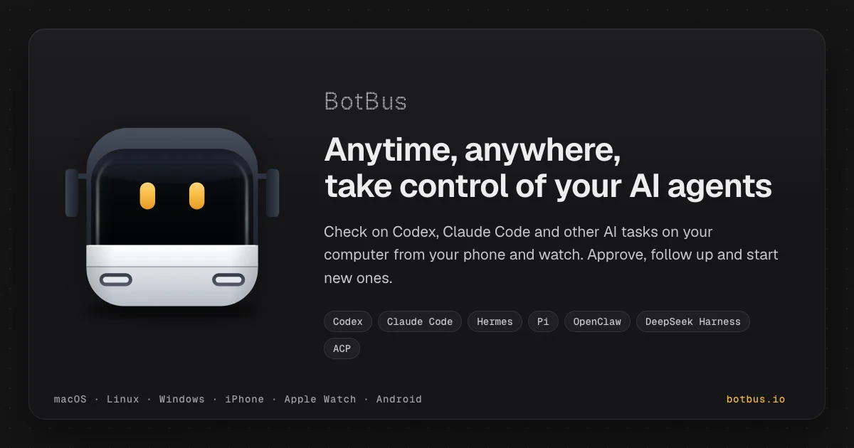
A 1200×630 dark social card built as a framed composition: a faintly dot-textured near-black canvas holds one inset rounded panel, split into a large glossy robot mascot on the left and a right-aligned text stack on the right (mono wordmark → bold two-line headline → gray subcopy → a wrapped row of monospace pill badges). Hierarchy reads mascot face first (the amber eyes are the only warm pixels), headline second, pills third; a single amber accent is reserved for the mascot's eyes and the domain link, while a bottom meta row of dot-separated platforms in mono anchors the panel.
Prompt preview
## Reference images

Study these alongside the description below: hierarchy, rhythm, spacing, colour. Build for the product you are asked about, using this design language.

- Screenshot: https://kage-design-assets.t3.tigrisfiles.io/screenshots/botbus/4595d9dc-89e4-42fb-aeff-fda963c01287-1791525749707.webp
- Design on Kage: https://kage.design/designs/botbus-og-image

## Before you start
The deliverable is a **1200×630 Open Graph / social share card image** (e.g. an HTML/CSS file sized exactly 1200×630 rendered to PNG, or a standalone SVG) for the user's own product — not a landing page. Before writing anything, ask the user:

- What product is this card for, and what does it do in one sentence?
- Brand name (exact spelling) and, if they have one, the brand accent colour?
- The headline they want (aim for ~6–9 words, breakable into two lines) and a one-sentence subcopy line?
- Do they have a logo or mascot image file (ask for its path) — or should you draw a simple vector mascot/abstract mark from scratch?
- What integration/keyword labels belong in the pill row (3–7 items)?
- What platform/tool names belong in the footer meta list, and what domain should appear bottom-right?

Wait for the answers, then apply everything below to *their* product with placeholder branding.

## Page structure
- **Canvas (1200×630):** near-black background with an extremely faint dot-grid texture; nothing sits directly on it.
- **Inset panel:** one rounded rectangle (~26px radius) inset roughly 40px from every edge, one shade lighter than the canvas with a hairline border. All content lives inside this frame — it makes the card read as a deliberate object in a feed.
- **Left mascot zone (~40% of panel width):** a single large mascot or logo mark, vertically centered, sized to nearly fill the zone's height, with a soft ambient shadow beneath. This is the visual anchor.
- **Right content stack:** from top — a small monospace wordmark in gray; a bold two-line headline in white at display size; a gray subcopy paragraph capped at ~680px width; then a wrapped row of fully-rounded pill badges naming integrations/keywords.
- **Footer meta bar:** pinned to the bottom of the panel, baseline-aligned — monospace platform list with `·` dot separators on the left, the domain in the accent colour on the right.

## Design language
- **Focal hierarchy:** mascot face → headline → subcopy → pills → footer. Give the mascot exactly one warm/coloured detail (like eyes) so the eye lands there first, then travels right to the headline.
- **Colour tokens:** canvas `#0e0e10`, panel `#1a1a1c` with a barely-visible vertical gradient, hairline borders `#2a2a2c`, headline `#f5f5f7`, subcopy `#9a9aa0`, meta text `#8b8b90`, one amber accent `#f5a623`. Use the accent **twice only**: the mascot's focal detail and the domain.
- **Type pairing:** one bold geometric/grotesque sans for headline (~46–48px, ~1.1 line-height) and body (~20px), plus one monospace for the wordmark, pills and footer (13–14px, slightly letter-spaced). Three clear sizes on the text side, no more.
- **Rhythm and density:** generous padding (~48–56px inside the panel); the middle band is dense (headline + subcopy + pills), the top and bottom are thin — the small wordmark above and the single meta line below frame the dense core.
- **Shape and depth:** pills fully rounded (999px radius) with dark fill and subtle border; any CSS-drawn mascot built from large radii (14px+); shadows soft and diffuse, never hard-edged.
- **Texture:** a dot grid at ~1px opacity / ~24px spacing so the black card doesn't die flat in dark-mode timelines.
- **Interaction:** none — this is a static image; keep everything legible at feed-thumbnail size (headline must survive being ~600px wide on screen).

## Never
- No "BotBus" name or wordmark, no bus-robot mascot, no "Anytime, anywhere, take control of your AI agents" copy, no pill labels like Codex / Claude Code / Hermes / Pi / OpenClaw / DeepSeek Harness / ACP, no botbus.io domain, no macOS · Linux · Windows · iPhone · Apple Watch · Android list verbatim.
- Never present the result as BotBus or reuse its mascot illustration; replace all branding and copy with the user's own placeholder content.