kage
kage
alkera.ai
Design analysis
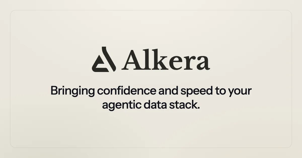
A 1200×630 social card built almost entirely from typography: a warm off-white field holds an inset hairline rounded frame, and a single centered lockup — a geometric glyph beside a large high-contrast serif wordmark — sits above a two-line bold-sans headline. Hierarchy is carried purely by the jump in scale from the ~120px serif brand row to the ~48px sans message, while a deliberately vacant lower third keeps the composition calm and print-like.
Prompt preview
## Reference images

Study these alongside the description below: hierarchy, rhythm, spacing, colour. Build for the product you are asked about, using this design language.

- Screenshot: https://kage-design-assets.t3.tigrisfiles.io/screenshots/databench-by-alkera/0ee2228e-27b4-4c16-93cb-b9928d3b6dcd-1791439316615.webp
- Design on Kage: https://kage.design/designs/databench-by-alkera-og-image

## Before you start
Ask the user what the card is for (product, launch, announcement), who the audience is, and which brand assets they already have — name, logo mark, brand colours and fonts. Wait for their answers before designing. Everything below is applied to *their* brand and copy, not to the reference card.

## Page structure
A single fixed 1200×630 canvas with all content on one vertical centre axis, top to bottom:

1. **Background field** — full-bleed warm off-white/cream fill covering the whole canvas.
2. **Inset plate frame** — a rounded rectangle border inset ~40px from every edge: 1–1.5px hairline stroke, ~28–32px corner radius, no fill (or a barely lighter fill). It frames the content like a printed plate.
3. **Brand lockup** (upper-centre, around 40–45% of canvas height) — a geometric logo glyph sitting to the left of the wordmark; wordmark set very large (~120px) in a high-contrast serif. Glyph is optically balanced against the cap height, with a small gap between glyph and name.
4. **Headline block** (just below optical centre, ~55–65% height) — a two-line value proposition in a bold sans-serif at ~48–52px, tight line height (~1.15), centred with deliberately balanced line breaks, ending in a period.
5. **Empty lower third** — left completely vacant; no footer, URL, badge or CTA.

## Design language
- **Two-tone palette**: one warm neutral field (~#EAE7E0) and one near-black ink (~#201E1A). No gradients, no accent colour — the entire card reads as ink on paper.
- **Type pairing does the branding**: an expressive display serif carries the wordmark (brand voice); a bold grotesque sans carries the message (clarity). Headline size is roughly 40% of the wordmark size; nothing else on the card competes for attention.
- **Strict centred axis**: every element is centred on the vertical midline. Content occupies less than half the canvas — generous negative space is the main luxury signal.
- **Hierarchy by scale, not weight alone**: brand row largest, message second, and nothing else. Optical centre sits slightly above geometric centre so the lockup feels elevated.
- **Frame treatment**: hairline inset border with a large radius creates the "card within a card" plate; no shadows, no textures, no illustrations, no product screenshots.
- **Tone**: quiet, editorial, print-like — confidence through restraint and whitespace rather than decoration.
- **Output**: build as a fixed 1200×630 HTML/CSS document (fixed-size container, loaded webfonts or open alternatives, real text for crisp rendering) and screenshot/export to PNG at exactly 1200×630 — or produce it as a standalone SVG. Keep ~40px safe margins on all sides so platform cropping never clips content, and verify text stays legible when the card is shrunk to chat-preview size.

## Never
- Never use the Alkera name, its delta/triangle glyph, or its tagline copy ("Bringing confidence and speed to your agentic data stack") — always substitute the user's brand or an explicit placeholder name and headline.
- Never copy the exact commercial fonts; substitute similar open-licensed faces (a high-contrast display serif plus a bold grotesque sans).
- Never present the result as Alkera's card or imply any connection to that product.