kage
kage
Design analysis
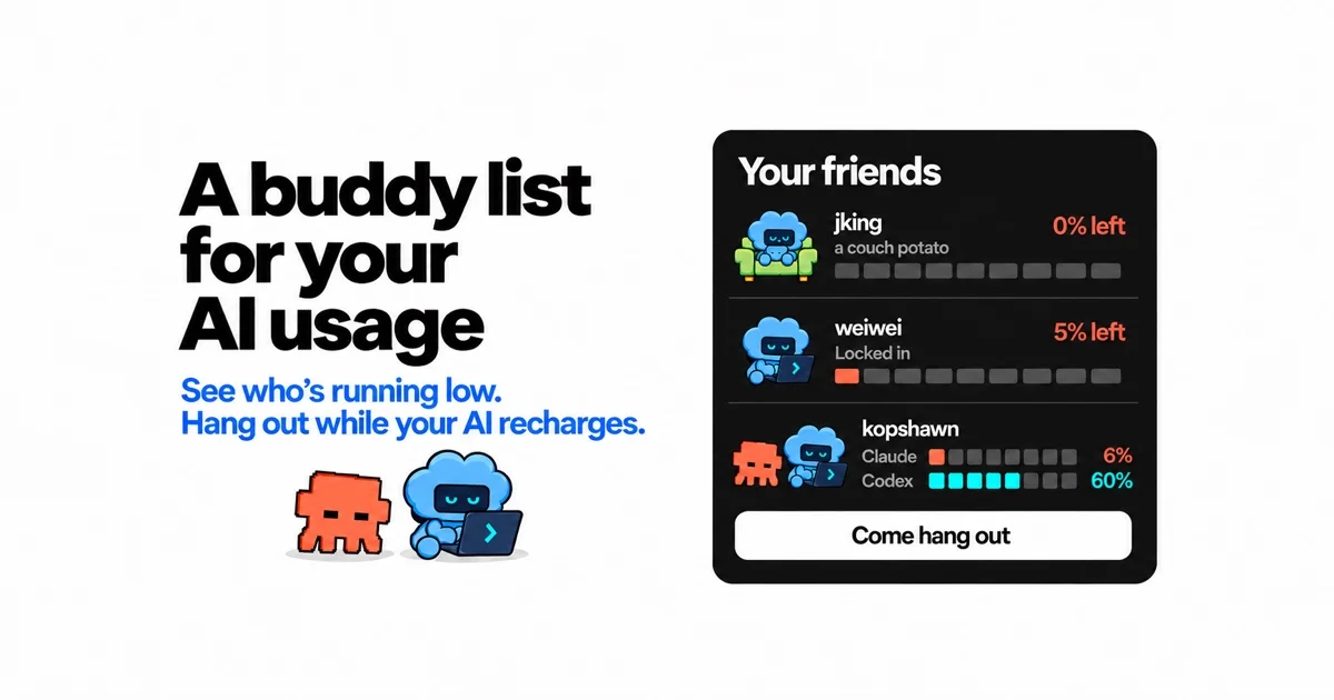
A 1200×630 social card split into a type-led left half and a product mock on the right: three stacked lines of ultra-heavy black grotesque at ~0.95 leading form the focal point, followed by a royal-blue subline and two small retro characters (a pixel-art creature and a cloud mascot at a laptop) sharing one baseline. The right half counterweights with a dark rounded buddy-list card — avatar, username and gray status per row, right-aligned bold percentages, and 10-segment battery bars where fill colour encodes state (red = nearly empty, teal = healthy), plus a white pill CTA. The palette stays disciplined — white canvas, near-black ink, one blue accent — with red, orange and teal reserved strictly as status semantics inside the UI mock, and the tension between chunky print-like type and 8-bit characters carries the personality without any photography or gradients.
Prompt preview
## Reference images

Study these alongside the description below: hierarchy, rhythm, spacing, colour. Build for the product you are asked about, using this design language.

- Screenshot: https://kage-design-assets.t3.tigrisfiles.io/screenshots/die-with-me/969d2984-194a-4ac7-afac-dbd7a0bb64b2-1789711262741.webp
- Design on Kage: https://kage.design/designs/die-with-og-image

# Social card design language

## Before you start
Ask the user what product this share image is for, who the audience is, what brand assets they already have (name, wordmark, colours, typeface), and which single screen or interaction best demonstrates the product. Wait for the answers before designing. Everything below is applied to their product with their branding and placeholder copy — this is not a recreation of the reference.

## Canvas and structure
- Produce one static image, exactly 1200×630: either a single HTML file sized 1200×630 rendered to PNG (screenshot at 2× for sharpness) or an equivalent inline SVG.
- Solid white background (#FFFFFF), no border or frame, generous safe margin of ~80px on all sides.
- Two columns: the left ~55% is purely typographic plus small characters; the right ~40% is a dark rounded UI mock of the product, with ~60px of clear space between them.
- Left column, vertically centred: a headline stacked over exactly three lines; below it a two-line subhead in the brand accent colour; below that, two small character illustrations (one pixel-art style, one flat vector) sitting side by side on a shared baseline, each with a soft ground shadow.
- Right column: one dark card (#161616, radius ~28px, large soft drop shadow) vertically centred, containing top to bottom: a bold white card title; two or three rows separated by faint 1px dark dividers, each row = playful avatar (36–44px), username in white semibold with a small gray status line beneath, and a right-aligned bold percentage; a 10-segment battery bar under each row; one row may carry two labelled mini-meters to show two sources at once; a full-width white pill button with short bold black CTA text pinned at the bottom of the card.

## Design language
- Focal hierarchy: the headline is the loudest element by a wide margin; the dark card is the second read; characters and CTA button are tertiary. Never introduce a second focal element.
- Type: one heavy grotesque family throughout. Headline ~84–92px, weight 800–900, line-height ~0.95, sentence case, near-black #111111. Subhead ~30px, weight 600–700, in the accent blue (#2B6BF3). Card title ~32px white weight 800. Row names ~20px weight 600; status lines ~15px gray #9A9A9A; percentages ~20px weight 700.
- Colour discipline: white canvas, near-black ink and card, exactly one brand accent on the left half (the blue subhead). Inside the UI mock only, use semantic status colours: red #E5484D for low/empty, teal #2FD6C3 for healthy, orange #F4623A as a secondary source colour; empty segments are dark gray #3C3C3C on the black card. Keep every status colour out of the left column.
- Segmented meters are the signature UI element: always 10 segments per bar (~28×12px each, 4px gap, 2–3px radius), fill count proportional to the percentage shown, fill colour matching the percentage text, bars spanning the full card width.
- Shape and depth: large radius on the card, full pill radius on the button, tiny radius on segments; the design is flat except for two shadow treatments — a large soft drop under the dark card and small ground shadows under the characters. No gradients, no glows, no borders on the white canvas.
- Rhythm: airy and centred on the canvas, compact and dense inside the card; the contrast between the spacious left half and the tight UI rows is what keeps the composition legible when the card is shrunk to a chat preview.
- Tone: nostalgic consumer-software warmth — pixel/retro characters, a buddy-list or status metaphor — applied to a technical subject; keep copy short, human and slightly wry.

## Never
- No Claude, Anthropic, OpenAI, Codex, AIM or any real product names, logos, mascots or icon sets anywhere in the card; use the user's branding or neutral placeholders (invented usernames, generic source labels such as "Source A / Source B").
- No copying of the reference's cloud-with-face mascot, its pixel creature, the headline or status copy ("a couch potato", "Locked in"), or the CTA text — write fresh placeholder copy in a similar voice.
- Never present the result as the reference product; the card must read as the user's own share image.