kage
kage
framerusercontent.com
Design analysis
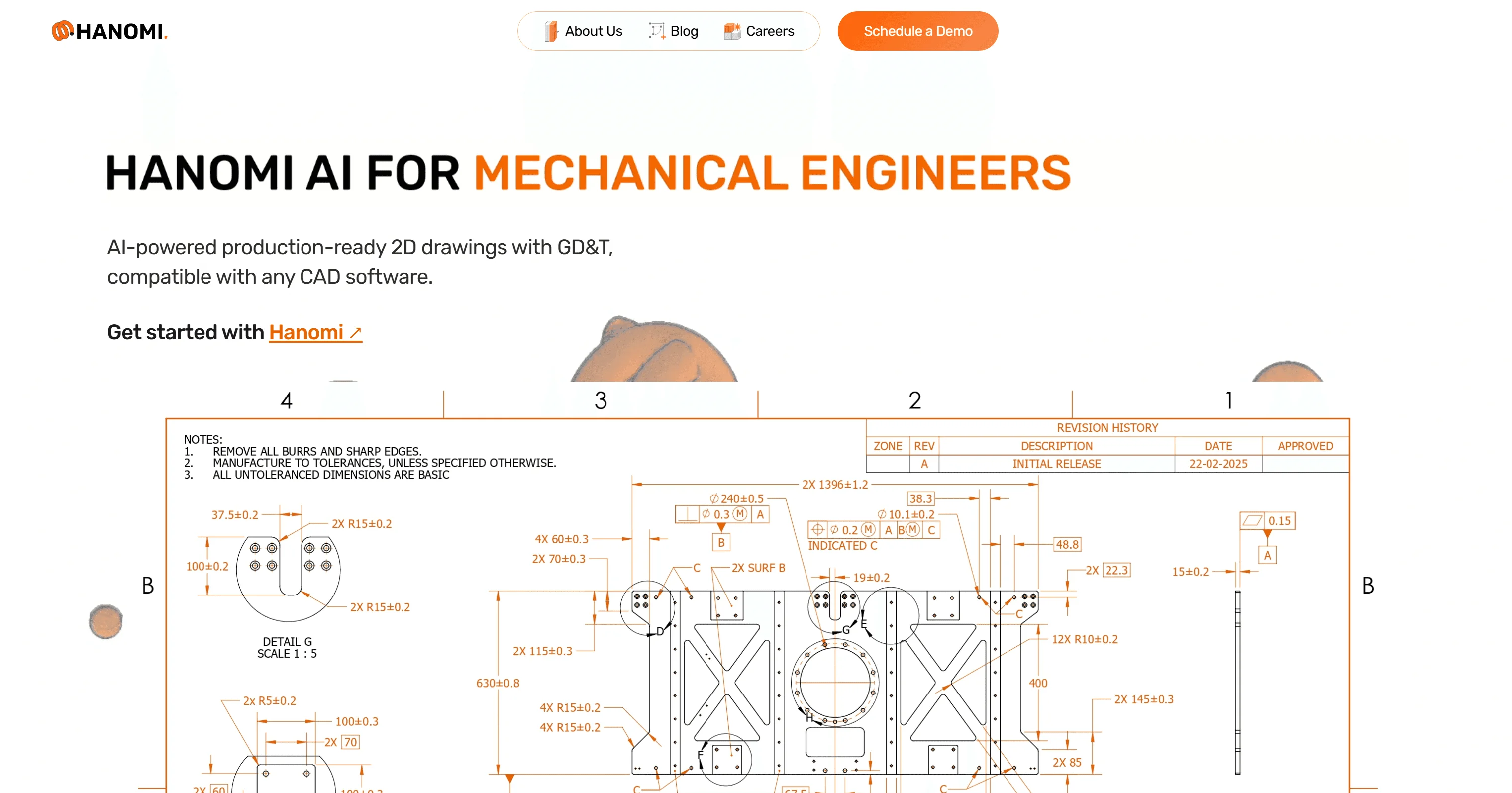
A 1200×630 social card on a clean white ground. The wordmark sits top-left; the focal headline "HANOMI AI FOR MECHANICAL ENGINEERS" uses heavy black uppercase with the last words flipped to saturated orange, creating a two-tone hierarchy. Below, a short gray subline and an underlined orange CTA text link. The bottom half transitions into a dense technical CAD drawing — fine black linework with orange dimension and GD&T annotations — bridged by faint 3D part renders peeking behind a numbered scale (4/3/2/1). The contrast between sparse editorial type above and dense engineering detail below is the card's core idea.
Prompt preview
## Reference images

Study these alongside the description below: hierarchy, rhythm, spacing, colour. Build for the product you are asked about, using this design language.

- Screenshot: https://kage-design-assets.t3.tigrisfiles.io/screenshots/hanomi-ai/e9c7db0f-53ff-4782-9d4a-bd8f49ee2bed-1790500562498.webp
- Design on Kage: https://kage.design/designs/hanomi-og-image

## Before you start
Ask the user what product the card is for, who the audience is, and what brand assets exist (name, logo mark, brand colours, typeface). Wait for answers before designing. Use placeholder branding and copy if they have none.

## Goal
Produce a single **1200×630 social card image** (Open Graph / Twitter card), delivered as HTML/CSS sized to 1200×630 and rendered to PNG, or as an SVG. Do not build a full webpage.

## Page structure
- **Canvas**: fixed 1200×630, pure white background, generous safe margins (~90px left/right).
- **Top row**: small logo mark + wordmark at top-left, ~28px tall, dark ink colour. Optionally a small right-aligned element kept subtle.
- **Headline (focal point)**: one line of very heavy uppercase type, ~64–72px, two-tone treatment — first words in near-black (#111), the key qualifier words in saturated orange (#E8641B). Left-aligned, positioned in the upper third.
- **Subline**: one short sentence, 22–24px, medium gray (#555), max ~55 characters per line, two lines max, directly under the headline.
- **CTA text link**: short bold phrase with one keyword in orange and underlined, ~20px, below the subline.
- **Lower half — subject imagery**: fill the bottom ~45% with the product's actual subject matter rendered as dense, fine detail (e.g. a technical drawing, schematic, code, or data view): thin dark linework, small annotations, and dimension-like labels in the accent colour. Optionally separate it from the type zone with a numbered scale strip (large thin numerals with hairline rules) and let a soft, blurred 3D shape peek from behind it for depth.

## Design language
- Two-colour discipline: white ground, near-black ink (#111111), one saturated accent (#E8641B). Accent appears only in: headline qualifier, CTA keyword, and annotation labels — nowhere else.
- Hierarchy by contrast of density: sparse, huge, airy type on top; very dense, small-scale technical detail below. That density flip is the visual hook.
- Type: one geometric sans family. Headline at 800–900 weight uppercase with slight negative tracking; subline at 400–500 in gray; annotations at 9–11px.
- Lines and rules: hairline (1px) strokes only, no shadows, no gradients, no rounded cards.
- Keep total text under ~20 words so it reads at thumbnail size; the headline must be legible at 300px wide.

## Never
- Do not use the Hanomi name, wordmark, logo, or its exact headline copy.
- Do not copy the specific CAD drawing or its annotations; draw a generic technical composition instead.
- Do not add photographic stock imagery, drop shadows, gradients, or extra accent colours.