kage
kage
holavoicemail.com
Design analysis
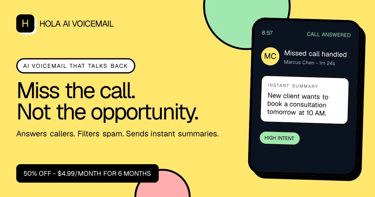
A 1200×630 social card uses a bright lemon-yellow canvas with a strong left-to-right composition: a compact black-and-white wordmark at top left, a pill-shaped eyebrow, oversized two-line black headline, supporting sentence, and a dark promotional pill along the bottom. On the right, a tilted dark phone mockup creates the focal image, backed by cropped pastel green and pink circles; thick black outlines, rounded corners, and restrained UI detail give the card a playful but highly legible treatment.
Prompt preview
## Reference images

Study these alongside the description below: hierarchy, rhythm, spacing, colour. Build for the product you are asked about, using this design language.

- Screenshot: https://kage-design-assets.t3.tigrisfiles.io/screenshots/hola-ai/73c6f07a-c4e1-4fc5-9416-1cbe2a0b2dde-1790143309598.webp
- Design on Kage: https://kage.design/designs/hola-og-image

## Before you start
Ask the user what they are building, who it is for, and what brand assets they already have, including the brand name, colours, typefaces, logo, and preferred copy. Wait for their answers before proceeding. Apply everything below to that product rather than reproducing the reference brand.

## Page structure
- **1200×630 canvas:** Build a wide social-card image with a full-bleed, warm lemon-yellow background and generous inset margins.
- **Top-left brand lockup:** Place a small rounded black app tile with a simple placeholder mark, followed by a placeholder brand name in a clean sans-serif.
- **Eyebrow pill:** Below the lockup, add a white horizontal pill with a black outline and short uppercase placeholder category text with generous tracking.
- **Primary headline:** Set a large, black, left-aligned two-line placeholder headline in the left half of the card; make it the main typographic focal point.
- **Supporting line:** Add one concise sentence beneath the headline in a smaller but still prominent sans-serif size.
- **Offer or metadata bar:** Anchor a black rounded rectangle near the lower-left edge with compact white placeholder text.
- **Decorative background shapes:** Add oversized cropped pastel circles behind the right-side product image—use green above and pink below or adapt the palette to the user’s brand.
- **Product visual:** On the right, render a slightly rotated dark smartphone or product-device mockup with a thick black edge/shadow. Include only generic placeholder interface content such as a time, status label, avatar initials, summary card, and one coloured tag.

## Design language
- **Composition:** Use a clear 60/40 split: typography and information on the left, one large illustrative product visual on the right. Keep the headline and phone from colliding, while allowing the device to crop slightly beyond the canvas for energy.
- **Hierarchy:** Establish the order through scale and placement: small lockup, tracked eyebrow, very large headline, supporting sentence, then compact bottom bar. The headline should occupy roughly one-third of the card height.
- **Colour:** Start with an approximate lemon background of `#FFE66D`, near-black text and device chrome around `#050505`/`#0B1220`, white content surfaces around `#FFFDF8`, mint green around `#9BE3AD`, and soft pink around `#F5A8AE`. Adjust these to the user’s brand while preserving strong contrast.
- **Type:** Pair a contemporary geometric or neutral sans-serif for all text. Use a very large regular-to-medium headline with tight line-height, smaller sentence copy, uppercase eyebrow lettering with expanded tracking, and compact white-on-black metadata text.
- **Shapes and edges:** Prefer pill controls, rounded cards, and bold near-black outlines around the phone, circles, and eyebrow. Use a thick offset black shadow on the device rather than a soft drop shadow; keep other shadows minimal.
- **Phone UI:** Treat the device as a simplified illustration, not a full product screenshot. Use a dark navy-black shell, subtle inner bezel, white summary card, circular avatar, mint status tag, and sparse readable labels so the visual remains clear at social-card scale.
- **Rhythm:** Keep the left side spacious and editorial, then increase visual density inside the phone mockup. Balance the dense device details with large flat background shapes and open yellow negative space.
- **Rendering and interaction:** This is a static asset with no interaction. Produce an exact 1200×630 PNG, preferably by creating HTML/CSS and rendering it or by using SVG; ensure all text is embedded, crisp, safely inset, and legible in link previews.

## Never
- Do not use the reference company’s logo, wordmark, product name, exact copy, icons, illustrations, phone UI text, or promotional offer.
- Do not copy the reference card verbatim or present the result as that product.
- Use placeholder branding, placeholder copy, and generic product-interface details tailored to the user’s own product.