kage
kage
wabi.ai
Design analysis
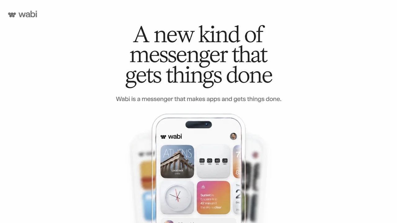
A 1200×630 launch card on a flat off-white canvas that leans almost entirely on type scale: a tiny lowercase wordmark sits top-left as the only asymmetric element, while a three-line high-contrast serif headline at roughly 90–100px dominates the upper centre, followed by a single small grey sans line. The bottom half is anchored by a centred iPhone mockup cropped by the canvas edge, its widget grid (photo tile, countdown, warm gradient weather card) supplying the card's only saturated colour, with heavily blurred colourful app screens fanned behind it to create a two-plane depth effect. Hierarchy is symmetrical and quiet — no buttons, badges or borders — letting the serif voice and the device imagery do all the work.
Prompt preview
## Reference images

Study these alongside the description below: hierarchy, rhythm, spacing, colour. Build for the product you are asked about, using this design language.

- Screenshot: https://kage-design-assets.t3.tigrisfiles.io/screenshots/wabi/f2469d00-9800-4473-85e0-c99ae6104bab-1791439245272.webp
- Design on Kage: https://kage.design/designs/wabi-og-image

## Before you start
Ask the user what product or announcement this card is for, who the audience is, and what brand assets they already have (name, wordmark, colours, typefaces, and any product screenshots or mockups). Wait for the answers before building. Everything below is applied to their brand and copy, not to the reference.

## Output
Produce a single **1200×630** social share card (Open Graph / Twitter summary large image). Deliver it as one self-contained HTML file sized exactly 1200×630 that can be screenshotted to PNG (e.g. headless Chrome or Playwright at `--viewport-size=1200,630`), or as an equivalent SVG. No scrolling content, no responsive variants — one fixed canvas.

## Page structure
Treat the canvas as four stacked zones on a strict vertical centre axis:

1. **Wordmark lockup (top-left, breaking the axis).** Small icon + lowercase wordmark at roughly 28–32px cap height, dark ink, ~48px from the top and left edges. It is the only off-axis element and acts as a counterweight to the centred composition.
2. **Headline block (upper centre, ~15% down the canvas).** The announcement headline set in a display serif across three stacked centred lines, ~90–100px, line-height ~0.95–1.0, near-black. This is the focal point of the whole card; nothing else competes at this scale.
3. **Subline (just below the headline).** Exactly one short sentence in a neutral sans, ~24px, mid-grey, centred, ~40px below the headline. No second paragraph, no CTA button.
4. **Device zone (bottom half).** A centred front-view phone mockup in a light frame with a large corner radius (~56px), cropped by the bottom canvas edge so it reads as continuing beyond the frame. Inside the phone, a miniature product UI: a small in-app header, then a 2-column widget grid (one photographic tile, one numeric/countdown-style tile, one warm gradient tile). Behind and slightly wider than the phone, fan 4–6 rounded rectangles in the product's accent hues (left and right), heavily blurred (20–30px blur, 40–60% opacity) to suggest other app screens out of focus.

## Design language
- **Hierarchy by scale alone.** One huge serif statement, one small sans detail, one image. No badges, buttons, dividers, or UI chrome on the canvas itself.
- **Canvas.** Flat near-white background (≈ #FAFAF7–#FFFFFF), no gradient, no border, no vignette. Keep all text inside ~48px safe margins so nothing clips in link previews.
- **Type pairing.** A high-contrast editorial serif for the headline (tight leading, slightly tightened tracking, sentence case) against a neutral grotesque sans for the wordmark and subline. If the user has no brand serif, pick a clean high-contrast serif and say so; keep the subline in the sans at roughly a quarter of the headline size.
- **Colour discipline.** Ink monochrome (#111 headline, #6B6B6B subline) on the off-white field. All saturation is quarantined inside the phone UI: one warm gradient tile (≈ #F0A46B → #E4593A), one cool/photo tile, one light neutral tile. The blurred background shapes may only reuse those same hues.
- **Depth as two planes.** Only two focus levels exist: razor-sharp centre (headline, subline, phone) and heavily blurred periphery. Nothing sits at mid-blur.
- **Shadow treatment.** At most one soft, diffuse shadow under the phone (large blur, low opacity). No hard drop shadows, no strokes.
- **Crop for continuity.** Let the phone bleed off the bottom edge; never float it fully inside the canvas with empty space beneath.

## Never
- Never use the reference product's name, wordmark, paw/flower glyph, headline copy, or its widget contents (Athens card, countdown figures, sunset text). Substitute the user's brand and placeholder product content.
- Never add CTA buttons, platform badges, URLs, QR codes, or stock photography.
- Never present the result as the reference product; it is a composition study applied to the user's brand.