kage
kage
speechka.io
Design analysis
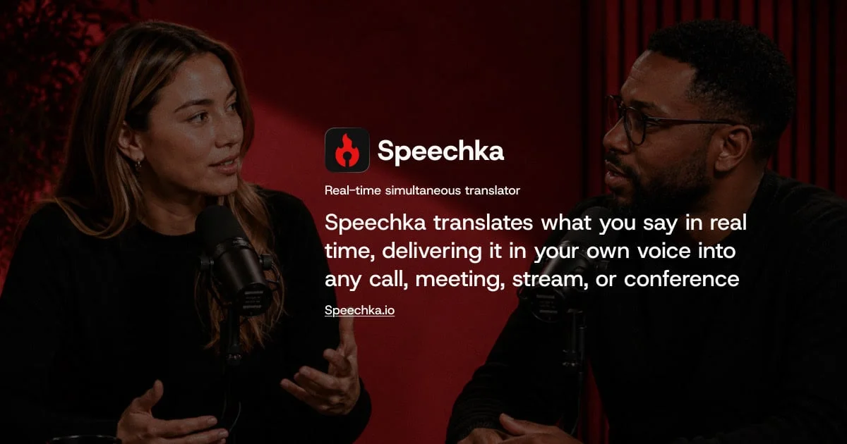
A 1200×630 card built on a full-bleed photograph of two speakers at podcast microphones, lit in deep crimson and darkened with an edge vignette so the centre column of white type owns the focal point. Hierarchy is a strict single-axis stack: app-icon-plus-wordmark lockup, a small kicker line, a three-line bold headline, then an underlined domain link, with the two photographed subjects framing the text left and right. The palette is disciplined — crimson studio light, near-black shadow, pure white type — and the red lighting echoes the red glyph in the icon tile, tying brand accent to scene.
Prompt preview
## Reference images

Study these alongside the description below: hierarchy, rhythm, spacing, colour. Build for the product you are asked about, using this design language.

- Screenshot: https://kage-design-assets.t3.tigrisfiles.io/screenshots/speechka/7a98667e-df9e-4999-9549-efcabade7184-1790229721161.webp
- Design on Kage: https://kage.design/designs/speechka-og-image

## Before you start

Ask the user what they are building, who it is for, and what brand assets they already have — product name, app icon or mark, brand colours, and typeface. Wait for the answers before writing any code. Everything below is applied to their product and their copy, not to the reference product.

## Page structure

Produce a single **1200×630 social share card** (OG image for X, Slack, LinkedIn, iMessage). Render it as a self-contained HTML/CSS file sized exactly 1200×630 (screenshot to PNG with a headless browser) or as an SVG. No scrolling, no interactivity — one fixed frame.

1. **Background layer (full bleed, 1200×630):** a photograph or photographic-style visual relevant to the product's use case, covering the entire canvas edge to edge, colour-graded toward the brand's accent colour and darkened so white text stays legible.
2. **Scrim / vignette layer:** a dark gradient strongest at the outer edges and bottom, lightest behind the text column, guaranteeing contrast for the type stack.
3. **Text stack (centre of canvas, one vertical axis slightly left of true centre):** four elements, top to bottom —
   - **Icon + wordmark lockup:** a rounded-square app icon tile (~90×90, radius ~24px, dark tile with the brand mark in the accent colour) with the product name beside it in bold white (~64px).
   - **Kicker:** one short descriptive line under the lockup (~24–26px, slightly reduced opacity white).
   - **Headline:** the main value proposition, 2–4 lines, bold white, ~48–54px, generous line height, max-width ~600px so it wraps into a compact block.
   - **Domain link:** the product URL at the bottom of the stack, ~24px, white, underlined.
4. **Framing:** if the background imagery contains people or objects, position them so they flank the text column on the left and right, never behind it.

## Design language

- **Focal hierarchy:** one text column, one axis. Everything is stacked top-to-bottom in a single centred block; nothing competes with it. The eye path is lockup → kicker → headline → URL.
- **Photographic treatment:** the background image is graded to the brand accent (in the reference, deep crimson studio lighting, roughly `#5c1720` mid-tones) with shadows falling to near-black `#0d0507`. Apply a vignette (radial or layered linear gradients) so edges are ~30–50% darker than the centre. Desaturate and darken enough that white text at small sizes still passes contrast.
- **Colour palette:** three colours only — the accent red (~`#c53038` for the icon glyph, grading into `#5c1720`/`#7a1e2a` scene tones), near-black (`#0d0507`–`#111111`), and pure white `#ffffff` for all type. Kicker and URL may drop to ~80–90% white opacity. No other hues.
- **Type:** a single modern grotesque sans throughout (e.g. Inter, Söhne-class). Wordmark bold ~64px; kicker regular ~24px at 85% white; headline bold ~48–54px with ~1.25 line height and a ~600px max-width; URL regular ~24px underlined. All type left-aligned within the centred stack — do not centre-align individual lines.
- **Icon tile:** rounded-square, dark near-black fill, ~24px corner radius, brand mark in the accent colour, subtle inner border or 1px light stroke so it separates from a dark background.
- **Spacing:** ~24px between icon lockup and kicker, ~24–32px between kicker and headline, ~24px between headline and URL. The whole stack sits optically centred vertically, slightly above true centre.
- **Mood:** cinematic and calm. The card should read like a still from a film about the product's use case, with the type treated as a title card — not like a UI screenshot or a promo banner.

## Never

- Do not use the Speechka name, wordmark, flame icon, tagline, headline copy, or the speechka.io domain.
- Do not reuse the reference photograph, its subjects, or its exact scene; use the user's own imagery or a clearly placeholder visual.
- Do not use any icon set, illustration style or brand element from the reference.
- Never present the result as Speechka's card — it is a social card in that composition style for the user's product, with placeholder branding and copy until they supply real assets.