kage
sponkly.com
Design analysis
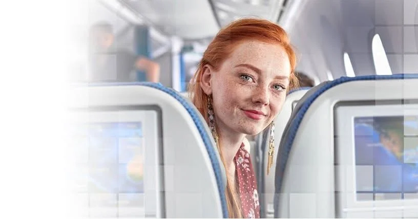
A nearly text-free OG card built entirely from one full-bleed photograph: a red-haired traveller glancing back over an airplane seat, placed right-of-centre so her face sits on the upper third intersection. The signature treatment is a lattice of translucent square tiles overlaid on the photo, densifying toward the top corners and bottom edge like a dissolving mosaic, while the left third fades into white through a soft blur gradient — reserving negative space where a wordmark and headline would normally sit. The palette is cool cabin grey and seat-back blue warmed only by the copper hair, letting one human focal point carry the whole card.
Prompt preview
## Reference images

Study these alongside the description below: hierarchy, rhythm, spacing, colour. Build for the product you are asked about, using this design language.

- Screenshot: https://kage-design-assets.t3.tigrisfiles.io/screenshots/sponkly/12ae8b7e-f651-4853-bb74-dfe95d57e091-1792735344349.webp
- Design on Kage: https://kage.design/designs/sponkly-og-image

# Social card (OG image) — mosaic-tile photography style

Produce a **1200×630 social card image** (Open Graph / Twitter / Slack preview) inspired by the composition described below. Render it as a single HTML file sized exactly 1200×630 (screenshot to PNG via Playwright/Puppeteer at deviceScaleFactor 2 if a retina asset is wanted) **or** as a standalone SVG that exports cleanly to PNG. No interactivity is needed — this is a static image.

## Before you start
Ask the user:
1. What product or announcement is this card for, and where will it be shared (X, LinkedIn, Slack, iMessage)?
2. Who is the audience, and what single feeling should the card convey?
3. What brand assets exist — name, logo, brand colours, typeface — and is there a licensed photo or illustration to use as the focal image?

Wait for the answers. Everything below is applied to *their* product and brand, not to the reference.

## Canvas structure (top to bottom, left to right)
1. **Full-bleed photograph** filling the entire 1200×630 canvas edge to edge, no margins, no border radius. The subject (person, product, or scene) is positioned right-of-centre so the focal point lands around the upper-right third intersection, looking toward the camera or the text zone.
2. **Mosaic tile overlay** across the whole photo: a grid of square cells (roughly 48–64 px, ~2–4 px gutters) filled with translucent white (e.g. `rgba(255,255,255,0.18–0.35)`). Tile opacity is not uniform — it is near-zero over the focal subject so the face/product stays crisp, and increases toward the top-left corner, top-right corner and bottom edge, so the photo appears to dissolve into tiles at the frame borders. A few isolated tiles can also pop at full opacity inside the photo for rhythm.
3. **White fade zone** on the left third: a horizontal gradient from solid `#FFFFFF` at the left edge to fully transparent by ~35–40% of the width, optionally with a slight blur on the photo beneath. This is the quiet zone reserved for text.
4. **Text block** in the left zone, vertically centred or lower-left aligned: a small wordmark (logo mark + name, modest size) and a 1–2 line headline in a dark neutral. Keep total text under ~15% of the canvas area; the photo is the message, the text is the caption.

## Design language
- **One focal point wins.** Everything serves a single human or product focal element placed off-centre on the thirds; the tile overlay deliberately protects it (low opacity) and dissolves the periphery instead.
- **Cool base, one warm accent.** Build the palette from cool neutrals and one cool brand hue — approximate the reference as cabin grey `#C9CFD6`, seat blue `#3E6FB0` to `#7FA6D9`, white `#FFFFFF` — and let exactly one warm accent (here copper-red hair, ≈ `#C0522E`) carry all the warmth. Map this to the user's brand: neutral photo treatment + one saturated accent that appears only in the subject.
- **Dissolve, don't decorate.** The tile lattice is the only graphic device. It reads as a texture/transition, not an ornament: translucent fills, hairline gutters, no shadows, no strokes, no borders anywhere on the card.
- **Type is quiet.** No type treatment is visible in the reference beyond reserved space, so keep it minimal: one humanist sans-serif, wordmark at ~28–36 px, headline at ~44–56 px semibold in near-black `#1E242B`, generous letter-spacing on the wordmark only. Text never overlaps the focal subject.
- **Soft photographic light.** Gradients are used only as fades (white edge fade, subtle vignette), never as coloured glows. Contrast is photographic, not UI-like.

## Never
- Do not reuse the reference photograph, its subject, the airline-cabin setting, or any Sponkly wordmark, name or copy. Use the user's own licensed imagery or a supplied/abstract placeholder photo.
- Do not add icons, badges, UI screenshots, buttons or fake CTA chips — this composition has none.
- Do not centre the subject or fill the card with text; the asymmetry (photo right, white text zone left) is the point.
- Do not present the result as the reference product; it is the user's brand rendered in this composition.