kage
kage
mailwell.app
Design analysis
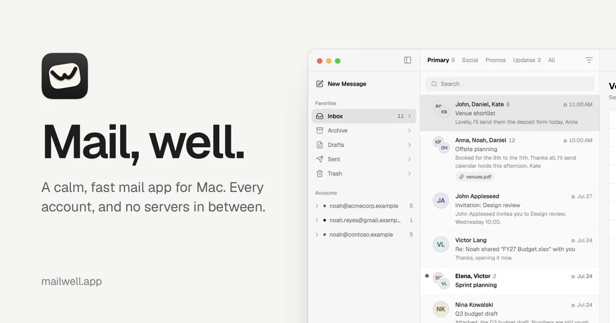
A 1200×630 social card built on a near-black canvas that splits into two zones: the left third carries the brand and message, the right two-thirds shows a tilted, cropped Mac mail app window floating into frame. Hierarchy is simple and confident — a small logo lockup at top left, a huge white headline ("Mail, well.") in a serif or refined sans at mid-left, and one short subline beneath it. The app screenshot provides all the colour and detail, with its orange accent reading against the otherwise monochrome card, so the card looks like a product reveal rather than an ad.
Prompt preview
## Reference images

Study these alongside the description below: hierarchy, rhythm, spacing, colour. Build for the product you are asked about, using this design language.

- Screenshot: https://kage-design-assets.t3.tigrisfiles.io/screenshots/mailwell/7b26503c-78af-41e0-8e0b-0f7ba9dd6dd9-1791525843335.webp
- Design on Kage: https://kage.design/designs/mailwell-og-image

## Before you start
Ask the user what they are building, who it is for, and what brand assets they already have (name, tagline, colours, type, and whether they have a product screenshot to feature). Wait for the answers. Everything below is applied to *their* product — the reference is only a compositional template.

## Goal
Produce a single **1200×630** Open Graph / social share card (render HTML/CSS to PNG, or write an SVG). It must read clearly when scaled down to a tiny link preview in Slack, X or iMessage.

## Page structure (canvas zones)
1. **Background** — one flat, very dark canvas (near-black, e.g. `#0e0e10`) filling the full 1200×630. No gradients busy enough to fight text; at most a very subtle vignette.
2. **Logo lockup, top-left** — a small app icon (~48px) with a one-word wordmark beside it, placed with generous margin (~64px from top and left edges). Keep it small; it anchors, it doesn't headline.
3. **Headline block, left third, vertically centred** — the product's value message in two or three short words with a typographic flourish (e.g. "Mail, well." style: a period or comma beat that gives it a voice). Set it very large (~96–120px) in white, tight leading, occupying roughly the left 30–35% of the canvas.
4. **Subline** — one sentence, ~20–24px, light gray (`#9a9aa0`), directly under the headline, max-width ~340px, stating what the product is for.
5. **Product screenshot, right two-thirds** — a large app-window screenshot placed so it bleeds off the right edge of the canvas, slightly rotated/scaled to feel dynamic but still legible. Give it a real window chrome (traffic lights, toolbar) and a soft, wide drop shadow or faint border so it lifts off the dark background.
6. **Optional footer URL** — a small, muted domain bottom-left, ~16px, same gray as the subline.

## Design language
- **Split composition**: text owns the left third, imagery owns the right two-thirds; never overlap type onto the screenshot. The screenshot bleeding off-canvas creates depth without decoration.
- **Monochrome canvas, accent via product**: the background and all text are black/white/gray; the only strong colour comes from accent UI inside the screenshot (e.g. an orange `#f0a030`-range highlight). This keeps the card readable and lets the product carry the palette.
- **Type**: one family throughout. Headline at display size with normal-to-tight tracking; subline and URL at small sizes in a lighter weight and muted gray. Two levels only.
- **Contrast discipline**: pure white for the headline, ~60% gray for supporting text, no mid-tone text that disappears at small preview sizes.
- **Depth**: one soft, large-radius shadow on the window; no glows, no busy patterns, no more than one visual layer beyond the flat canvas.
- **Safe margins**: keep all text ≥64px from canvas edges so nothing clips in different preview crops.

## Never
No logos, wordmarks, product names, copy, screenshots, illustrations or icon sets from the reference. Use the user's own branding and a placeholder screenshot if none exists. Never present the result as the reference product.