kage
kage
Design analysis
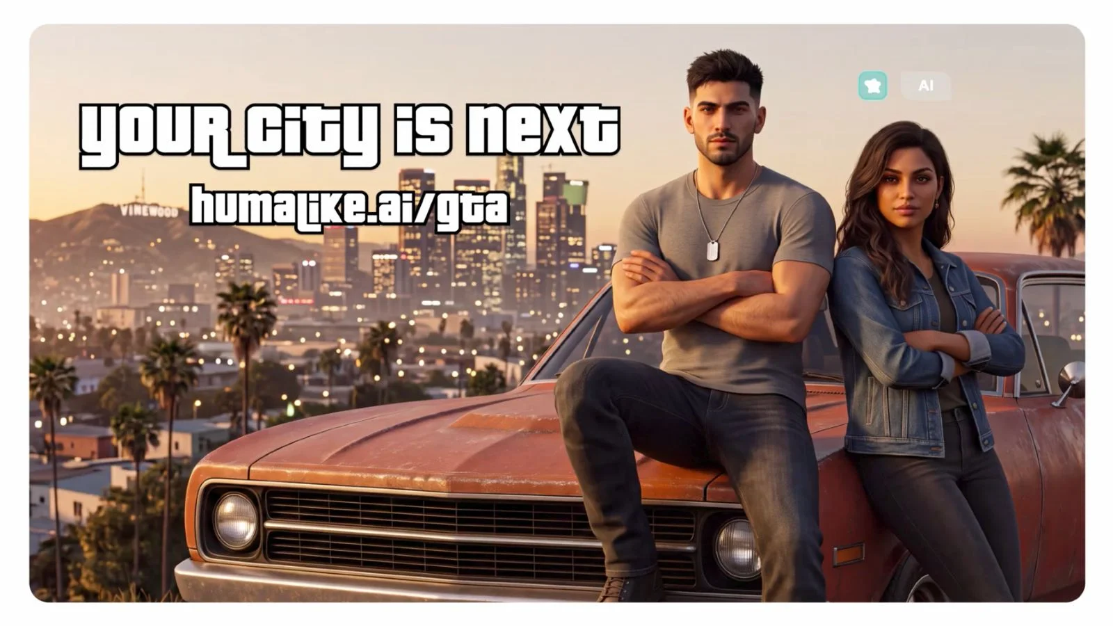
A 1200×630 social card on a white matte with rounded corners, built as a full-bleed golden-hour illustration: a dusk skyline, palm trees and a rust-orange muscle car with two characters leaning on it occupy the right two-thirds. The headline 'Your city is next' sits top-left in ultra-heavy white display type with a thick black stroke and a gently arched baseline — a clear homage to GTA title typography — with the URL humalike.ai/gta repeated in the same treatment below it, slightly rotated. A tiny mint icon chip plus an 'AI' pill in the top-right corner is the only UI element, keeping focus on the type-lockup-versus-scene tension. The warm peach-to-amber sky gradient against teal dusk skyline gives the white outlined type maximum contrast, and the card reads at thumbnail size despite dense scenery.
Prompt preview
## Reference images

Study these alongside the description below: hierarchy, rhythm, spacing, colour. Build for the product you are asked about, using this design language.

- Screenshot: https://kage-design-assets.t3.tigrisfiles.io/screenshots/humalike-x-gta-rp/5108d8af-3b2a-416b-a450-978e95c81501-1790575277598.webp
- Design on Kage: https://kage.design/designs/humalike-x-gta-rp-og-image

## Before you start
Ask the user what they are building, who the card is for (X, Slack, LinkedIn, iMessage share previews), what one-line hook or URL must appear on the card, and what brand assets they have (name, colours, any mascot or illustration style). Wait for the answers before designing. Everything below is applied to their product, not to the reference.

## Page structure
Produce a single 1200×630 social card image — ideally one fixed-size HTML/CSS file rendered to PNG with Playwright or Puppeteer, or a standalone SVG. Compose it in these layers, back to front:

1. **Canvas**: 1200×630 card with ~24px rounded corners, sitting on a plain white page background so the crop looks like a physical card.
2. **Background scene (placeholder)**: a full-bleed illustrated environment representing the product's world — a warm golden-hour gradient sky (peach #f4c48a to amber #e8956b), a hazy dusk skyline and hills in muted teal (#2f4f5f), and simple CSS/SVG silhouettes (buildings, trees, a foreground vehicle or object in rust orange #b45a32). Keep the left half less busy so text sits cleanly; let the right two-thirds carry the visual weight.
3. **Headline lockup (top-left)**: a 2–4 word hook set in one ultra-heavy display face, white fill with a thick (8–12px) dark stroke, ~90–120px size, tight tracking, with a very slight arch or wave to the baseline.
4. **URL or tagline sub-line**: the site path or short tagline directly beneath the headline in the same outlined treatment at ~40–55% of the headline size, rotated about 2–3°, tucked under the headline's lower edge.
5. **Badge cluster (top-right)**: one small rounded-square icon chip (~36px, mint or brand accent) plus a tiny low-contrast white pill label, inset ~40px from the corner. This is the only UI-style element.

## Design language
- **Focal hierarchy**: the headline owns the top-left quadrant and is the first thing read; the illustrated subject anchors the lower-right; everything else is atmosphere. Never let the scene compete with the type.
- **Type treatment**: one chunky display face does all the work — white fill, heavy dark stroke, minimal letter-spacing. No body copy on the card; hierarchy comes from size and rotation alone (headline → rotated sub-line → badge).
- **Colour**: warm, cinematic palette — peach/amber sky gradient, teal dusk midground, one saturated rust-orange foreground accent, white type with near-black stroke. Cap it at these four roles.
- **Depth**: build three planes — gradient sky, hazy silhouette skyline, sharp dark foreground subject — with soft atmospheric fade between them so the card reads at 200px wide.
- **Contrast rule**: the lightest, highest-contrast elements are the type; the background stays mid-value everywhere behind text. If a zone is too busy behind the headline, add a subtle darkening or blur behind the lockup rather than shrinking type.
- **Safety**: keep all text inside a ~60px inset and visually centred vertically so platform crops never clip the lockup; total text should be readable in under 2 seconds.

## Never
- Do not reproduce the GTA wordmark, Pricedown font, the VINEWOOD sign, Rockstar characters, their cars, or any copy or imagery from the reference; the arched outlined-type idea must be rebuilt with the user's own fonts and words.
- Do not use photography of real people or claim the card belongs to any existing game or brand.
- Do not add body paragraphs, bullet lists, or more than one sub-line — a social card is not a landing page.
- Do not exceed the four-colour palette or introduce a second display typeface.