kage
kage
hypervibe.so
Design analysis
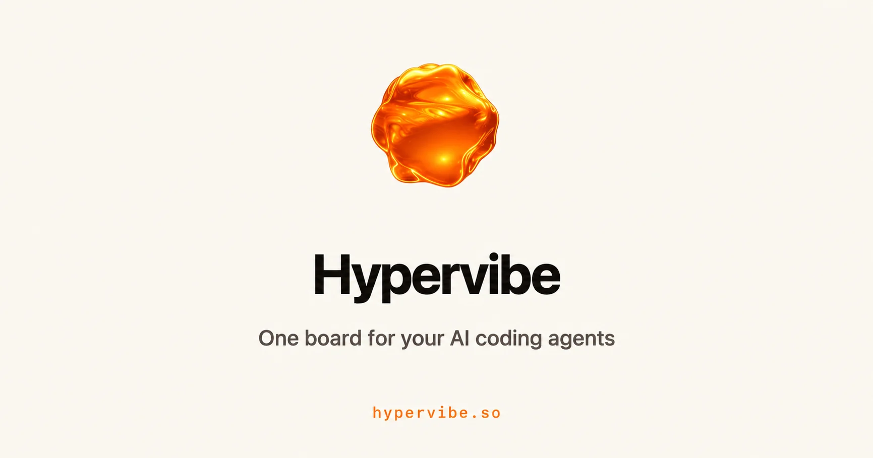
A restrained 1200×630 social card built on one centered vertical axis over a warm off-white canvas (#F2EFE9). Hierarchy is carried purely by scale steps: a glossy molten-orange 3D blob (~30% of canvas width) acts as the sole image, an oversized extra-bold near-black wordmark with tight tracking follows, a mid-size warm-gray tagline sits beneath, and a tiny letter-spaced orange monospace domain anchors the bottom margin. Roughly 95% of the surface is neutral; the single saturated orange accent is reserved for the mark and the URL, and the enormous negative space makes the three-element stack read instantly at feed thumbnail size.
Prompt preview
## Reference images

Study these alongside the description below: hierarchy, rhythm, spacing, colour. Build for the product you are asked about, using this design language.

- Screenshot: https://kage-design-assets.t3.tigrisfiles.io/screenshots/hypervibe/d6b67ee7-dea6-43b5-9b89-9cee3003dd83-1791699068469.webp
- Design on Kage: https://kage.design/designs/hypervibe-og-image

## Before you start
Ask the user what product or project the card is for, the exact brand name, tagline and domain to display, what accent colour and background tone they prefer, and whether they have an existing mark (logo, glyph, 3D asset or emoji) to use as the focal element. Wait for the answers. Everything below uses placeholder branding and copy — apply the composition to their brand, not to any reference product.

## Page structure
Produce a single **1200×630** social card (Open Graph / Twitter summary large image). Build it as a fixed-size HTML page rendered to PNG (e.g. 1200×630 body screenshotted with Playwright/Puppeteer) or as an SVG with `viewBox="0 0 1200 630"`. No scrolling, no responsive behaviour.

1. **Canvas** — full-bleed flat warm off-white background (≈ `#F2EFE9`), no border, no frame, no texture beyond at most a whisper of grain.
2. **Focal mark** — one glossy 3D blob (CSS blob shape with layered radial-gradients: bright highlight upper-left, saturated body, darker rim) or the user's own mark, horizontally centered, ~30–34% of canvas width, with its optical center around 32–36% down from the top.
3. **Wordmark** — the brand name in near-black (`#141414`), extra-bold neo-grotesque sans, ~120–140px, letter-spacing about −0.04em, centered, sitting ~70–90px below the mark.
4. **Tagline** — one short line under the wordmark, ~40–44px, regular weight, warm gray (≈ `#6F6B64`), ~44px of gap above it.
5. **Domain footer** — the URL in small monospace (~26–30px), accent orange (≈ `#E85D1F`), letter-spacing ~0.15em, centered, baseline ~60–70px from the bottom edge.

Keep all content inside a central ~1000×520 safe area so platform crops never clip the wordmark.

## Design language
- One column, one axis: every element is center-aligned; the composition is a vertical stack of exactly four elements with nothing else on the canvas.
- Hierarchy by scale alone: mark → giant wordmark → mid tagline → tiny mono URL. No boxes, dividers, badges, buttons or panels anywhere.
- Generous negative space is the design: outer margins ≥ 100px, the stack floats in the middle; do not fill the top or bottom corners.
- Colour discipline: ~95% of the canvas is neutral (cream background, near-black ink, warm gray). One saturated accent colour is used exactly twice — in the focal mark and the monospace domain. Approximate palette: background `#F2EFE9`, ink `#141414`, secondary `#6F6B64`, accent `#E85D1F`, highlight `#FFB347`.
- Type pairing: a single neo-grotesque family (e.g. an Inter/Helvetica-class face) at two extremes — extra-bold, tightly tracked for the wordmark; regular for the tagline. Monospace appears only once, for the URL, as a technical accent. Scale ratio between wordmark and tagline is roughly 3:1.
- The focal mark is the only dimensional element: glossy radial-gradient highlights, a slightly darker rim, subtle asymmetry so it feels organic. Everything else stays flat — no text shadows, no gradients on type.
- Static composition; no motion (it is a rendered image).

## Never
- Never reuse the reference product's name, tagline, domain, or its exact molten-blob artwork or icon set — replace all of it with the user's brand and a distinct mark.
- Never present the finished card as belonging to the reference product; it is a new card in the same compositional style.