kage
kage
requesteagle.tokarev.work
Design analysis
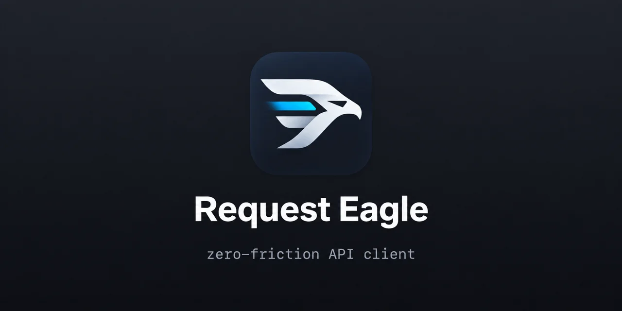
A 1200×630 social card built on a single centered vertical stack: squircle app icon, heavy sans wordmark, then a monospace tagline, all on a near-black canvas with a subtle top-to-bottom lightening. Hierarchy is earned purely through scale and weight — icon (~230px), then ~72px bold white name, then ~30px letter-spaced gray monospace — with roughly 60% of the canvas left as empty dark space so the mark reads even at thumbnail size. The only colour is a single cyan speed-stripe inside the eagle logo, which makes the monochrome composition feel engineered rather than plain; the monospace tagline quietly signals the developer audience.
Prompt preview
## Reference images

Study these alongside the description below: hierarchy, rhythm, spacing, colour. Build for the product you are asked about, using this design language.

- Screenshot: https://kage-design-assets.t3.tigrisfiles.io/screenshots/request-eagle/ec475c02-bb8f-4c72-b304-632715ca0143-1791612031795.webp
- Design on Kage: https://kage.design/designs/request-eagle-og-image

# Goal

Produce a 1200×630 Open Graph / social preview image (render HTML/CSS to PNG, or hand-build an SVG at 1200×630) inspired by this composition, using the user's own placeholder branding and copy — never the reference brand.

## Before you start

Ask the user what product or project the card is for, who it is for, and what brand assets they already have: product name, tagline, logo or icon (or whether you should use a simple abstract placeholder), and any brand colours. Wait for the answers before designing. Everything below is applied to that product, not to the reference.

## Page structure

A single fixed-size canvas (1200×630) with one centered column, top to bottom:

1. **Background**: a near-black field with a very subtle vertical gradient (lighter at the top, darkest at the edges/bottom) — flat enough to stay quiet, deep enough to give the foreground contrast.
2. **App icon**: a large squircle tile (~220–240px, corner radius ~22–24% of its size) centered horizontally, sitting slightly above the vertical midpoint. Fill it with a dark tinted surface a step lighter than the background, and place a simple bold vector mark inside — geometric strokes, at most one accent-coloured detail (a stripe, a slash, a wing).
3. **Wordmark**: the product name centered below the icon with ~48–64px of breathing room, in a heavy sans-serif (weight 700–800), very large (~68–76px), pure off-white.
4. **Tagline**: one short descriptor line centered under the name with ~24px of space, set in a monospace face at ~28–32px, letter-spaced, in a muted gray.

## Design language

- **Composition**: everything lives on one centered axis; the visual mass sits in the middle band of the canvas, with roughly 55–60% of the card as empty background. Never fill the space — the emptiness is the design.
- **Hierarchy by scale, not decoration**: icon → huge bold wordmark → small quiet tagline. Three sizes, three tones, done.
- **Colour discipline**: monochrome base (background ~#0d1218–#131a22, icon tile ~#151d28, wordmark ~#f4f7fa, tagline ~#8b95a3). Introduce exactly one saturated accent (e.g. cyan ~#2fa8e8) and only inside the logo mark, so it reads as the single point of energy on the card.
- **Type pairing**: a geometric/neo-grotesque sans for the name (Inter, Manrope, etc.) against a true monospace for the tagline — the mono face signals "developer tool" without saying it. Tagline is lowercase with slight tracking (+0.04em).
- **Surfaces and edges**: the icon tile is the only "surface" — a rounded squircle with a faint inner lightness or 1px top highlight, no drop shadow heavier than a soft ambient glow. No borders, no cards, no dividers anywhere else.
- **Contrast for thumbnails**: test at 400px wide — the name must stay legible and the mark must survive; if it doesn't, increase scale and cut elements.

## Never

- Do not use the Request Eagle name, eagle logo, or its copy ("zero-friction API client") — use the user's placeholder branding and copy.
- Do not add screenshots, UI mockups, badges ("open source", star counts), URLs, or extra sections; this card is icon + name + tagline only.
- Do not introduce a second accent colour, gradients on the text, or background patterns/illustrations.
- Never present the result as the reference product.