kage
kage
cdn.prod.website-files.com
Design analysis
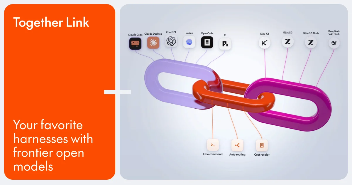
A 1200×630 social card uses a strong two-panel composition: a saturated orange rounded rectangle on the left carries the white wordmark and stacked headline, while a pale cool-gray rounded panel on the right holds the visual story. The right side centers glossy interlocking purple, magenta, and orange chain links, with small tool and model labels connected by fine lines; oversized white type, generous padding, and soft 3D shading create a clear focal hierarchy.
Prompt preview
## Reference images

Study these alongside the description below: hierarchy, rhythm, spacing, colour. Build for the product you are asked about, using this design language.

- Screenshot: https://kage-design-assets.t3.tigrisfiles.io/screenshots/together-link/8dfd42d2-12b7-4b90-8ec9-0dbc92d071aa-1791612037425.webp
- Design on Kage: https://kage.design/designs/together-link-og-image

## Before you start
Ask the user what they are building, who it is for, and what brand assets they already have, including the name, colours, typefaces, and any approved visual elements. Wait for their answers before designing. Apply everything below to their product, using placeholder branding and copy until those answers are provided.

## Page structure
- **1200×630 social-card canvas:** Create a fixed 1200×630 image intended for sharing on X, Slack, LinkedIn, or iMessage; keep all important content inside generous safe margins.
- **Left identity panel:** Place a tall rounded rectangle occupying roughly one-third of the canvas, filled with a vivid brand colour; put a small placeholder wordmark near the upper-left and a large stacked headline anchored near the lower-left.
- **Central divider:** Use a narrow, high-contrast plus-like or connector-shaped transition between the two panels so the identity block visibly joins the visual block.
- **Right visual panel:** Fill the remaining two-thirds with a pale cool-gray/lavender rounded rectangle and use it as an airy diagram stage.
- **Hero object:** Center a large glossy, interlocking abstract object—such as linked loops, rings, or modular forms—in three contrasting brand colours, angled slightly for depth.
- **Supporting labels:** Add small placeholder tool/model nodes along the upper edge and a few capability nodes below the hero object, connected with thin curved or straight lines to the central form.

## Design language
- Build hierarchy through a simple left-to-right split: brand and message first, then a large visual metaphor; do not compete with the headline using extra body copy.
- Use a compact but oversized type scale: small wordmark at the top, then a 48–60px multiline headline with tight leading and strong left alignment. Use a clean geometric sans-serif with rounded details and medium-to-semibold weight.
- Treat colour as the main organizing device: use a saturated orange close to `#ff4b08` for the identity panel, near-white `#f7f8fb` type, and a cool pale gray/lavender background around `#dfe5ef`; accent the hero with lavender `#a58be8`, magenta `#c20c8f`, and orange-red `#ed3d0b`.
- Keep the composition minimal but playful: large rounded corners around 28–34px, no hard outer border, and soft ambient shadows and highlights on the 3D hero object and node cards.
- Make the hero object feel dimensional with rounded geometry, specular highlights, darker undersides, subtle gradients, and gentle blur/shadow; keep the surrounding diagram lines thin, quiet, and low contrast.
- Render small node labels as restrained UI-like annotations: tiny dark text, compact white or translucent cards, and simple placeholder symbols rather than a dense legend.
- Preserve generous negative space in the right panel so the chain or linked-object silhouette remains immediately legible at thumbnail size.
- If adding motion before export, use only a subtle hover or floating effect; the final deliverable must be a static 1200×630 PNG or SVG with crisp text and no animation dependency.
- Implement as HTML/CSS rendered to PNG, SVG, or another reliable image-generation method. Verify the final output is exactly 1200×630 and readable when reduced to social-card size.

## Never
- Do not copy the reference’s logos, wordmark, product name, exact copy, illustrations, photography, model/tool icon set, or branded symbols.
- Do not present the result as Together Link or imply affiliation with the reference product.
- Use placeholder branding, placeholder headline, generic abstract nodes, and original geometry tailored to the user’s product.