kage
kage
kerno.io
Design analysis
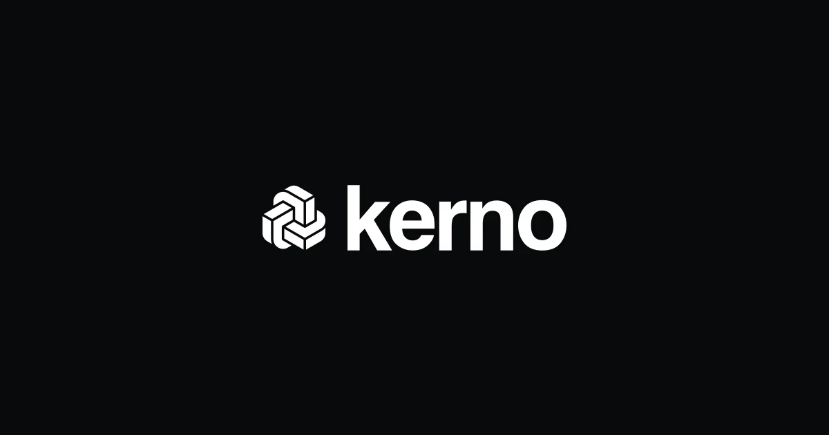
A 1200×630 social card uses an almost-black canvas with a single centered focal lockup: a white geometric interlocking mark followed by a large, heavy lowercase wordmark. The generous negative space and stark monochrome treatment make the identity immediately legible at link-preview scale, with no secondary copy or decorative elements competing for attention.
Prompt preview
## Reference images

Study these alongside the description below: hierarchy, rhythm, spacing, colour. Build for the product you are asked about, using this design language.

- Screenshot: https://kage-design-assets.t3.tigrisfiles.io/screenshots/kerno-1-0/7fe57011-7bac-45f9-826c-c8259fd93b74-1792130513129.webp
- Design on Kage: https://kage.design/designs/kerno-1-0-og-image

## Before you start
Ask the user what they are building, who it is for, and what brand assets they already have, including the product name, colours, type choices, and any logo or mark. Wait for their answers before proceeding. Apply the guidance below to their product, not to the reference brand.

## Page structure
- **1200×630 social-card canvas:** Create a fixed 1200×630 image intended for link previews on X, Slack, LinkedIn, and iMessage.
- **Centered brand lockup:** Place a placeholder geometric mark beside a placeholder wordmark as the only focal content, centered both horizontally and vertically with a balanced gap between symbol and text.
- **No supporting content:** Keep the card free of buttons, captions, metadata, borders, or extra decoration so the identity remains readable in a small preview.

## Design language
- **Build hierarchy through singular focus:** Use one large central lockup rather than multiple content zones; let the wordmark be the dominant element and keep the symbol optically balanced beside it.
- **Use extreme negative space:** Leave broad, even margins around the lockup. The composition should feel calm, deliberate, and immediately recognizable when reduced.
- **Use a near-black field:** Set the background to approximately `#08090A` or `#0B0C0D`, with a white foreground around `#F5F5F2`; avoid gradients and coloured accents unless the user's brand requires them.
- **Pair a geometric mark with a bold sans wordmark:** Use a custom-looking abstract mark built from simple interlocking or modular shapes, alongside a heavy lowercase or sentence-case sans-serif wordmark. Use a large display size, roughly 96–120px on a 1200px canvas, with tight but readable tracking.
- **Keep contrast flat and crisp:** Use solid fills, sharp edges, and no visible shadows, texture, photography, or illustration. If the mark needs internal separation, use the background colour as clean negative-space gaps.
- **Respect optical centering:** Center the combined mark-and-wordmark group, not each element independently. Align the symbol's visual weight and height to the wordmark rather than relying only on bounding boxes.
- **Make it an actual image:** Produce the result as a 1200×630 social card, for example by rendering HTML/CSS to PNG or exporting an SVG to PNG. Use placeholder branding and copy such as `YOUR MARK` and `YourProduct` until the user supplies real assets.
- **Keep interaction irrelevant:** This is a static asset; do not add hover states, animation, controls, or responsive page chrome. Ensure text remains crisp and legible in the final raster export.

## Never
- Never copy the reference logo, wordmark, product name, or tagline.
- Never use the Kerno name or recreate its exact geometric symbol.
- Never include logos, wordmarks, copy, illustrations, photography, or icon sets from the reference.
- Never present the result as Kerno or imply affiliation with it; use placeholder branding and user-supplied assets only.