kage
kage
milepost.club
Design analysis
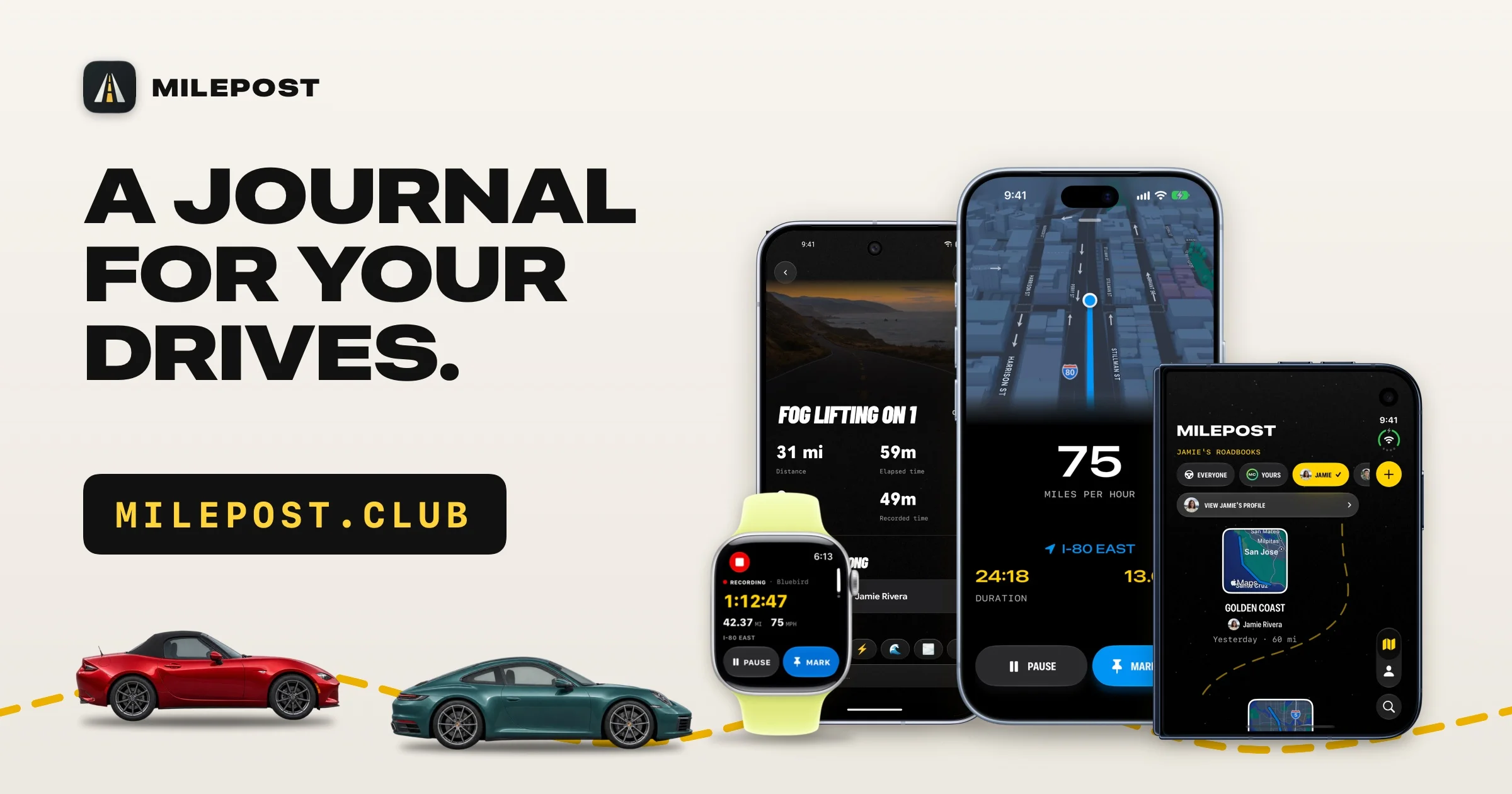
A poster-style 1200×630 social card built on an asymmetric split: a cream canvas carries a heavy three-line uppercase headline and a black URL chip in taxi-yellow monospace on the left, while the right two-thirds is filled by an overlapping cluster of two phones and an Apple Watch showing real app screens. A dashed yellow road line runs along the bottom edge, tied to flat cut-out cars, so the single accent colour (yellow) becomes the connective motif across type, UI and illustration. Hierarchy is purely scale-driven — wordmark small, headline huge, URL chip secondary — which keeps the card legible even at thumbnail size.
Prompt preview
## Reference images

Study these alongside the description below: hierarchy, rhythm, spacing, colour. Build for the product you are asked about, using this design language.

- Screenshot: https://kage-design-assets.t3.tigrisfiles.io/screenshots/milepost/5851f354-f4fd-4cd7-9097-4e24514a8959-1791871381157.webp
- Design on Kage: https://kage.design/designs/milepost-og-image

# Design a 1200×630 Open Graph social card

## Before you start
Ask the user and wait for answers before designing:
- What product or announcement is the card for, and what is the one-line message it must land in a feed?
- Who is the audience and on which platforms will it be shared (X, Slack, LinkedIn, iMessage)?
- What brand assets exist: name, logo/icon, exact brand colours, typefaces, and the domain or handle to display?
- Do they have real product screenshots or should the devices carry invented-but-plausible UI?

Everything below is applied to *their* product and brand, not to the reference.

## Page structure
Produce a single landscape image at exactly 1200×630 (e.g. an HTML/CSS file rendered to PNG at 1200×630, or an SVG with a PNG export step). Keep all critical content inside a safe area ~48px from every edge, since platform UI crops corners.

- **Top-left brand row:** small rounded-square app icon (black tile, one simple white motif) next to an uppercase bold wordmark. Total height ~10% of the canvas.
- **Left text column (~45% width, vertically centred in upper two-thirds):** the headline in three stacked lines, uppercase, extremely heavy, left-aligned, with a full-stop on the final line. Beneath it, a black rounded-rectangle chip (~radius 12px) containing the domain in yellow monospace, letter-spaced, sized like a small button.
- **Right visual field (~55% width):** a cluster of device mockups — two phones plus one watch — overlapping with a deliberate scale stagger: the hero phone largest and centre-right, a second phone behind and to its left showing a dark screen, the watch lowest and front-left with a coloured band. Screens show real-looking app UI (a map screen, a stats/recording screen) so the cluster reads as the product, not decoration.
- **Bottom band:** a dashed accent-coloured road line running the full width with a gentle curve, passing under the devices; one or two flat side-view vehicle cut-outs standing on the line at the left, slightly overlapping the text column's lower edge.

## Design language
- **Canvas:** warm cream ground (~#F1EEE7), not pure white; no gradients, no background pattern. One flat colour field that makes black type and yellow accents pop in thumbnails.
- **Hierarchy by scale alone:** wordmark ~24px, headline ~95–105px (the largest element on the canvas by a wide margin), URL chip ~28px mono. No subheads, no body copy — the card carries exactly three text elements.
- **Colour:** near-black ink (~#141414) for type and chip fill; one saturated accent (~#F2C230 taxi yellow) used only on the chip text, the dashed road line, the watch band and one or two UI highlights; device screens in dark navy-black (~#0D1117) with a single blue map accent (~#3F7DF0). Accent appears in at least three places so it reads as a system, not an accident.
- **Type pairing:** a condensed extra-bold grotesque for the headline (tight leading ~0.95, slight tracking) against a monospace/typewriter face for the domain chip; a plain clean sans for any in-device UI text.
- **Imagery treatment:** devices drawn as clean mockups with rounded bezels and soft diffuse drop shadows (no reflections, no perspective distortion); cars as flat cut-outs with a small ground shadow; the dashed line is the only "drawn" element linking the text side to the device side.
- **Motion:** none — this is a static export; design everything to hold up at 600×315 and even 160×160.

## Never
Never use the reference product's name, wordmark, road-icon logo, real app screens, specific car models or photography, or its copy ("A journal for your drives", the .club domain). Invent placeholder branding, placeholder UI and generic vehicle silhouettes, and never present the result as that product.