kage
kage
Design analysis
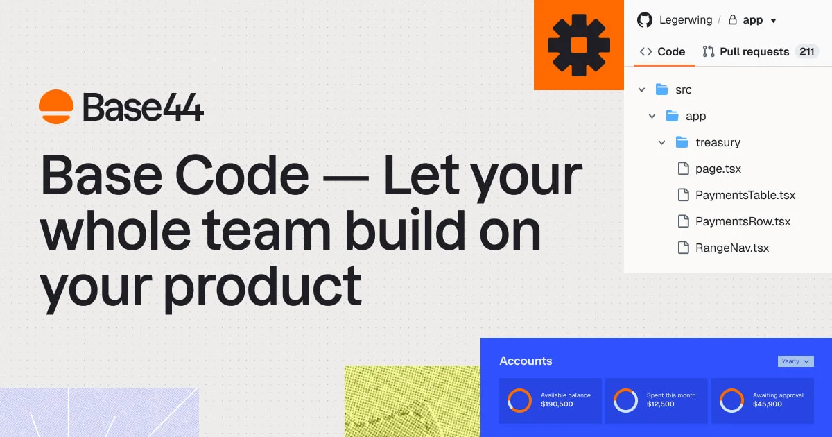
A 1200×630 landscape social card on a warm cream canvas with a faint dot grid, built as a bold editorial split composition. The left two-thirds carry the brand lockup and a massive three-line black grotesque headline ('Base Code — Let your whole team build on your product') that dominates the entire card; the right third is a cropped collage of product evidence: an orange tile with a dark gear glyph stacked above a GitHub-style repo panel (breadcrumb, Code/Pull-requests tabs with a count badge, nested file tree), and a blue Accounts dashboard panel with three donut-ring stat blocks along the bottom. Retro halftone swatches — lavender dots and a chartreuse hill texture — are cropped by the bottom edge, giving print-poster warmth. Colour is disciplined: cream field, ink headline, orange brand accent, cobalt-blue panel, with the textures as the only playful noise.
Prompt preview
## Reference images

Study these alongside the description below: hierarchy, rhythm, spacing, colour. Build for the product you are asked about, using this design language.

- Screenshot: https://kage-design-assets.t3.tigrisfiles.io/screenshots/base-code/b818f223-046d-4f3f-b430-b032e50df980-1791871314194.webp
- Design on Kage: https://kage.design/designs/base-code-og-image

## Before you start
Ask the user what they are building, who it is for, and what brand assets they already have (product name, tagline, logo glyph, brand colours, typeface). Wait for the answers before designing. Everything below is applied to *their* product and brand — this reference is only for composition and visual language.

## The deliverable
Produce a **1200×630 Open Graph social card** (the image shown when a link is shared on X, Slack, LinkedIn, iMessage). Recommended approach: a single HTML/CSS file sized exactly 1200×630 (fixed pixel layout, no scrolling) rendered to PNG, or an equivalent SVG. All UI mockups are drawn in CSS/SVG — no external images. Use the user's placeholder branding and copy throughout.

## Page structure (zones, top to bottom)

1. **Canvas background** — full-bleed warm cream field with a very faint dot grid (~24px spacing, 4–6% opacity dots). This is the base layer of the whole card.
2. **Brand lockup, top-left** (~60px from top/left) — logo glyph + wordmark, roughly 40–48px tall total. Small and quiet; it anchors the corner but never competes with the headline.
3. **Headline block, left two-thirds** — starting below the lockup: `ProductName — Tagline` set across three lines, enormous (100–120px), heavy grotesque weight, near-black ink, tight leading (~1.0), normal letter-spacing. Break the line so the product name sits on line one and the tagline fills lines two and three. This block is the focal point of the card.
4. **Right column collage** (top-right quadrant, two stacked elements):
   - **Accent tile** — a solid brand-accent square (~150×140px) flush against the top edge, containing one bold dark glyph (a gear, spark, or other single-icon mark from the user's brand) centred. It overlaps/sits flush above the panel below.
   - **Repo / file-tree panel** — a white card (~300×420px) styled like a Git host UI: top row with avatar dot + `org / repo` breadcrumb, then two tabs (`Code` active with underline accent, `Pull requests` with a small count pill), then a nested tree: 2–3 chevron folders indented hierarchically, each containing 3–4 file rows with file-type icons and `.tsx`-style filenames. 13–14px UI type, generous row spacing, crisp thin dividers.
5. **Dashboard panel, bottom-right** — a cobalt-blue card (~540×160px, cropped by the right/bottom edges is fine) titled with a small panel label plus a dropdown chip on the right. Inside, three equal stat cells, each with a small donut ring (two-tone: accent + panel colour), a muted label and a large white value ($-style numbers). Reads as product evidence at a glance.
6. **Bottom texture swatches** — two organic print textures cropped by the bottom edge: a lavender/periwinkle dotted-halftone swatch on the left and a chartreuse halftone hill/landscape swatch centre-left. Keep them low and partial (~100–150px tall), like paper swatches slid under the composition.

## Design language
- **Hierarchy**: one giant headline owns the card; every UI panel is supporting evidence, deliberately small and crisp so the type reads even at feed-thumbnail size. Nothing else is allowed to approach the headline's size.
- **Composition**: asymmetric split — ~60–65% of the width for type, ~35–40% for a stacked UI collage. Panels are allowed to bleed off the top, right and bottom edges to make the canvas feel cropped from a larger world.
- **Colour (approx. hex)**: cream field `#F5F0E6`; ink `#111111`; brand accent orange `#FF5A00` (used for the glyph tile, logo, tab underline, count pill and donut ring); cobalt panel blue `#2B47FF`; texture accents lavender `#C9C6F0` and chartreuse `#D8E26B`. Limit yourself to one cream field, one ink, one brand accent, one panel colour, two texture tones.
- **Type**: a single grotesque sans family throughout. Headline at heavy weight, ~105–120px, leading ~1.0. All UI text inside panels 12–14px, medium weight, normal case. Never more than those two scales — the contrast between the two IS the look.
- **Shape & depth**: panels have square or very slightly rounded corners (0–6px radius), hairline borders or none, and at most a very soft shadow. No glassmorphism, no gradients on panels — flat colour blocks.
- **Texture**: a faint dot grid over the cream base plus 1–2 halftone/dotted print swatches at the bottom edge. Textures stay behind everything and never touch the headline.
- **Motion**: none — this is a static exported image.

## Never
- Never use the Base44 name, logo, sun/gear glyph, headline copy, repo name ('Legerwing'), file names, or stat copy in the output — invent neutral placeholder branding and copy for the user's product.
- Never present the result as Base44 or imply affiliation.
- Never add photography, stock illustration, or icon sets from the reference — only the simple drawn UI mockups and textures described above.