kage
kage
milliseconds.ai
Design analysis
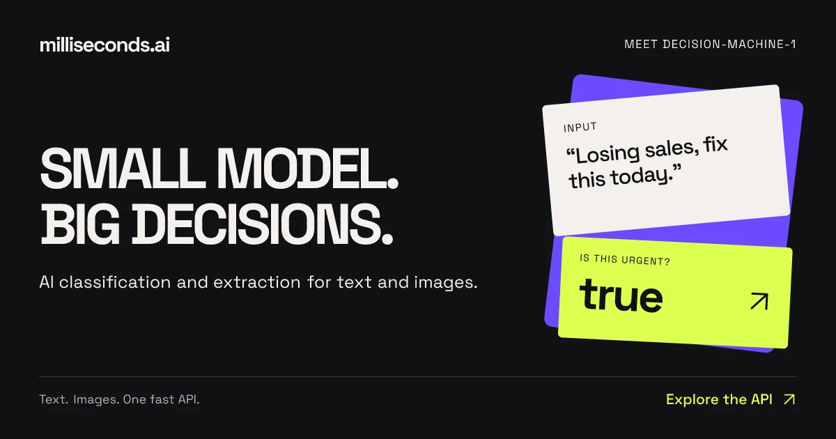
A 1200×630 social card on a near-black canvas split into a quiet left type zone and a kinetic right vignette. The focal point is a two-line condensed uppercase headline ending in periods, supported only by a small gray subline; the right half replaces photography with a fanned stack of UI cards — a cream "input" card with quoted text, a lime "output" card answering with a bold value and arrow — tilted over a violet backing card so the product demo itself becomes the imagery. Letter-spaced uppercase micro-labels anchor the top corners, and a hairline footer rule balances a gray tagline against a lime CTA, giving the whole composition a symmetric, print-poster finish.
Prompt preview
## Reference images

Study these alongside the description below: hierarchy, rhythm, spacing, colour. Build for the product you are asked about, using this design language.

- Screenshot: https://kage-design-assets.t3.tigrisfiles.io/screenshots/milliseconds-ai/2f1f0df7-b2f6-434b-a729-2bb4a675180d-1790056904019.webp
- Design on Kage: https://kage.design/designs/milliseconds-og-image

## Before you start
Ask the user what they are building, who it is for, and what brand assets they already have (name/wordmark, colours, fonts). Wait for the answers before designing — everything below is applied to *their* product, not to the reference.

The deliverable is a single static Open Graph social card at exactly **1200×630 px**: build it as a standalone HTML/CSS file (with fixed 1200×630 body) that can be rendered to PNG via headless Chrome/Puppeteer, or as a standalone SVG. Use placeholder branding and placeholder product copy throughout.

## Page structure
Top to bottom, inside ~56–64px safe margins:

1. **Canvas** — near-black full-bleed background; nothing else decorative behind the content.
2. **Top bar** — lowercase wordmark left in white; an uppercase, letter-spaced kicker right (e.g. "MEET [PRODUCT-NAME]") in small type. Both sit on one shared baseline at the top.
3. **Main zone (vertically centred, two columns)**:
   - **Left column (~55% width)**: a two-line uppercase display headline where each line ends with a period, followed by one short gray subline. This column is the focal point — nothing else competes.
   - **Right column**: a fanned stack of three UI cards acting as a miniature product demo: a saturated backing card rotated ~-10°, an off-white card on top rotated ~-5° containing a small uppercase label (e.g. "INPUT") and a quoted user text, and an accent-coloured card overlapping below rotated ~+4° containing a small uppercase label (e.g. "IS THIS URGENT?"), a bold lowercase answer word, and a ↗ arrow aligned right.
4. **Footer** — a 1px hairline rule spanning the full content width, then a row: gray micro-tagline left, accent-coloured CTA link with ↗ arrow right.

## Design language
- **Hierarchy**: giant display type is the hero; the card stack is the only other loud element; everything else (kicker, labels, footer) is micro-type. Exactly one focal point per half.
- **Colour**: near-black canvas ≈ `#0E0E11`; off-white text and card surfaces ≈ `#F2F0EA`; gray subline/labels ≈ `#9A9AA0`; hairlines ≈ `#2A2A2E`. One acid accent for the output card + CTA (reference uses lime ≈ `#D9F64A` — substitute the user's brand accent), and one saturated secondary only for the backing card (reference uses violet ≈ `#6C4BF4` — substitute the user's secondary or a darker tint of their accent). The accent appears on exactly two elements; everywhere else stays monochrome.
- **Type**: heavy condensed grotesk for the display headline (Archivo Condensed / Anton class), sized ~110–130px with leading ~0.95; lowercase geometric sans for the wordmark; uppercase micro-labels at ~16–18px with ~0.15em tracking; neutral sans for the subline. Max two families plus the condensed display. Replace all with the user's fonts if provided.
- **Cards**: corner radius ~14–16px, generous internal padding (~28–36px), soft drop shadows (large blur, low-opacity black) so they lift off the dark canvas; alternating small rotations (-5° / +4°) over the more strongly tilted backing card create the fanned-stack depth. Each card is label + content only — no chrome, icons, or fake UI details beyond that.
- **Rhythm & framing**: strict grid, large negative space between headline and cards; the top bar and hairline footer "frame" the poster so it reads as a print layout, not a webpage screenshot.
- **Static output**: no motion — but test legibility at small preview sizes (e.g. 300px wide) since the card must read in a chat sidebar.

## Never
- Never use the Milliseconds.ai name, wordmark, the "MEET DECISION-MACHINE-1" kicker, the "SMALL MODEL. BIG DECISIONS." headline, the "Losing sales, fix this today." / "IS THIS URGENT? true" card copy, or its exact lime/violet palette unless the user supplies them as their own brand assets.
- Never present the result as Milliseconds.ai or reproduce the composition verbatim with real branding — all content must be the user's own product examples with placeholders.