kage
kage
opencode.ai
Design analysis
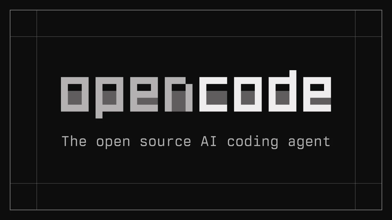
A 1200×630 social card built almost entirely from value, not colour: a flat near-black field framed by low-contrast hairline rules that overlap like print registration marks, creating small cross-ticks at the corners. The focal lockup is a lowercase pixel-block wordmark split into two tones — "open" in light grey, "code" in white — whose counters are filled with darker grey blocks at staggered heights, giving a dithered terminal texture. A widely tracked monospace tagline sits beneath at roughly a tenth of the wordmark's scale, and the rest of the canvas is deliberately empty, letting the type carry the whole composition.
Prompt preview
## Reference images

Study these alongside the description below: hierarchy, rhythm, spacing, colour. Build for the product you are asked about, using this design language.

- Screenshot: https://kage-design-assets.t3.tigrisfiles.io/screenshots/opencode-2-0/e19f8f85-0321-4b88-b4fa-50ef0587c8c8-1791957826909.webp
- Design on Kage: https://kage.design/designs/opencode-2-0-og-image

# Build a 1200×630 OG social card in a monochrome terminal style

## Before you start
Ask the user what product or project the card is for, who the audience is, and which brand assets they already have (name or placeholder wordmark, tagline copy, brand colours, typefaces). Wait for their answers before writing any code. Everything below is applied to *their* brand and copy — the reference is only the design language.

## Deliverable
Produce one image at exactly **1200×630**. Recommended approach: a single HTML file with a fixed 1200×630 container, rendered to PNG (e.g. Playwright/Puppeteer screenshot), or a standalone SVG exported at that size. It must read clearly when shrunk to ~200px wide in a chat sidebar or timeline.

## Page structure (canvas zones, top to bottom)
1. **Background field** — full-bleed flat near-black (`#0E0E0E`–`#111111`). No gradient, no noise, no vignette.
2. **Registration frame** — a 1px hairline rectangle inset ~30px from every edge, in a low-contrast grey (~`#3D3D3D`). Add a second, slightly offset hairline rectangle so the two overlap and produce small cross-tick marks near the corners, like print registration or a camera viewfinder. Keep both lines subtle; they should be discoverable, not loud.
3. **Focal lockup** — the brand wordmark, horizontally centred and sitting slightly above vertical centre, spanning roughly 65–75% of the canvas width. This is the only dominant element.
4. **Tagline** — one line of supporting copy directly below the wordmark with a clear gap (about one wordmark cap-height), centred, in mid grey.
5. **Nothing else** — resist adding logos, buttons, URLs, screenshots or icons. The empty space is part of the design.

## Design language
- **Monochrome discipline:** exactly one background plus three text greys — white `#FFFFFF`, light grey `#C9C9C9`, mid grey `#7A7A7A` — with hairlines at ~`#3D3D3D`. If the user's brand has an accent colour, allow at most one small accent; otherwise stay grey-on-black.
- **Type pairing:** a pixel/bitmap display treatment for the wordmark (either a pixel typeface, or letters custom-built from thick rectangular blocks with square terminals and zero rounding), against a clean monospace face (IBM Plex Mono / JetBrains Mono class) for the tagline in sentence case with ~0.12–0.18em letter-spacing.
- **Two-tone hierarchy inside the wordmark:** render the two words of the brand name in adjacent values — first word light grey, second word white — so hierarchy comes from value contrast instead of colour.
- **Dithered texture detail:** fill the enclosed counters of wordmark letters with darker grey rectangles at staggered heights, suggesting loading bars or a half-filled terminal. Keep it inside the letterforms only; never scatter decoration on the background.
- **Hierarchy by scale and value only:** the wordmark should be roughly 8–10× the tagline's visual weight. No shadows, no glows, no gradients, no borders around text.
- **Hairline geometry:** every rule is 1px and low-contrast; frames are inset and doubled/offset rather than solid heavy borders.
- **Negative space as the layout tool:** keep ≥80px of clear margin inside the hairline frame; the lockup floats alone. The composition should feel like a terminal boot screen, not a poster.
- **Legibility check:** the tagline must remain readable at 200px-wide preview — around 28–30px at full 1200px scale, never smaller.

## Never
- Do not reproduce the "opencode" name, its pixel wordmark, its letterforms, or the exact tagline copy. Use the user's own placeholder brand and copy.
- No third-party logos, icon sets, illustrations, photography, screenshots, gradients or drop shadows anywhere on the card.
- Never present the result as the reference product.