kage
kage
openflowkit.com
Design analysis
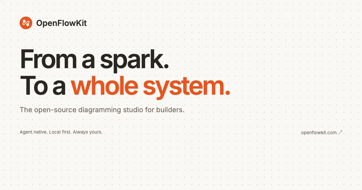
A 1200×630 social card built almost entirely from type on a warm off-white field overlaid with a faint dot grid that nods to a diagramming canvas. The lockup is anchored top-left: a small solid-orange circular logo mark beside a bold wordmark, then a two-line ultra-bold headline where only "whole system" flips to orange, a gray one-line subtitle, and a footer row pairing micro-copy on the left with the domain plus an ↗ arrow on the right. The bottom third is deliberately empty, so the dense upper-left block reads as a single focal mass against generous whitespace.
Prompt preview
## Reference images

Study these alongside the description below: hierarchy, rhythm, spacing, colour. Build for the product you are asked about, using this design language.

- Screenshot: https://kage-design-assets.t3.tigrisfiles.io/screenshots/openflowkit-2/9f630fdf-7bfc-4d31-b058-159720bab04c-1791957696009.webp
- Design on Kage: https://kage.design/designs/openflowkit-2-og-image

# Social card (OG image, 1200×630)

## Before you start
Ask the user what product or page the card is for, who will see it when the link is shared, and what brand assets exist: product name, logo mark or glyph, brand colours, typeface, tagline and any short copy. Wait for the answers before building. Everything below is applied to *their* brand and copy — use placeholder name ("Acme"), placeholder headline and placeholder accent colour until they answer.

## Page structure
Produce a single 1200×630 image — either a standalone SVG, or an HTML/CSS file at exactly 1200×630 rendered to PNG with a headless browser (Playwright/Puppeteer screenshot at deviceScaleFactor 1). One file, no external dependencies except the brand font if provided.

- **Canvas**: fixed 1200×630, warm off-white background, covered edge-to-edge by a subtle dot grid.
- **Logo row** (~72px from top/left margin): a small solid accent-coloured circle (~44px) containing a simple white glyph, with the wordmark set in bold dark type (~30px) baseline-aligned to its right.
- **Headline block** (starting ~120px down): two lines, each on its own line, ~110–120px, weight 750–800, line-height ≈1.02, letter-spacing ≈ −0.02em. Line 1 fully in ink; line 2 in ink except the two or three most important words, which take the accent colour. Keep terminal periods — they give it an editorial cadence.
- **Subtitle** (~40px below headline): one gray line, ~24px regular weight, stating what the product is in plain words.
- **Footer row** (~470px from top, spanning both margins): left-aligned gray micro-copy (~14px, three short fragments separated by periods); right-aligned the bare domain (~15px gray) followed by a small ↗ arrow, baseline-aligned with the left text.
- **Bottom third**: intentionally empty patterned canvas — no content, no decoration.

## Design language
- One type family carries the whole card; hierarchy comes from size, weight and colour only — never a second font, never decorative styles.
- Colour palette is three flat values: warm off-white ground (≈#F4F1EC), near-black ink (≈#1B1A17), one saturated accent (≈#EE5322 here; substitute the user's accent). Secondary text is a warm gray (≈#8A867E).
- The accent appears exactly once, on the pivotal words of the headline. Nothing else on the card is coloured.
- The dot grid: 1px dots on a ~32px pitch at ~10–12% opacity, implemented as a `radial-gradient` background — quiet enough to read as texture, loud enough to suggest a diagramming canvas.
- Composition is asymmetric and left-anchored: all content sits in the upper-left two-thirds with ~80px margins; the empty bottom third is part of the design, giving the type block room to breathe.
- Everything is flat — no shadows, borders, gradients, cards or photography. Contrast between the ~115px headline and ~14px footer (a 1:8 scale jump) is the main visual event.
- Keep all text ≥64px from every edge so Slack/X/LinkedIn crops never clip it, and sanity-check legibility at a 120px-wide thumbnail.

## Never
- Do not reuse OpenFlowKit's name, circular glyph, headline ("From a spark. To a whole system."), taglines, micro-copy, domain or exact colour values. Use the user's branding, or clearly placeholder copy, and never present the result as the reference product.