 kage
kage

Design analysis
The page reads like a printed technical spec: one monospace family carries everything from the yellow announcement bar to the footer, and hierarchy comes from bold, underlines and 1px table borders rather than size jumps or decoration. The hero is a short statement with a red accent bar, then the page spends its length on a huge bordered logo wall, a tabbed product section illustrated with an ASCII architecture diagram, and man-page-style sections (Performance, Uptime, Cost, Security, Features) separated by dotted rules and punctuated with attributed quotes. Colour is rationed — yellow promo bar, orange-red CTA and accent bar, blue/green inline links on an otherwise black-and-white page — which makes the sparse accents and the ASCII diagram feel intentional rather than plain.
Prompt preview
## Reference images

Study these alongside the description below: hierarchy, rhythm, spacing, colour. Build for the product you are asked about, using this design language.

- Full page: https://kage-design-assets.t3.tigrisfiles.io/screenshots/planetscale-com/b4abfdd8-cd39-4289-8914-c1bd40d118b4-1789060620-full.webp
- Above the fold: https://kage-design-assets.t3.tigrisfiles.io/screenshots/planetscale-com/b4abfdd8-cd39-4289-8914-c1bd40d118b4-1789060077493.webp
- Design on Kage: https://kage.design/designs/planetscale-landing-page

## Before you start
Ask the user what they are building, who it is for, and what brand assets they already have (product name, logo, colours, typefaces). Wait for the answers before writing any code. Everything below is a design language to apply to *their* product — not a template of the reference site.

## Page structure
Build a single long document-style landing page, one centred column (~1100–1200px max width, generous side padding), left-aligned text, in this order:

1. **Announcement bar** — full-width bright strip with one line of small monospace text and a small rectangular CTA chip inline at the end.
2. **Header/nav** — logo left; inline text links separated by thin vertical dividers (Platform, Resources, Docs, Pricing); right side: text link, outlined secondary button, filled accent primary button. Everything small monospace, square corners.
3. **Hero** — a single bold statement line with a 3–4px vertical accent bar on the left, followed by 2–3 short paragraphs of running text where key phrases are bold or colour-highlighted and inline links are underlined. End with a one-line setup sentence that introduces the logo wall.
4. **Customer logo wall** — a full table grid: 5 columns × many rows, every cell outlined with a 1px black border, customer wordmarks at a consistent ~24–28px height in their own brand colours. This is the page's social-proof centrepiece.
5. **Lead quote** — one short testimonial directly under the wall, quotation mark, attribution line in grey.
6. **Product tabs** — a full-width tab bar divided by borders (one tab per product/engine the user's company sells); the active tab is filled black with white text, inactive tabs are white. Tab body: a few paragraphs of copy with inline links, then an **ASCII/box-drawing architecture diagram** (┌─┐ │ ▼ arrows, labelled boxes) centred in the panel, then a closing quote.
7. **Performance section** — underlined bold heading, short copy, a product-dashboard screenshot (metrics strip + line chart) inside a subtle border, a one-line grey caption, then a quote.
8. **Dotted separator** — a full-width row of small dots.
9. **Uptime section** — heading, copy with hard numbers (e.g. SLA percentages), a bullet list where each bullet is an underlined link, closing quote.
10. **Dotted separator.**
11. **Cost section** — heading, short persuasive copy, bullets with inline links (purchasing/procurement options).
12. **Security section** — heading, compliance bullets as plain text items, link to docs, quote, link to a trust page.
13. **Features section** — heading plus intro, then three dense subsections (shared features, then one per product), each a bulleted list where feature names are underlined inline links and descriptions are plain monospace.
14. **Closing quote** — one final testimonial with attribution.
15. **Footer** — five columns of underlined text links with small headings (Company / Product / Resources / Learn / Open source or equivalents), then a legal row of pipe-separated links, a copyright line, and a pipe-separated social row. Top border, same monospace throughout.

## Design language
- **One type family, flat scale.** Use a single monospace font (e.g. Berkeley Mono, JetBrains Mono, IBM Plex Mono) for everything. Body ~14–15px, line-height ~1.65. Headings are barely larger than body — hierarchy comes from **bold + underline**, never from size jumps. No sans/serif pairing.
- **Document rhythm.** The page alternates: short underlined heading → 2–4 lines of copy → bullet list → testimonial → dotted rule. Dotted separator lines (· · · · ·) between major sections act like page-break rules in a manual. Keep sections short; density comes from linked bullets, not walls of text.
- **Colour treatment.** Background white `#FFFFFF`, text near-black `#111111`. Accent palette is small and rationed: announcement bar yellow `#FFD60A` with black text and a black CTA chip; primary buttons and the hero accent bar in a hot orange-red `#FF4B26`; inline links in blue `#1B5FE0`, with a green `#12924F` variant for product/engine names. Everything else — borders, table lines, footer — is pure black on white. Never fill sections with background colour.
- **Borders, radius, shadow.** 1px solid `#111111` borders everywhere, radius 0 on every element, no drop shadows. Table-like grids (logo wall, tab bar) are built from collapsed single-pixel borders so the page feels like an ASCII table. Dashboard screenshots get at most a hairline border.
- **Links and emphasis.** Every meaningful noun in body copy can be a link: underline it and colour it blue or green. Bold is for emphasis, not headings. Underline section headings as well.
- **Quotes as punctuation.** Small monospace blockquotes open with a `"` glyph; attribution on its own line in grey `#6B7280` as `— Name, Role @ Company`. Scatter one per section instead of a testimonial carousel.
- **ASCII diagrams.** Render architecture/migration diagrams as monospace box-drawing characters with ▼ arrows inside a bordered container — this is the page's signature visual; prefer it over illustrations.
- **Tabs.** Rectangular, border-divided tab bar; active tab = black fill + white text; switching swaps the panel content in place with no animation.
- **Motion.** Nearly none: underline/colour shift on link hover, instant tab changes, no parallax, no large fades.

## Never
- Do not use the reference site's name, logo, wordmark, or any of its copy, customer logos, testimonials, or product names (e.g. its database engine names).
- Do not reproduce its quotes, statistics, compliance claims, or the specific customer roster.
- Do not present the result as the reference product — apply this visual system to the user's own brand, content and palette.
Components from this page
All components
 Announcement strip with inline CTA
planetscale.com · Banner
Announcement strip with inline CTA
planetscale.com · Banner
 Announcement bar and utility navigation
planetscale.com · Navigation
Announcement bar and utility navigation
planetscale.com · Navigation
 Monospace database platform hero
planetscale.com · Hero
Monospace database platform hero
planetscale.com · Hero
 Enterprise logo grid
planetscale.com · Logo cloud
Enterprise logo grid
planetscale.com · Logo cloud
 Editorial technical tabs
planetscale.com · Tabs & steps
Editorial technical tabs
planetscale.com · Tabs & steps
 Performance monitoring chart
planetscale.com · Chart
Performance monitoring chart
planetscale.com · Chart
 Terminal-style product brief card
planetscale.com · Card
Terminal-style product brief card
planetscale.com · Card
 Editorial feature grid
planetscale.com · Feature grid
Editorial feature grid
planetscale.com · Feature grid
 Editorial Link-Grid Footer
planetscale.com · Footer
Editorial Link-Grid Footer
planetscale.com · Footer
Related designs
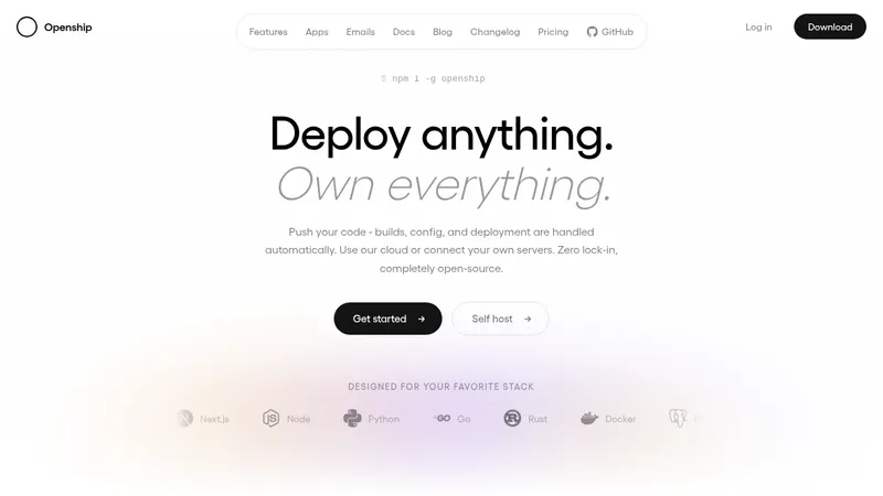

 OpenShip Cloud
Landing page · Cloud & infrastructure
OpenShip Cloud
Landing page · Cloud & infrastructure
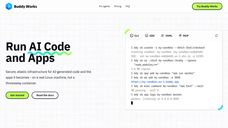

 AI Sandboxes by Buddy
Landing page · Cloud & infrastructure
AI Sandboxes by Buddy
Landing page · Cloud & infrastructure
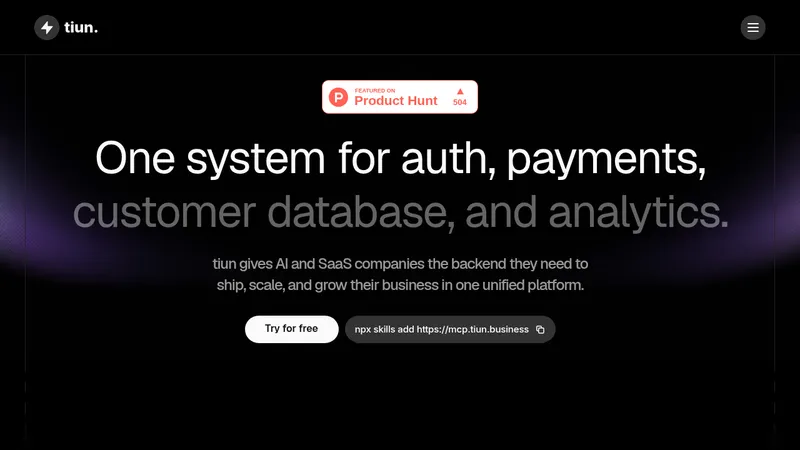

 tiun.
Landing page · Cloud & infrastructure
tiun.
Landing page · Cloud & infrastructure
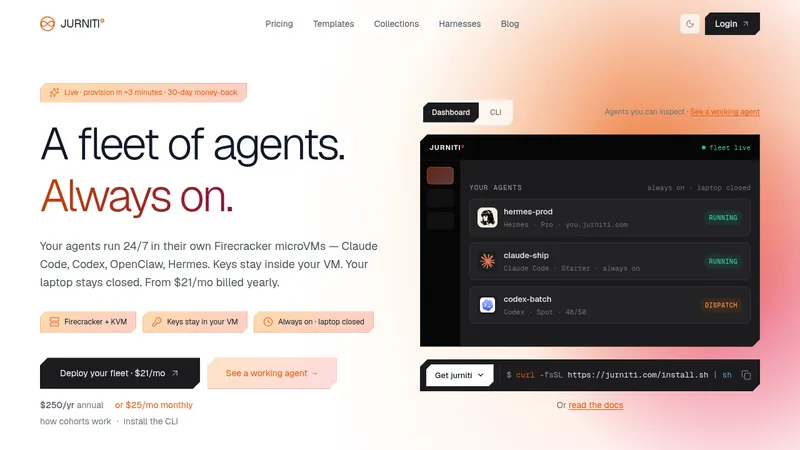

 jurniti
Landing page · Cloud & infrastructure
jurniti
Landing page · Cloud & infrastructure


 cloudflare.com
Landing page · Cloud & infrastructure
cloudflare.com
Landing page · Cloud & infrastructure


 termsquad.com
Landing page · Cloud & infrastructure
termsquad.com
Landing page · Cloud & infrastructure