kage
kage
jurniti.com

Design analysis
A long-form infrastructure landing page uses a restrained editorial system: oversized thin black headings, small uppercase orange section labels, generous white space, and centered content widths. The hero introduces a warm peach-to-pink wash behind a product dashboard, while the body alternates sparse explanatory sections with dense three-column directories, bordered feature cards, terminal panels, pricing columns, and a final FAQ table; peach cards and orange micro-accents provide continuity without overwhelming the monochrome base.
Prompt preview
## Reference images

Study these alongside the description below: hierarchy, rhythm, spacing, colour. Build for the product you are asked about, using this design language.

- Full page: https://kage-design-assets.t3.tigrisfiles.io/screenshots/jurniti/cfab9c3f-60ef-4e80-9a31-cc939c39468c-1789538542122-full.webp
- Above the fold: https://kage-design-assets.t3.tigrisfiles.io/screenshots/jurniti/cfab9c3f-60ef-4e80-9a31-cc939c39468c-1789538537376.webp
- Design on Kage: https://kage.design/designs/jurniti-landing-page

## Before you start
Ask the user what they are building, who it is for, and which brand assets they already have (name, colours, typography, logo, and any existing UI). Wait for their answers before designing. Apply the reference’s structure and design principles to their product, not to the reference product.

## Page structure
1. **Global header:** Create a compact, understated navigation bar with a small brand mark at left, a short set of centered text links, and utility/login and primary action controls at right.
2. **Hero:** Use a two-column hero with a large thin headline and highlighted second line on the left, short explanatory copy, feature chips, primary and secondary CTAs, and small pricing/help text. Place a dark product UI preview on the right over a soft peach-to-pink atmospheric background.
3. **Problem introduction:** Add a centered eyebrow, large two-line heading, and concise paragraph explaining the problem before the product solution.
4. **Problem cards:** Show three equal-width pale peach cards in a row, each with a tiny line icon, short heading, and compact explanatory text.
5. **Platform overview:** Add a centered section introducing the product’s broad platform or ecosystem, with a heading, paragraph, and a dense directory of offerings.
6. **Autonomous/primary directory:** Use a small uppercase category label followed by a three-column grid of light-gray cards. Each card has a small square icon, title, author/source line, and one or two lines of description; allow the final row to be incomplete rather than forcing symmetry.
7. **Coding/tools directory:** Repeat the same three-column card grid for the larger secondary category, preserving the compact metadata hierarchy and light-gray surfaces.
8. **Featured templates:** Add a left-aligned subsection heading and supporting line, with a small browse link at right. Follow with two rows of three white cards using thin dark borders, compact icons, titles, metadata, and descriptions.
9. **Fleet deployment feature:** Introduce a spacious two-column product feature: explanatory heading and paragraph on the left, a delicate system/relationship diagram on the right.
10. **Command/example feature:** Place a dark terminal/code example on the left and a right-side explanatory panel about cohorts or variants, including small metric columns beneath the copy.
11. **Feature grid:** Add a centered heading and paragraph about the core infrastructure qualities, followed by a six-item, three-column grid of small icon-and-copy features with generous whitespace and no heavy card containers.
12. **Memory section:** Use a centered heading and paragraph, then three wide pale peach cards with icons, labels, short descriptions, and small status pills. Add a centered purchase/support note beneath.
13. **Observability section:** Use the same centered editorial pattern, with two wide peach cards side by side, then a narrower centered peach callout card and a small explanatory note.
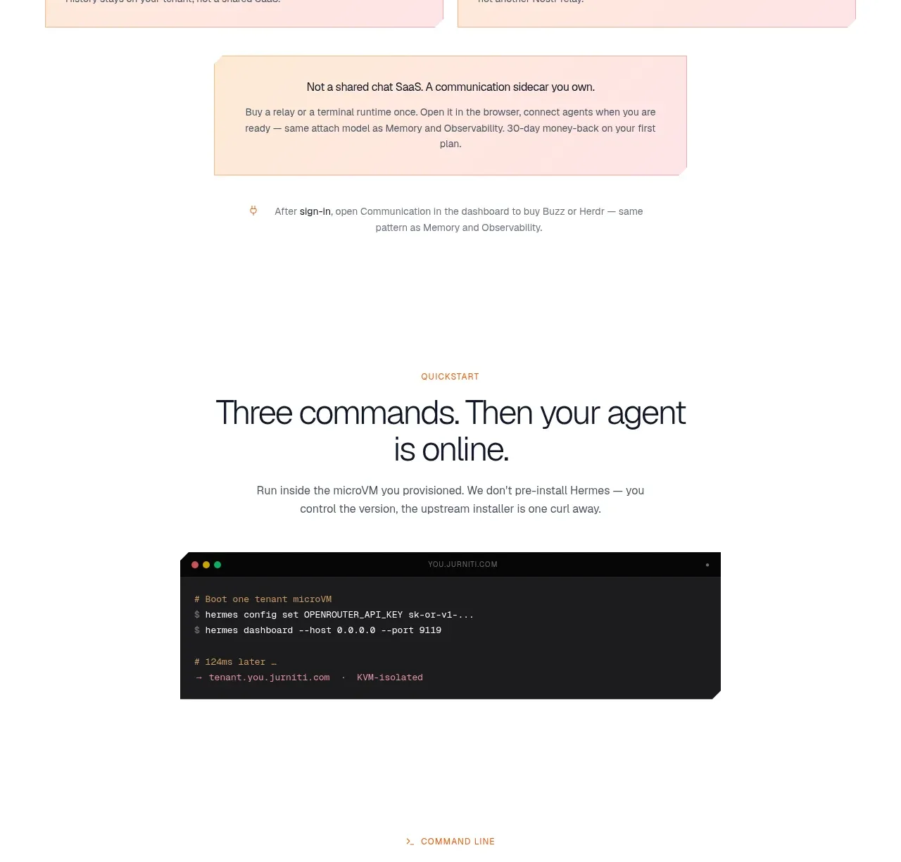
14. **Communication section:** Repeat the pattern with two peach feature cards, a centered callout card, and a small follow-up note, keeping the section rhythm consistent but changing the content density.
15. **Quickstart:** Add a centered heading and short paragraph, then a wide dark terminal window with a few setup commands and colored prompt details.
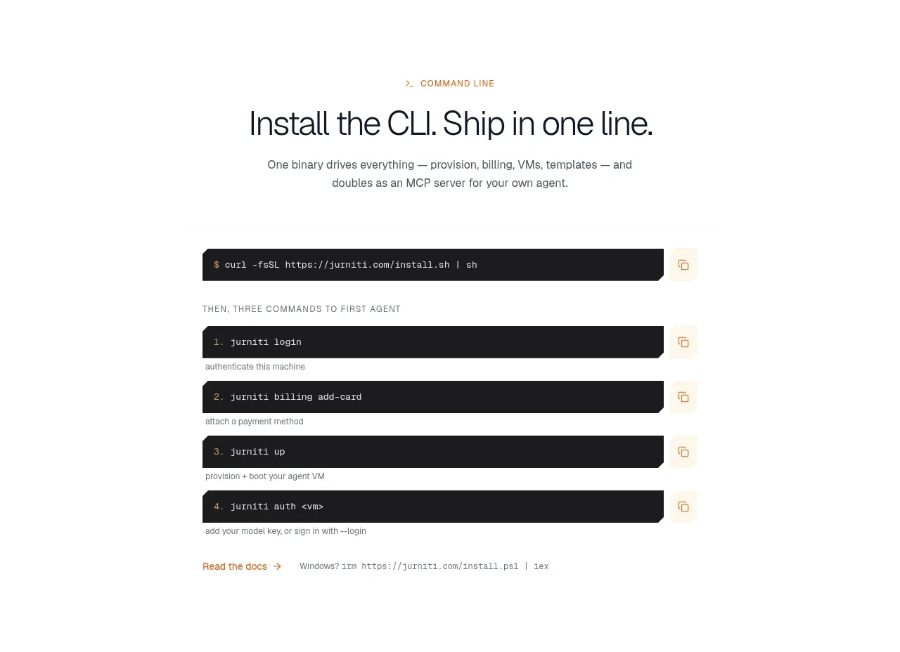
16. **CLI installation:** Present a centered heading and explanation followed by one wide dark install command and a vertical stack of numbered dark command rows, each with a copy affordance. Finish with small documentation/platform links.
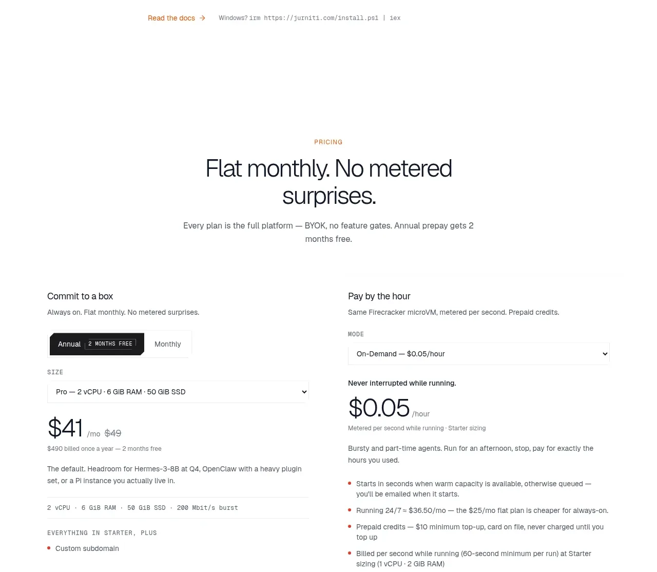
17. **Pricing:** Add a centered pricing heading and supporting copy, then a two-column comparison. The left side is a committed monthly plan with billing toggle, plan selector, large price, included specs, CTA, and guarantee note; the right side explains metered hourly usage with rate, bullets, and credit CTA. Keep the columns separated by a fine vertical rule or generous gap.
18. **Pricing reassurance row:** Add a small centered line of trust points such as guarantee, no markup, cancellation, and fast setup.
19. **FAQ:** Use a centered heading and a wide two-column question-and-answer table. Separate rows with very light horizontal rules; keep questions short and visually distinct from the longer technical answers.
20. **Final CTA:** Add a centered eyebrow, large two-line ownership-oriented heading, short pricing reassurance, and paired dark/peach buttons.
21. **Footer:** Use a warm off-white footer background with the brand mark and short description in the first column, several dense link columns grouped by category, then a bottom legal row and a fine-print block of supporting links/text.

## Design language
- Build hierarchy with a very large, thin sans-serif display scale for section headings, compact regular body copy, and tiny uppercase orange eyebrows with generous letter spacing.
- Keep the page predominantly white and editorial. Alternate very spacious centered sections with dense directory grids, tables, command panels, and pricing details so the long page develops a clear rhythm.
- Use warm accents sparingly: approximate peach `#F8DCCB`, blush pink `#F7DDE0`, pale cream `#FFF8EC`, and muted orange `#C9774F`. Reserve near-black `#171717` for headings, buttons, code panels, and high-contrast UI previews; use cool light gray `#F2F2F1` for directory cards.
- Pair a modern thin grotesk/sans-serif for headings with the same family at smaller weights for body copy; use a monospace face only inside terminal, CLI, and technical code surfaces. Scale headings from roughly 48–64px in the hero to 30–40px for major sections and 18–24px for card titles, with tight line-height.
- Use mostly square or subtly rounded rectangles. Directory cards can have small 4–6px radii; peach feature cards can use slightly softer 6–8px corners. Prefer 1px gray or black borders, almost no shadow, and crisp flat surfaces; reserve glow/gradient only for the hero atmosphere.
- Use small monochrome or orange line icons and compact square product marks as supporting metadata, never as the main visual. Keep card padding consistent and align all grids to a central max-width.
- Treat dark command blocks as deliberate visual anchors: near-black panels, monospace text, small colored prompt fragments, and copy buttons aligned to the right. Keep them compact rather than making them full-screen code editors.
- Use repeated component patterns for peach feature cards, command rows, FAQ rows, and directory cards, but vary section spacing and width to avoid a monotonous page.
- Keep interaction understated: buttons may darken slightly on hover, peach cards may lift by 1–2px, directory/template cards may gain a faint border emphasis, and copy controls should provide a concise copied state. Avoid dramatic animations; use subtle fade/slide reveals for long-form sections.
- Ensure the dense grids, pricing comparison, FAQ table, and footer remain readable on smaller screens by collapsing columns into a single vertical flow while preserving the editorial spacing and clear grouping.

## Never
- Do not copy any logo, wordmark, product name, tagline, marketing copy, illustrations, photography, screenshots, icon set, exact directory entries, or code from the reference.
- Do not present the result as the reference product or imply affiliation with it.
- Create original brand assets, content, labels, UI examples, and product-specific terminology for the user’s product.
Components from this page
All components
 Top navigation
jurniti · Navigation
Top navigation
jurniti · Navigation
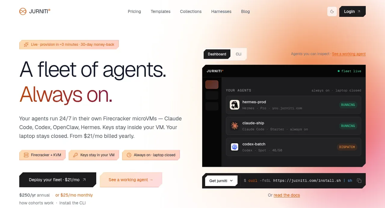 Agent platform hero
jurniti · Hero
Agent platform hero
jurniti · Hero
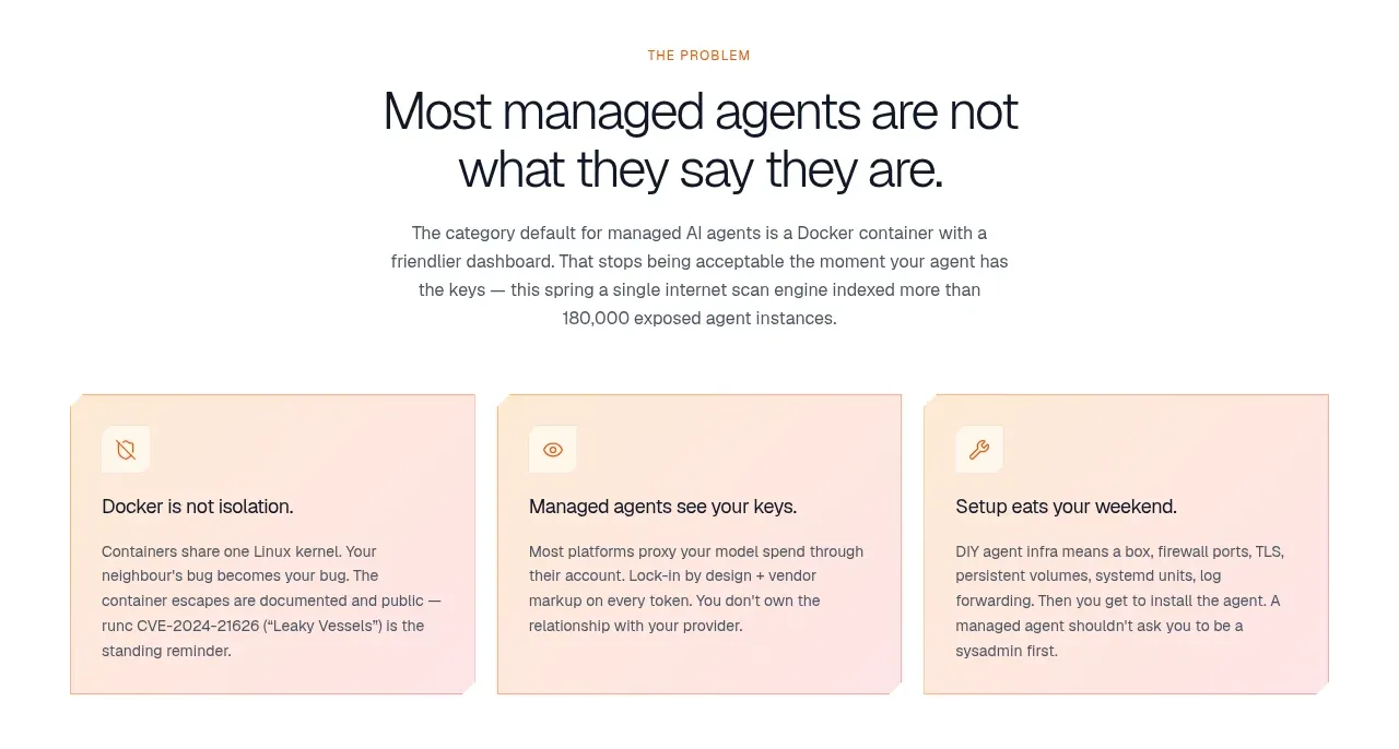 Problem cards
jurniti · Feature grid
Problem cards
jurniti · Feature grid
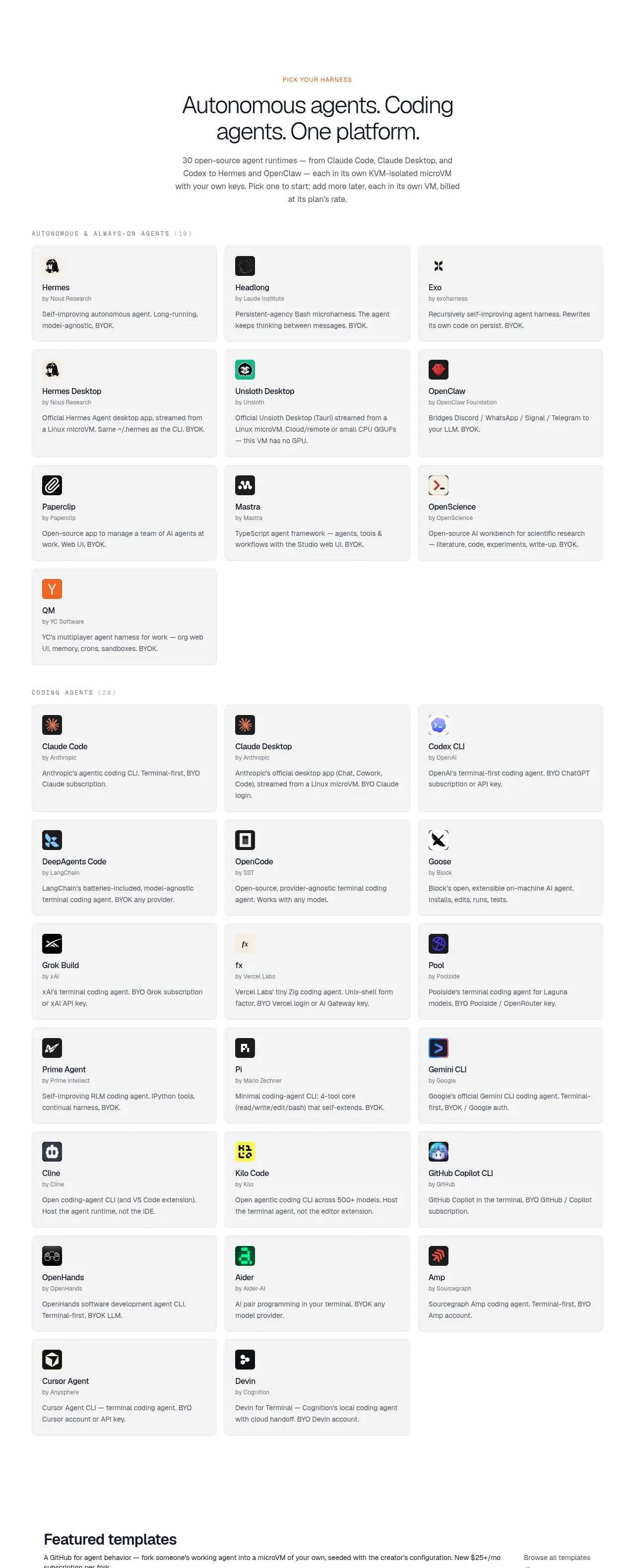 Agent directory
jurniti · Feature grid
Agent directory
jurniti · Feature grid
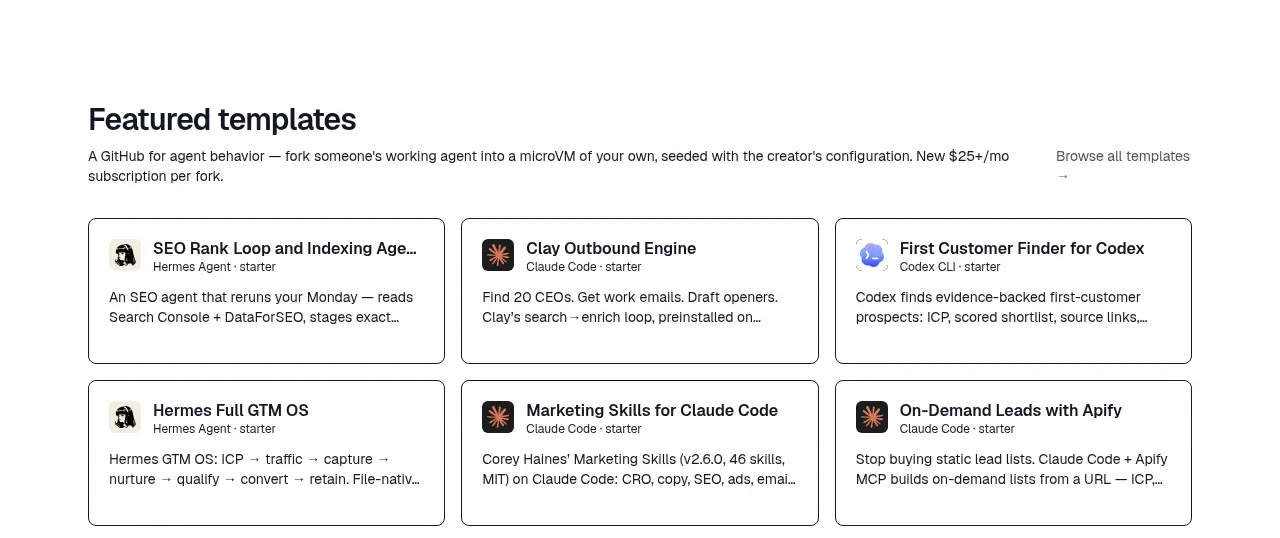 Featured templates
jurniti · Feature grid
Featured templates
jurniti · Feature grid
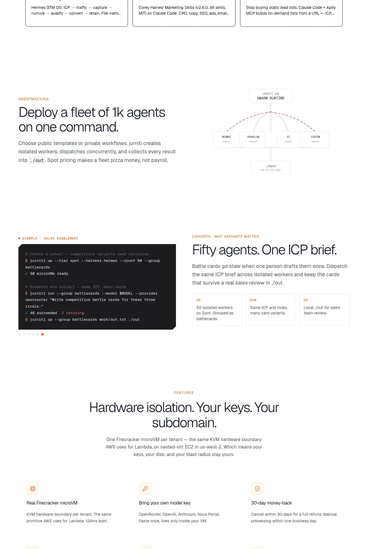 Deployment workflow
jurniti · Feature grid
Deployment workflow
jurniti · Feature grid
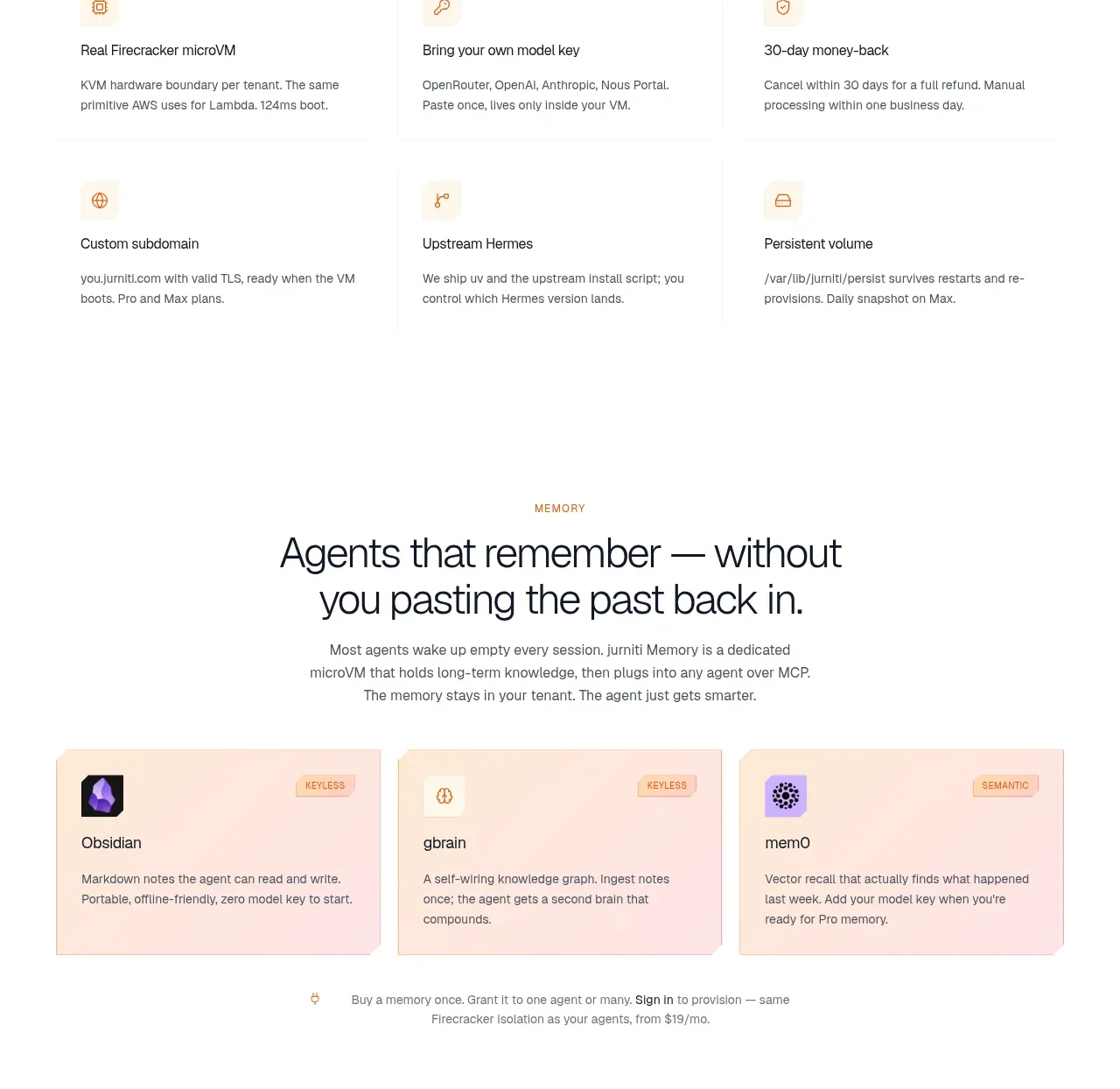 Infrastructure capabilities
jurniti · Feature grid
Infrastructure capabilities
jurniti · Feature grid
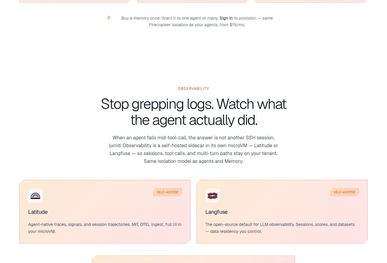 Memory modules
jurniti · Feature grid
Memory modules
jurniti · Feature grid
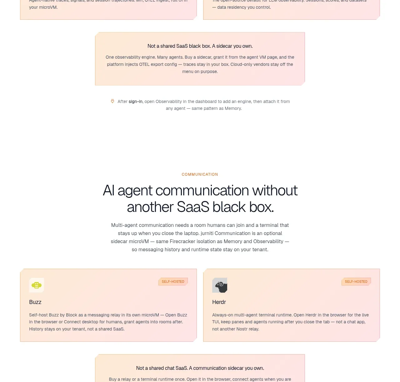 Observability tools
jurniti · Feature grid
Observability tools
jurniti · Feature grid
 Communication integrations
jurniti · Feature grid
Communication integrations
jurniti · Feature grid
 Quickstart terminal
jurniti · Code block
Quickstart terminal
jurniti · Code block
 CLI installation steps
jurniti · Code block
CLI installation steps
jurniti · Code block