kage
kage
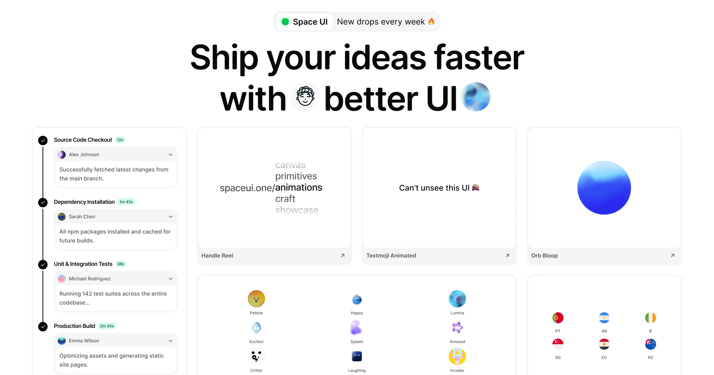
Design analysis
A 1200×630 social card that compresses the product's landing page into one canvas: a two-segment pill badge sits dead-centre at the top, followed by a two-line near-black headline at roughly 68px with a circular face chip and a blue gradient orb dropped inline where words would go. The lower ~45% is a deliberately cropped bento strip — a CI-style timeline with black check nodes and mint duration chips, three labelled demo tiles with ↗ footers, and grids of avatar orbs and flag chips — signalling a living product page without clutter. Colour is disciplined (white surfaces, hairline #E5E5E5 borders, one blue gradient, mint-green status chips), so the extreme scale contrast between the 68px headline and 12px card meta does all the hierarchy work.
Prompt preview
## Reference images

Study these alongside the description below: hierarchy, rhythm, spacing, colour. Build for the product you are asked about, using this design language.

- Screenshot: https://kage-design-assets.t3.tigrisfiles.io/screenshots/spaceui-one/73d75f12-2724-446e-9ed2-4f1a340e1bd2-1790162330705.webp
- Design on Kage: https://kage.design/designs/spaceui-one-og-image

## Before you start
Ask the user what they are building, who it is for, and what brand assets they already have (product name, one-line promise/tagline, brand colours, typeface, any avatar or mark they use). Also ask what single message the card must land in under two seconds, and whether they want HTML/CSS rendered to PNG or an SVG. Wait for the answers before designing — everything below is applied to their product, not to the reference site.

The deliverable: one social preview image at exactly **1200×630 px**. Build it as a fixed-size HTML/CSS canvas (`.card { width: 1200px; height: 630px; overflow: hidden; }`) rendered to PNG via a headless browser (Playwright/Puppeteer), or as a single SVG with `viewBox="0 0 1200 630"`. Embed or use deterministic system-safe fonts so the render doesn't shift.

## Page structure
A centred single-column composition on a white canvas with ~48–56px outer padding, built top to bottom:

1. **Badge row** (~40px from top): a horizontally centred two-segment pill. Left segment on white with a hairline border: a small filled status dot + short wordmark (~13px, medium). Right segment on a light grey chip: a one-line promise ("New drops every week"-style, ~13px). Total pill height ~36–40px.
2. **Headline block** (~38% of canvas height): two short centred lines of heavy near-black sans at 64–72px, tight tracking. Inside the sentence, one or two decorative inline elements sit where words would go — a small circular face/avatar chip (~1em) and a blue gradient orb (~1.1em) — so type and image share the same baseline and the line reads as a sentence, not a title + image.
3. **Bento preview strip** (lower ~45%, deliberately cropped by the bottom edge):
   - **Left timeline column** (~30% width): a white card with four stacked steps — each a black circular check node on a vertical connector line, a bold 12–13px step title, a mint-green duration chip (12s / 1m45s style), then an avatar row and a greyed 11–12px one-line body that truncates with ellipsis.
   - **Right demo row**: three equal-width white tiles, each with a centred demo moment (a stacked word list mid-animation, one line of display text with an emoji, a single gradient orb) and a footer bar: 12–13px label left, ↗ arrow right.
   - **Bottom row** (cropped ~70% by the canvas edge): a 3×3 grid of small named avatar/emoji-style orbs (name in 10–11px grey below each) and a 2×3 grid of circular flag-style chips with two-letter codes. Let the canvas cut these off on purpose.

## Design language
- **One focal point, one accent.** The headline owns the card; everything beneath it is 11–13px, giving ~5:1 scale contrast. Hierarchy comes from size alone, not colour or weight variety.
- **Crops as a device.** Cards running off the bottom edge make a static image feel like a window onto a longer page. Never try to fit everything inside — crop intentionally, but keep badge and headline fully within a ≥40px safe margin.
- **Colour system (approx hex):** canvas #FFFFFF; text #0A0A0A; hairline borders #E5E5E5–#EEEEEE; grey chip fill #F5F5F5; mint status chips #DCFCE7 background with #059669 text/dot; single blue gradient accent #60A5FA→#1D4ED8. Nothing else — no photography, no second accent.
- **Type:** one geometric grotesque (Inter/SF-style). Headline at 600–700 weight, −0.02em, line-height ~1.05, sized so two short lines fill the width with air. Card labels 500 weight; timeline body 400 greyed to #6B7280.
- **Surfaces:** white cards, 1px hairline borders, 14–16px radius, no drop shadows (or imperceptible at most). Separation comes from grid rhythm and hairlines, never elevation.
- **Inline imagery beats hero photography.** Small round visual moments (avatar chips, gradient orbs) embedded in the headline line act like punctuation.
- **Suggest motion statically.** In a still image, imply liveness with ↗ affordances, green timer chips, and demos frozen mid-animation rather than decorative flourishes.
- **Grid:** strict columns with ~24px gutters; every tile aligns to the same outer padding so the cropped bottom row still reads as part of one system.

## Never
- Never reuse the reference product's name, wordmark, tagline, headline copy, emoji set, avatar names, or card labels — replace all of it with the user's own placeholder branding and copy.
- Never present the result as the reference product or include its logo, illustrations, or icon set.
- Never break the monochrome-plus-one-accent system with stock photos, extra accent colours, or heavy illustration; never add shadows or 3D effects to force depth.