 kage
kage
openflowkit.com
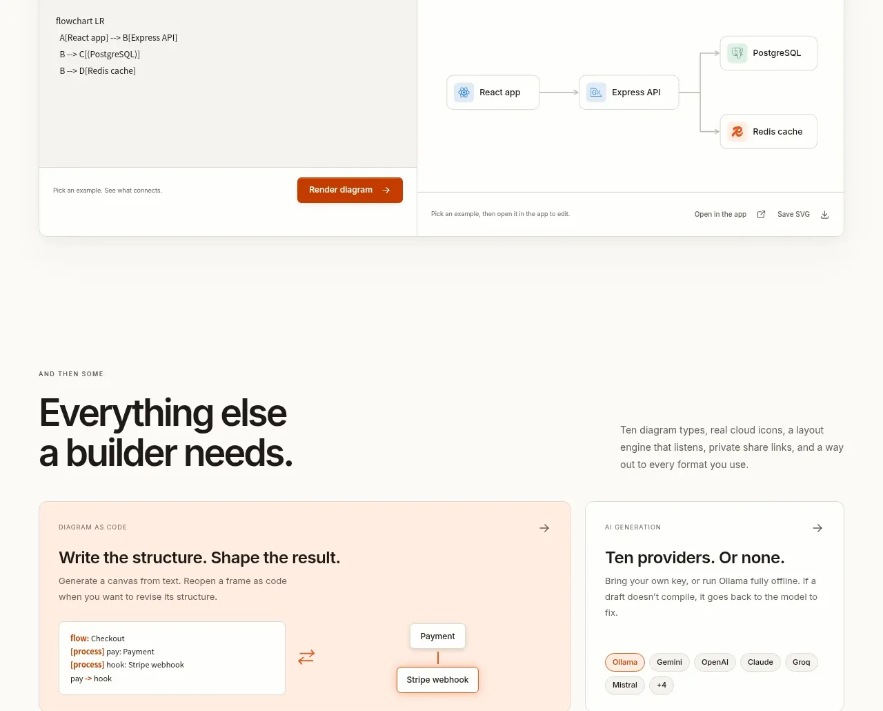
Design analysis
A split editor demonstrates a direct relationship between source text and a rendered diagram, with a clear render action and preview controls.
Prompt preview
## Reference images

Study these alongside the description below: hierarchy, rhythm, spacing, colour. Build for the product you are asked about, using this design language.

- Component: https://kage-design-assets.t3.tigrisfiles.io/components/openflowkit-2/3de20331-4179-415d-a7ba-29915155b155-1791957762-8.webp
- Full page it was cut from: https://kage-design-assets.t3.tigrisfiles.io/screenshots/openflowkit-2/3de20331-4179-415d-a7ba-29915155b155-1791957697393-full.webp
- Component on Kage: https://kage.design/component/openflowkit-2-code-block

## Before you start
Ask what source format and rendered output the user's product connects, plus what minimum interactive flow should be demonstrated.

Build a wide split-pane code-to-visual component. Add a slim header with a file/context label on the left and a select or view control on the right. The left pane uses a warm gray background (`#f3f2ee`) and monospace code with comfortable line height; the right pane is white and contains a simple connected visual preview. Separate panes with a 1px border. Add a bottom action bar with a prominent burnt-orange “render/apply” button, secondary controls, and a small status message. Use 10–12px radii on the outer frame, a subtle shadow, and responsive behavior that stacks or switches between tabs on mobile. Keep code and preview legible at all widths.

Never use the reference's logo, product name, copy, illustrations, imagery, or exact code/diagram content.
More components
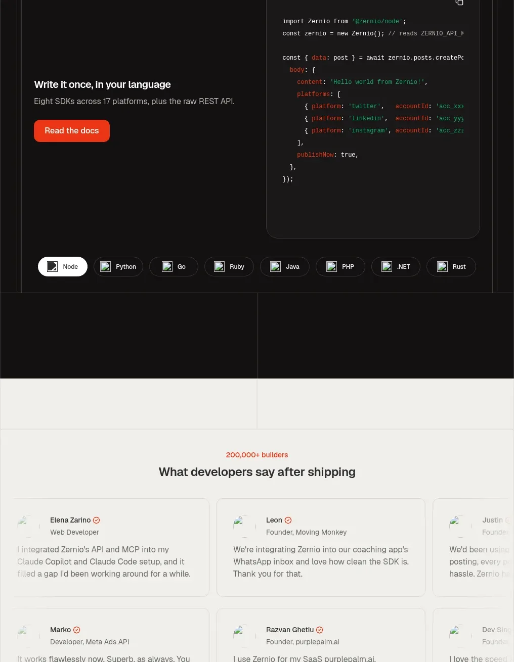
 Developer integration code showcase
Zernio · Code block
Developer integration code showcase
Zernio · Code block
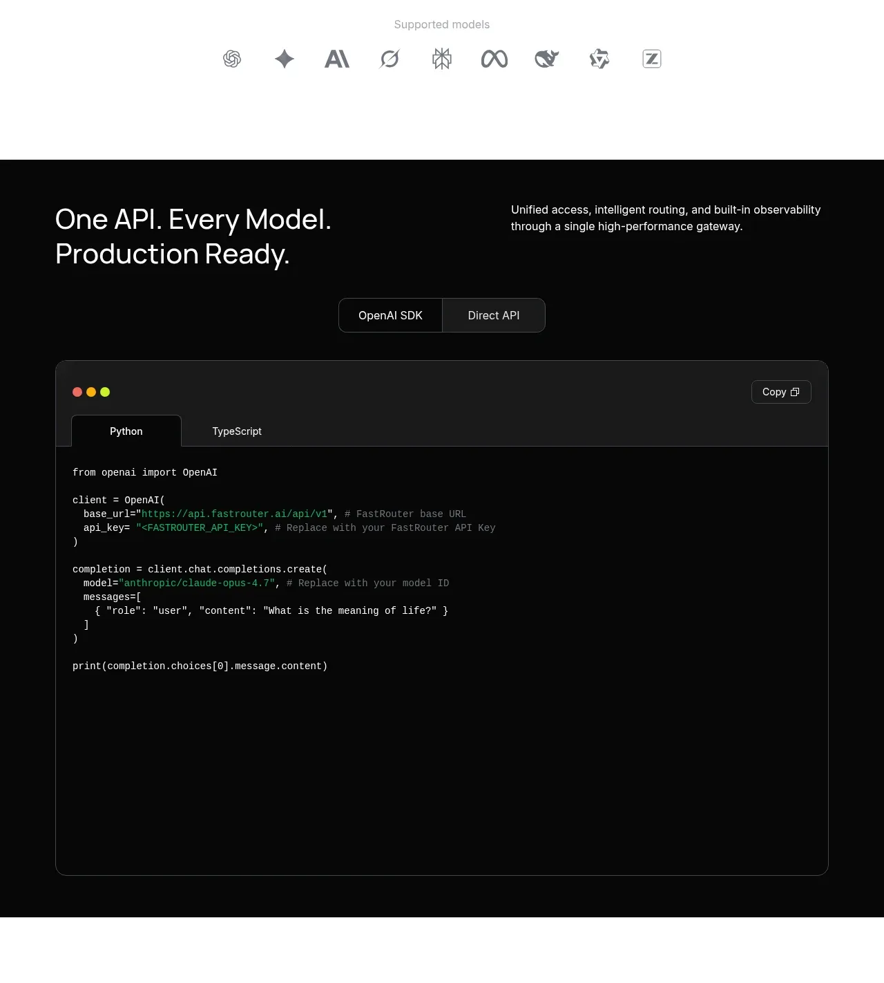
 Production-ready API code example
FastRouter.ai · Code block
Production-ready API code example
FastRouter.ai · Code block
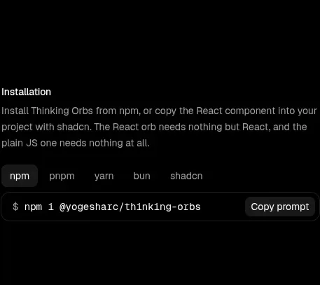
 Installation instructions
Thinking Orbs · Code block
Installation instructions
Thinking Orbs · Code block
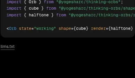 Shapes and render extensions
Thinking Orbs · Code block
Shapes and render extensions
Thinking Orbs · Code block
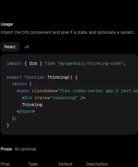 Usage example
Thinking Orbs · Code block
Usage example
Thinking Orbs · Code block
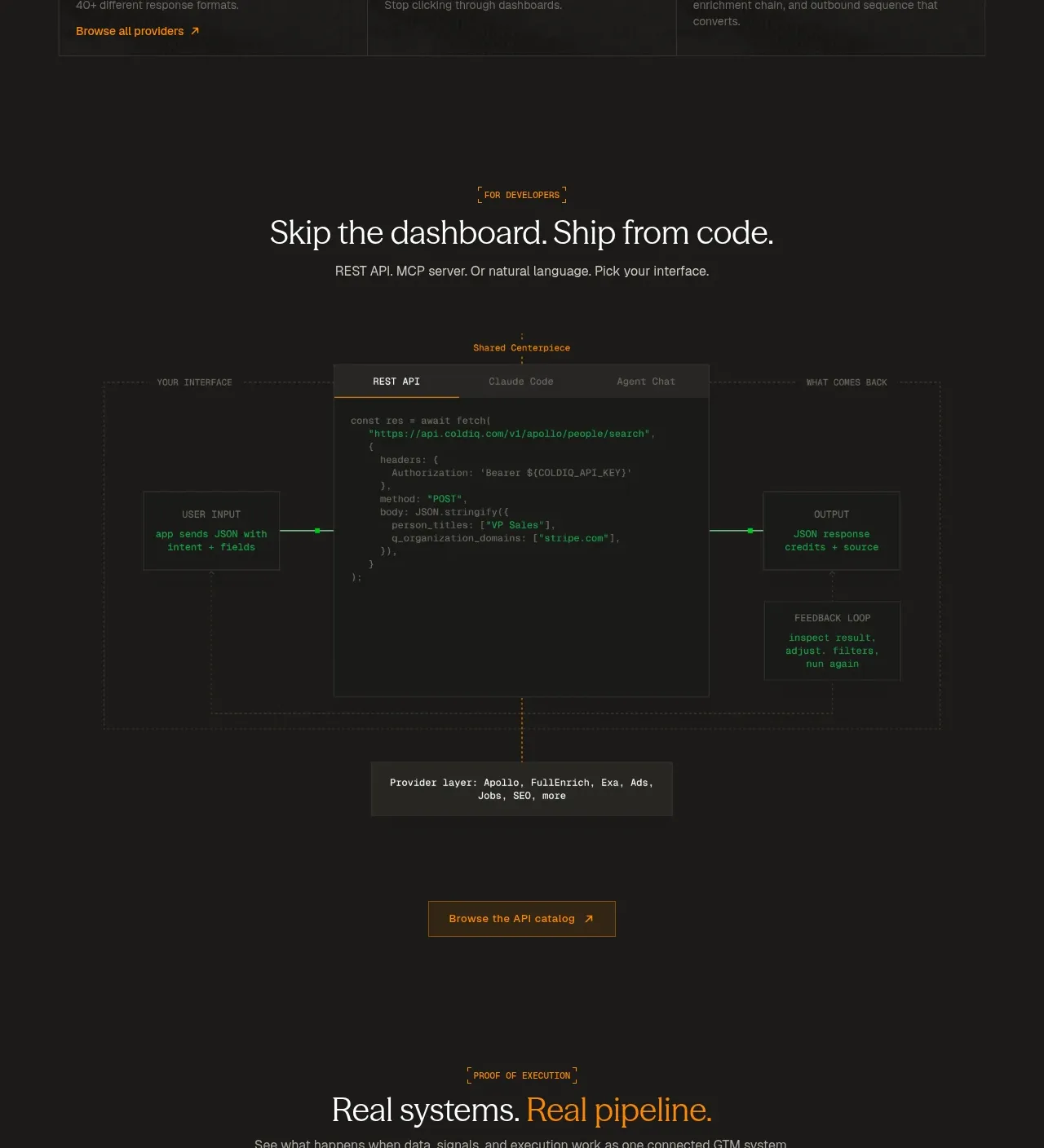
 Code-first integration explainer
ColdIQ x Slack · Code block
Code-first integration explainer
ColdIQ x Slack · Code block