 kage
kage
zernio.link
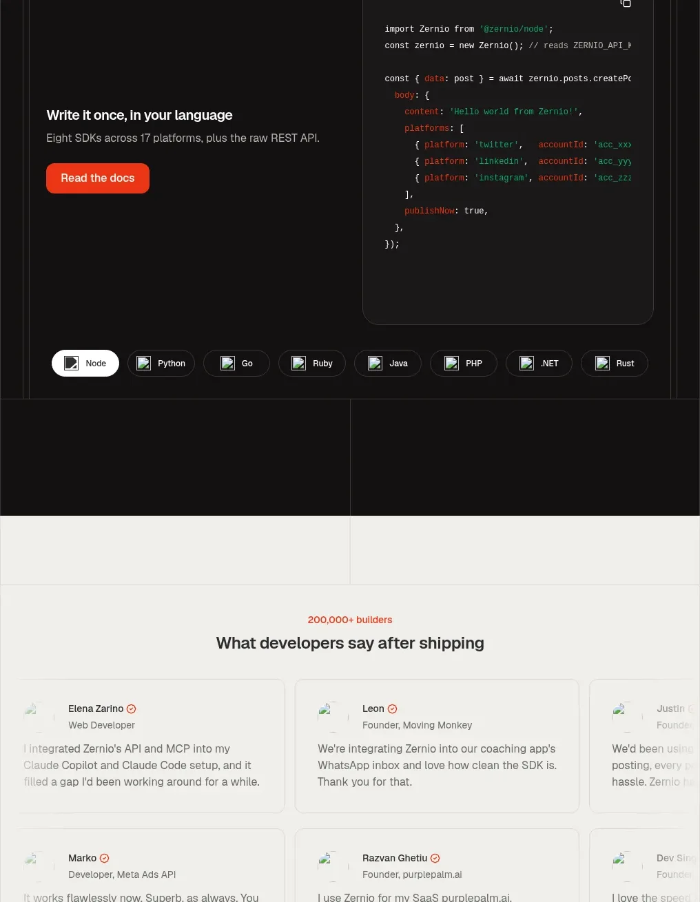
Design analysis
A second dark section presents API, MCP, and CLI modes through tabs, with a large code-oriented panel, language selectors, and documentation CTA.
Prompt preview
## Reference images

Study these alongside the description below: hierarchy, rhythm, spacing, colour. Build for the product you are asked about, using this design language.

- Component: https://kage-design-assets.t3.tigrisfiles.io/components/zernio/c501b537-d018-43e7-982b-563c0d4d1135-1791612293-9.webp
- Full page it was cut from: https://kage-design-assets.t3.tigrisfiles.io/screenshots/zernio/c501b537-d018-43e7-982b-563c0d4d1135-1791612175252-full.webp
- Component on Kage: https://kage.design/component/zernio-code-block

## Before you start
Ask what the user's product, audience, and brand are, then apply the following principles to that product rather than copying the reference.

Build a dark developer section with a centered eyebrow, heading, and supporting sentence. Add a large bordered code-demo shell with top tabs for integration modes, a split interior containing a short value proposition and CTA on the left and syntax-highlighted code on the right, and a bottom row of language pills. Use #111111 for the canvas, #1d1d1d for panels, #343434 borders, warm white text, subdued gray copy, and orange-red accents for the active tab and CTA. Provide copy-to-clipboard and keyboard-accessible tab interactions. On smaller screens, stack the value proposition above the code while keeping the code horizontally scrollable.

Never: use logos, product names, copy, illustrations, or imagery from the reference.
More components
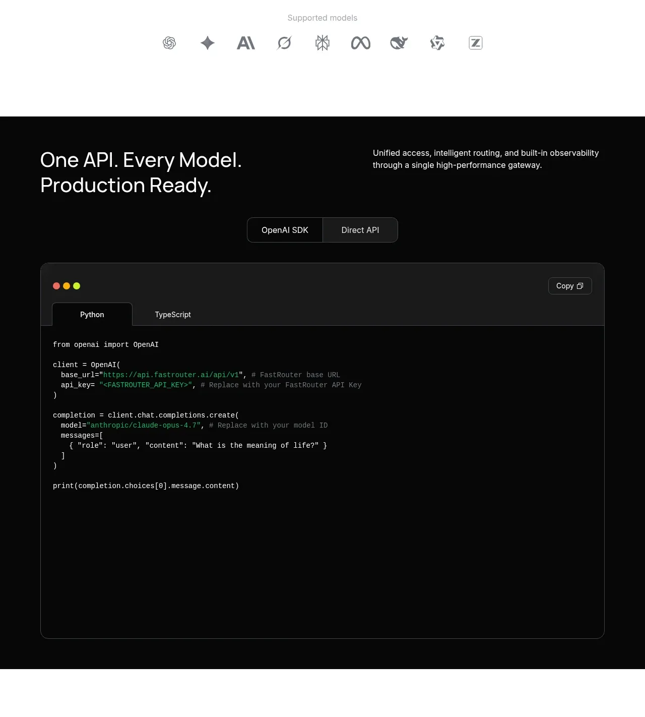
 Production-ready API code example
FastRouter.ai · Code block
Production-ready API code example
FastRouter.ai · Code block
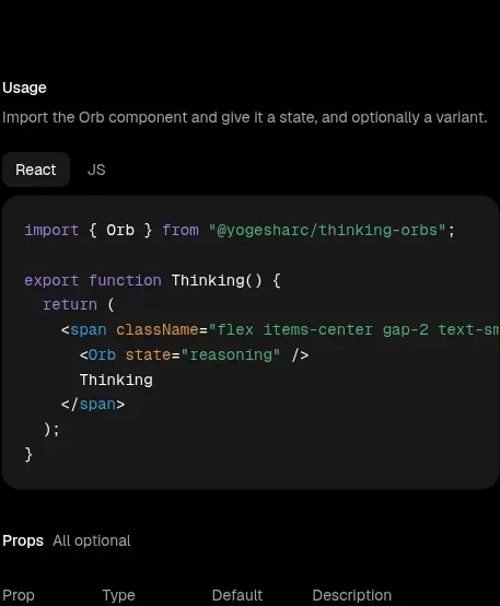
 Usage example
Thinking Orbs · Code block
Usage example
Thinking Orbs · Code block
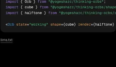 Shapes and render extensions
Thinking Orbs · Code block
Shapes and render extensions
Thinking Orbs · Code block
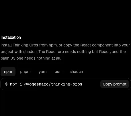 Installation instructions
Thinking Orbs · Code block
Installation instructions
Thinking Orbs · Code block
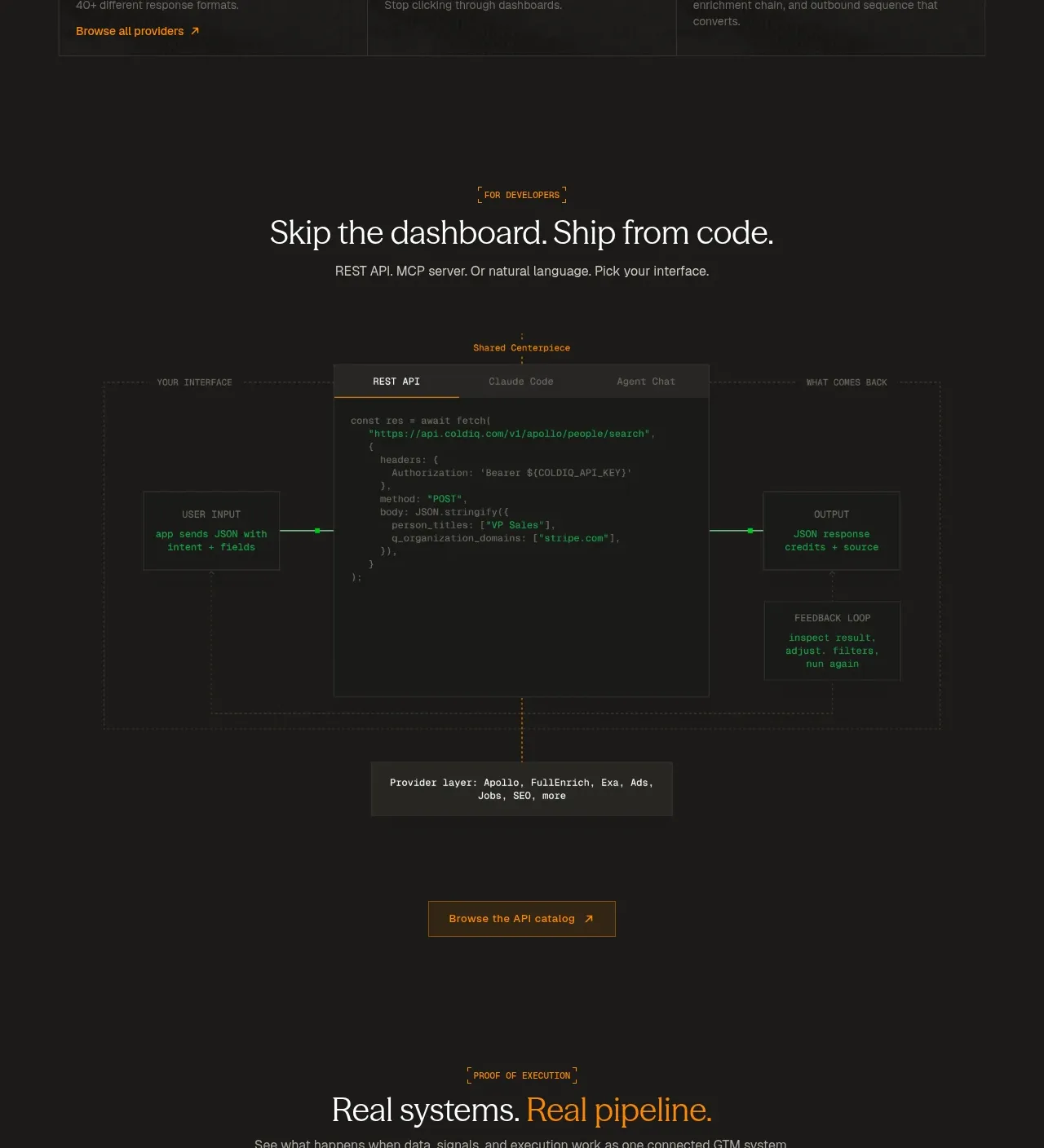
 Code-first integration explainer
ColdIQ x Slack · Code block
Code-first integration explainer
ColdIQ x Slack · Code block
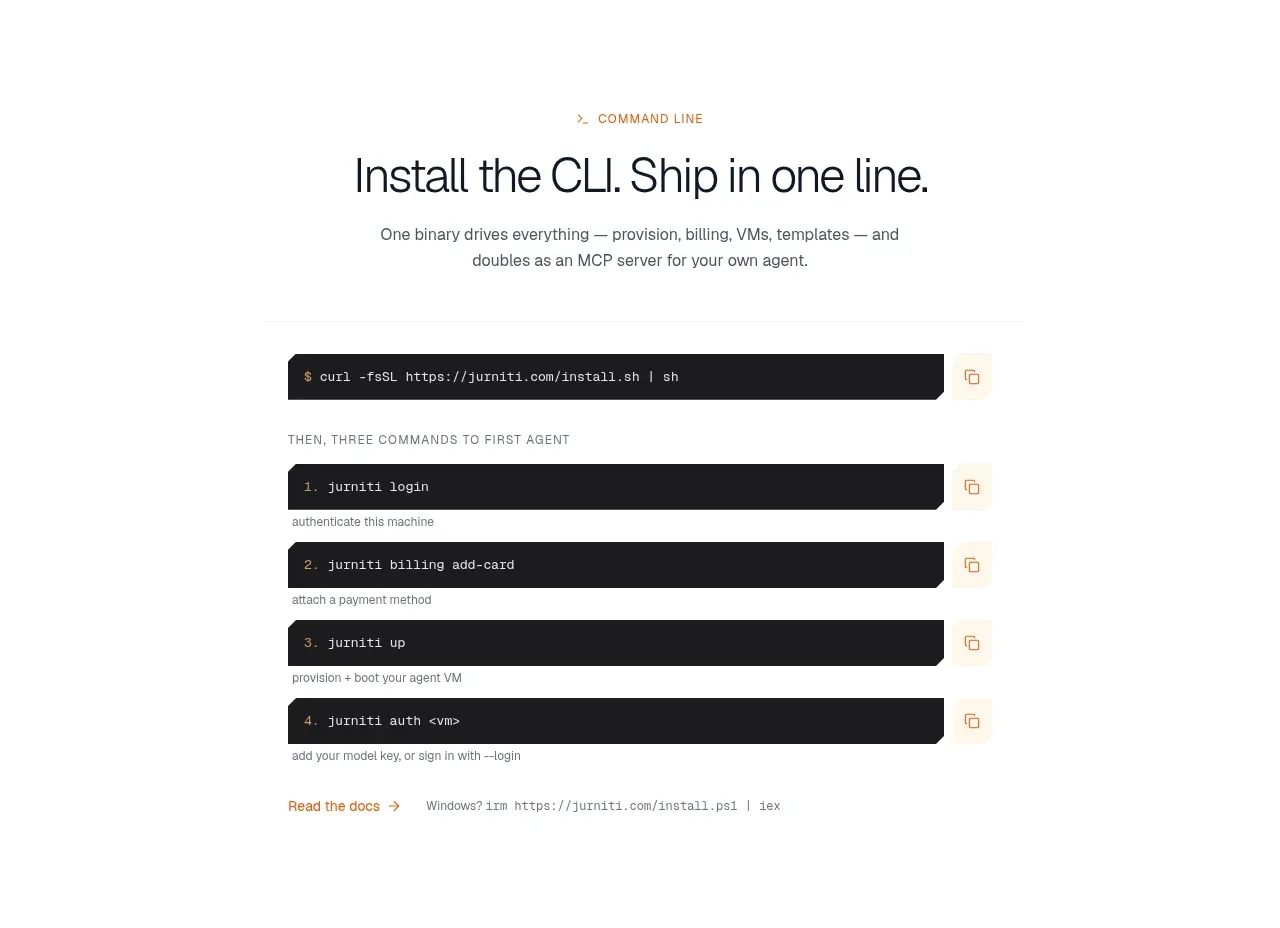
 Quickstart terminal
jurniti · Code block
Quickstart terminal
jurniti · Code block