 kage
kage
thinkingorbs.com
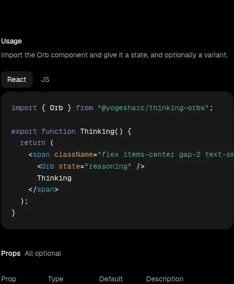
Design analysis
The usage section explains the basic API with a framework tab and a large syntax-highlighted code panel, keeping the visual language consistent with the installation block.
Prompt preview
## Reference images

Study these alongside the description below: hierarchy, rhythm, spacing, colour. Build for the product you are asked about, using this design language.

- Component: https://kage-design-assets.t3.tigrisfiles.io/components/thinking-orbs/1e178b90-85cc-40c4-86e5-bc16130bc9ab-1791180317-3.webp
- Full page it was cut from: https://kage-design-assets.t3.tigrisfiles.io/screenshots/thinking-orbs/1e178b90-85cc-40c4-86e5-bc16130bc9ab-1791180214590-full.webp
- Component on Kage: https://kage.design/component/thinking-orbs-code-block-2

## Before you start
Ask what the user's product and brand are, then apply the principles below to that product rather than reproducing the reference.

Create a usage documentation section for a developer product. Align it to a narrow content column and include a small heading, one muted sentence, a compact framework/language tab switcher, and a large code block. Use a charcoal code surface (#171717) with a 12px radius, subtle #242424 border, 14–15px padding, and a monospace font around 11–12px. Apply restrained syntax colors: lavender for keywords, cyan/blue for tags or properties, green for strings, and gray for punctuation. Keep line height around 1.65 and allow horizontal scrolling on mobile. Add a copy-code control that appears on hover or remains accessible in the header. The section should teach the basic integration without becoming visually dominant.

Never: use logos, product names, copy, illustrations, or imagery from the reference.
More components
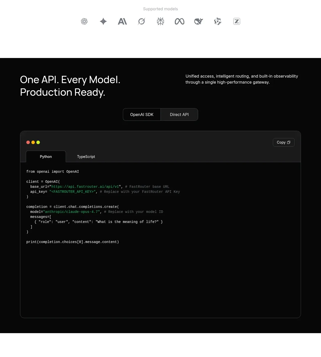
 Production-ready API code example
FastRouter.ai · Code block
Production-ready API code example
FastRouter.ai · Code block
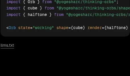
 Shapes and render extensions
Thinking Orbs · Code block
Shapes and render extensions
Thinking Orbs · Code block
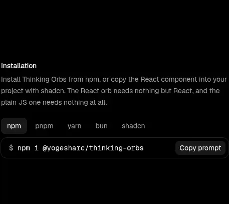 Installation instructions
Thinking Orbs · Code block
Installation instructions
Thinking Orbs · Code block
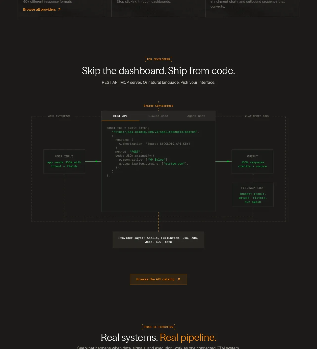
 Code-first integration explainer
ColdIQ x Slack · Code block
Code-first integration explainer
ColdIQ x Slack · Code block
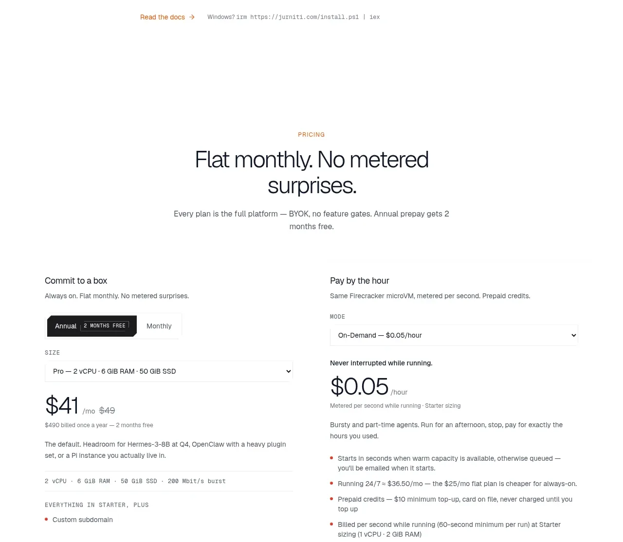
 CLI installation steps
jurniti · Code block
CLI installation steps
jurniti · Code block
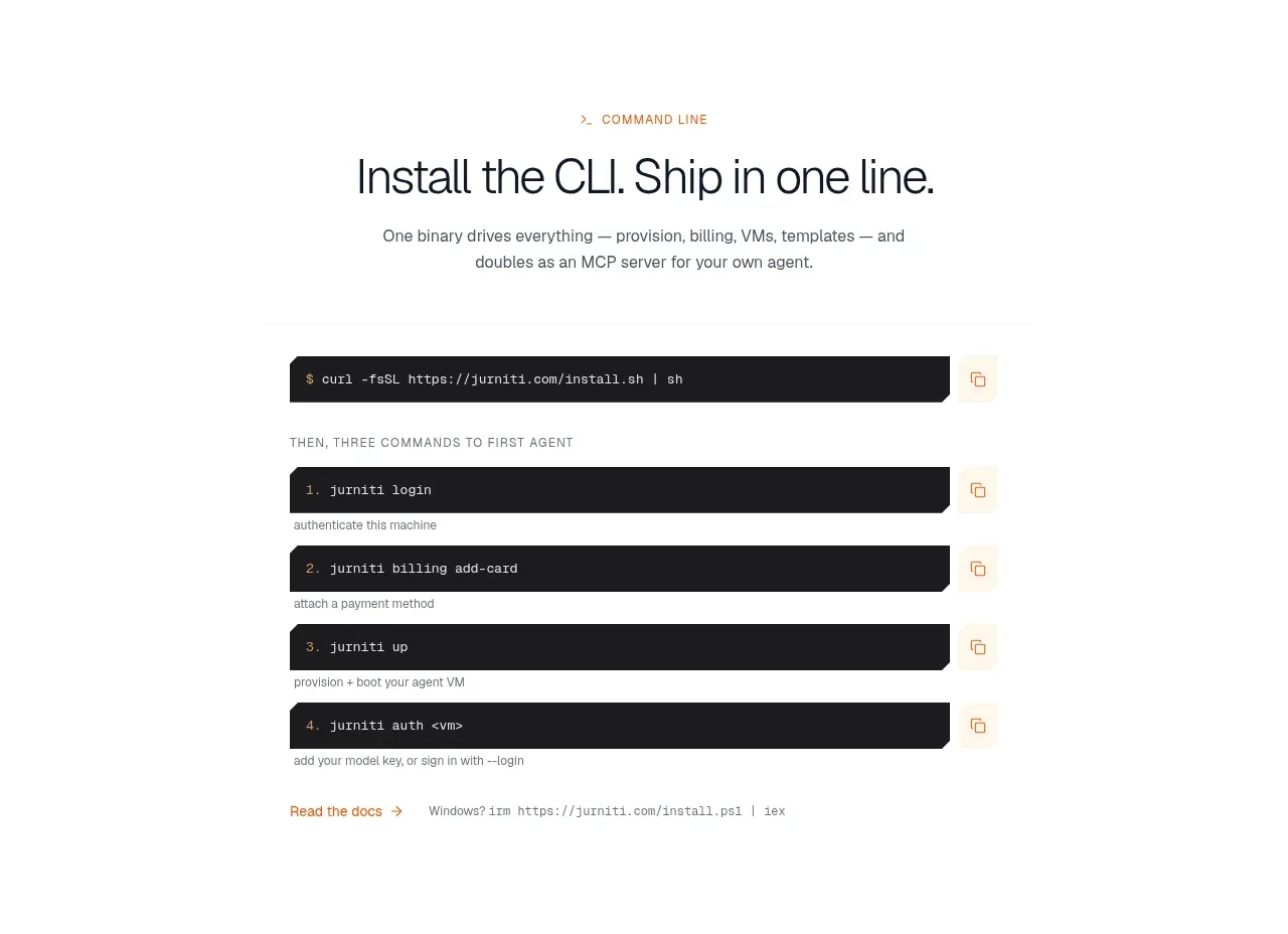 Quickstart terminal
jurniti · Code block
Quickstart terminal
jurniti · Code block