 kage
kage
thinkingorbs.com
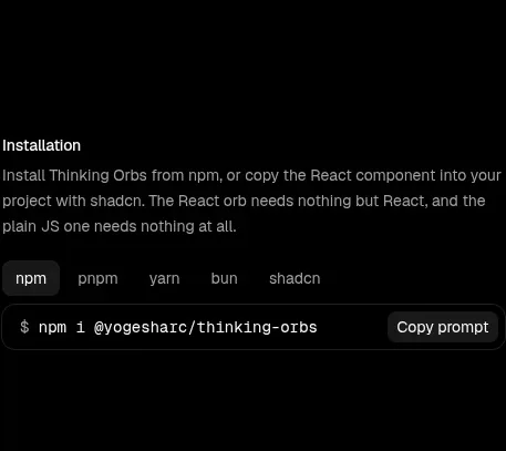
Design analysis
A narrow documentation block begins the content below the gallery, using a short explanation, package-manager tabs, and a compact command row with a copy action.
Prompt preview
## Reference images

Study these alongside the description below: hierarchy, rhythm, spacing, colour. Build for the product you are asked about, using this design language.

- Component: https://kage-design-assets.t3.tigrisfiles.io/components/thinking-orbs/1e178b90-85cc-40c4-86e5-bc16130bc9ab-1791180317-2.webp
- Full page it was cut from: https://kage-design-assets.t3.tigrisfiles.io/screenshots/thinking-orbs/1e178b90-85cc-40c4-86e5-bc16130bc9ab-1791180214590-full.webp
- Component on Kage: https://kage.design/component/thinking-orbs-code-block

## Before you start
Ask what the user's product and brand are, then apply the principles below to that product rather than reproducing the reference.

Build a narrow installation documentation section on a black page, aligned to the same left edge as the main documentation column. Use a small 13px white section title, a 12px gray explanatory paragraph, and a horizontal tab group for package managers. Tabs should be compact charcoal pills with one active tab using a slightly lighter fill and white text. Below, place a single-line monospace command inside a near-black rounded container with a subtle border, plus a small right-aligned copy button. Use #050505 page background, #181818 surfaces, #2a2a2a borders, #d8d8d8 primary text, and #777777 secondary text. Keep vertical spacing calm and documentation-like, with an accessible tablist and copy feedback state.

Never: use logos, product names, copy, illustrations, or imagery from the reference.
More components
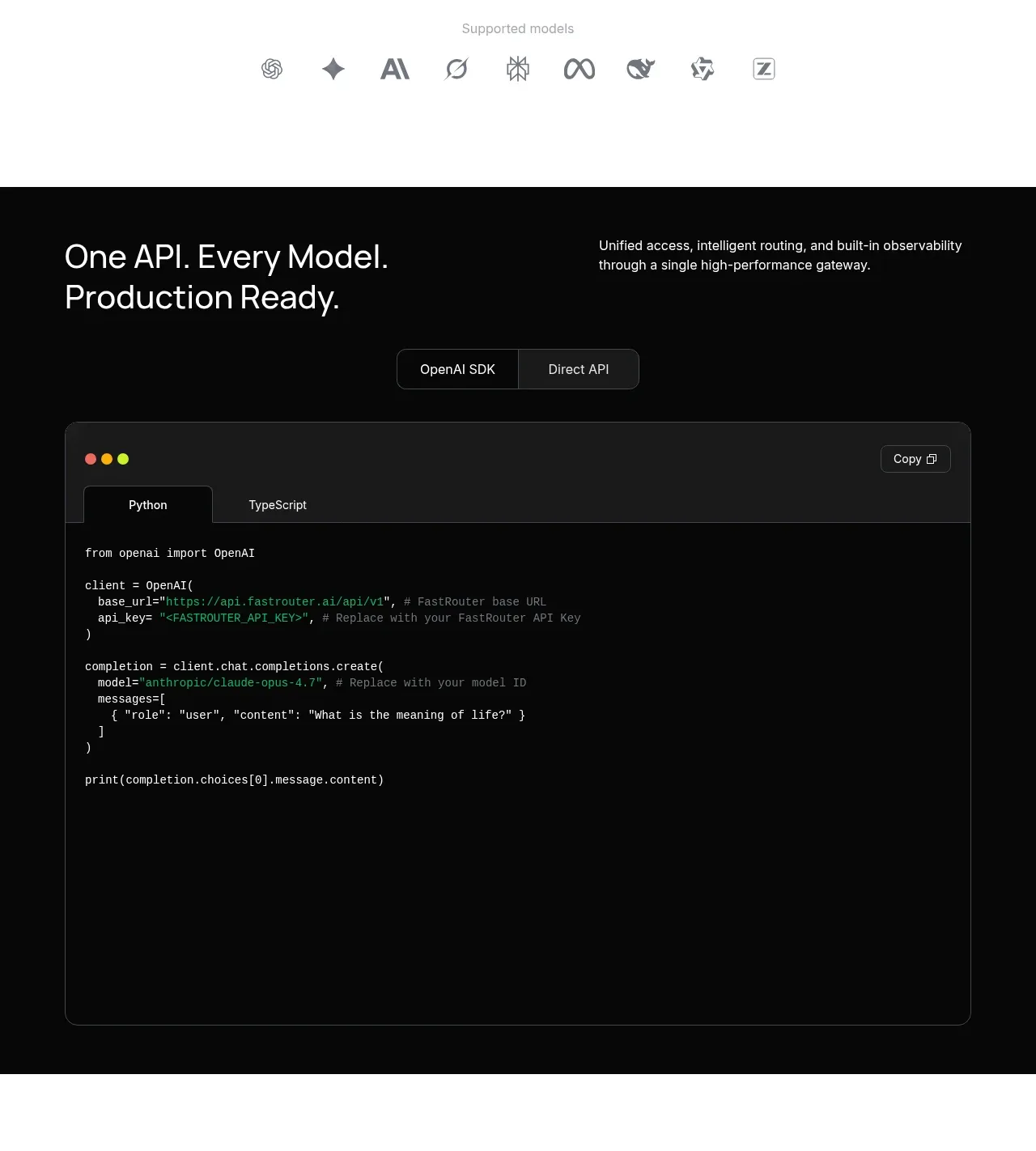
 Production-ready API code example
FastRouter.ai · Code block
Production-ready API code example
FastRouter.ai · Code block
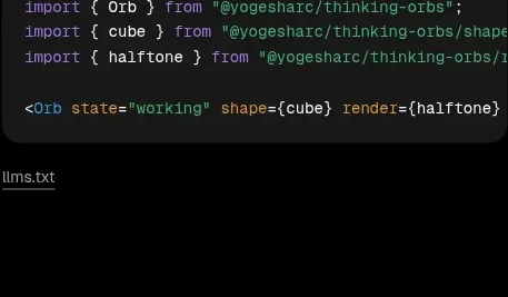
 Shapes and render extensions
Thinking Orbs · Code block
Shapes and render extensions
Thinking Orbs · Code block
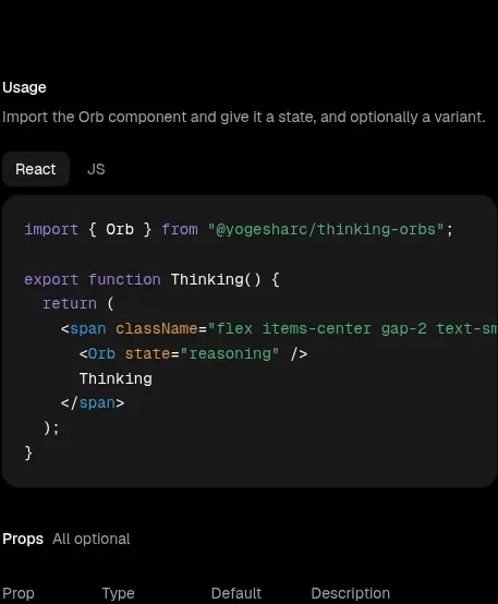 Usage example
Thinking Orbs · Code block
Usage example
Thinking Orbs · Code block

 Code-first integration explainer
ColdIQ x Slack · Code block
Code-first integration explainer
ColdIQ x Slack · Code block
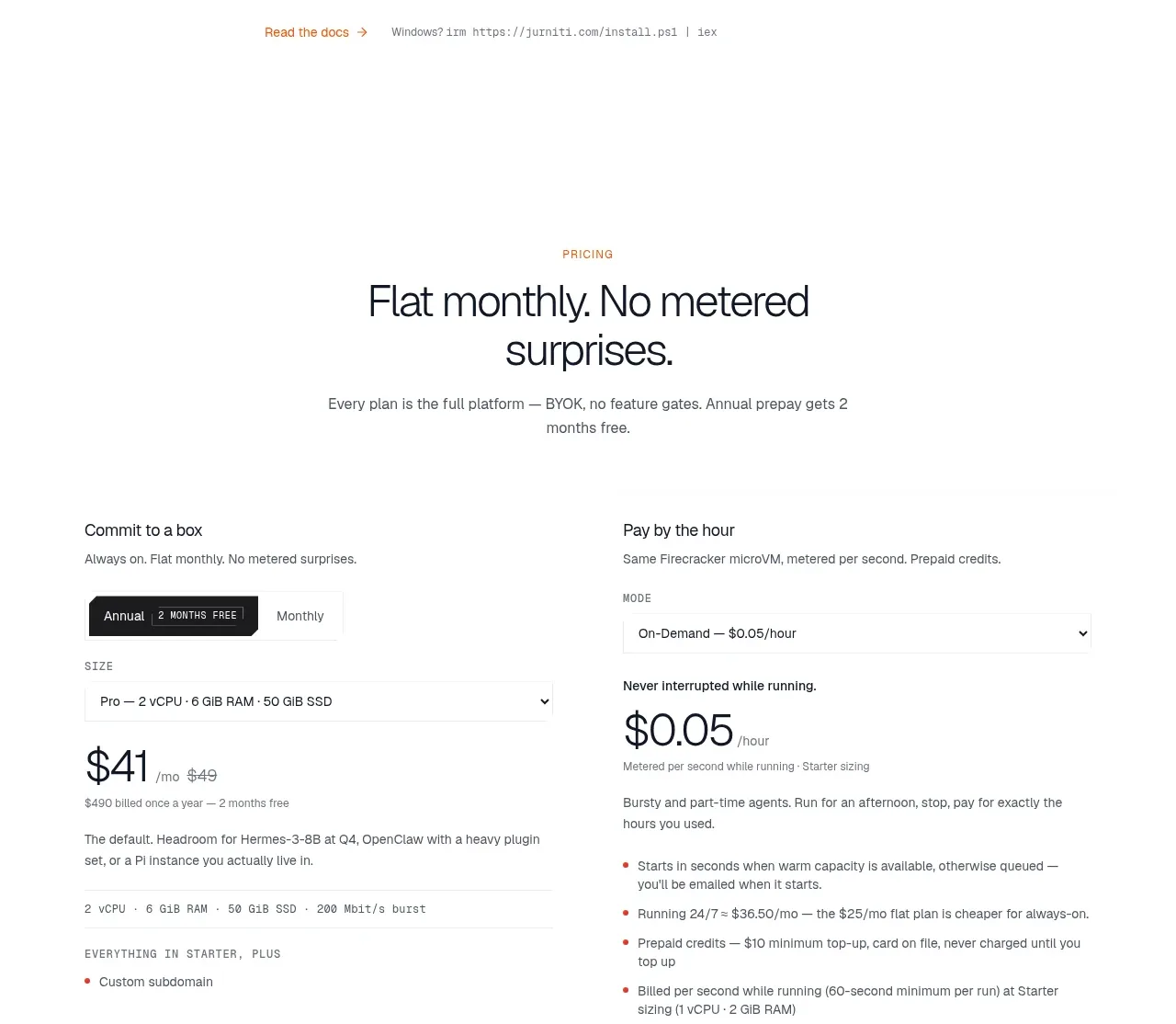
 CLI installation steps
jurniti · Code block
CLI installation steps
jurniti · Code block
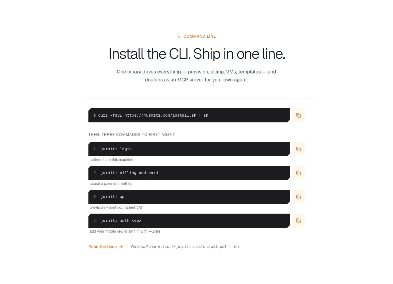 Quickstart terminal
jurniti · Code block
Quickstart terminal
jurniti · Code block