kage
kage
adant.ai
Design analysis
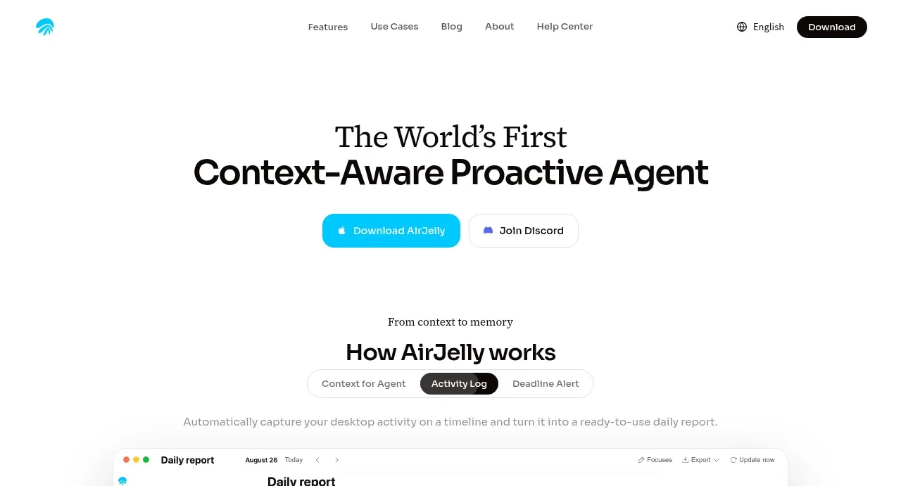
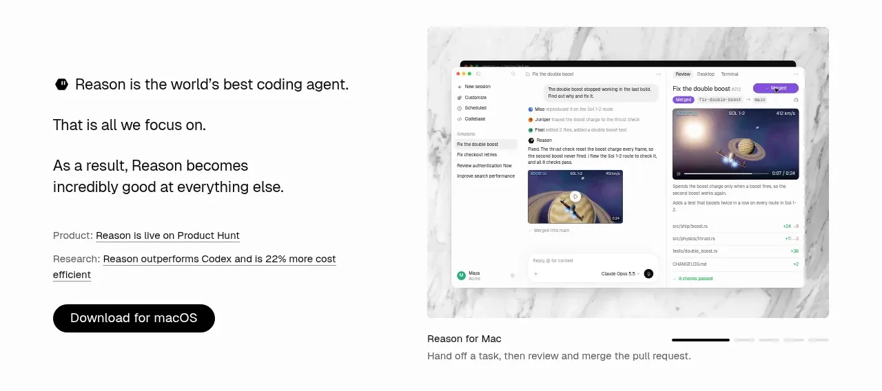
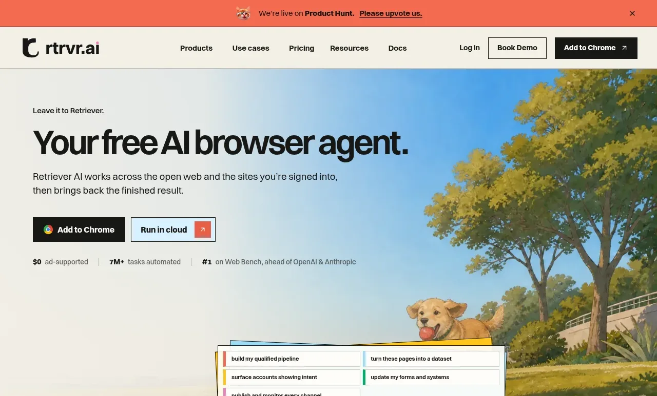
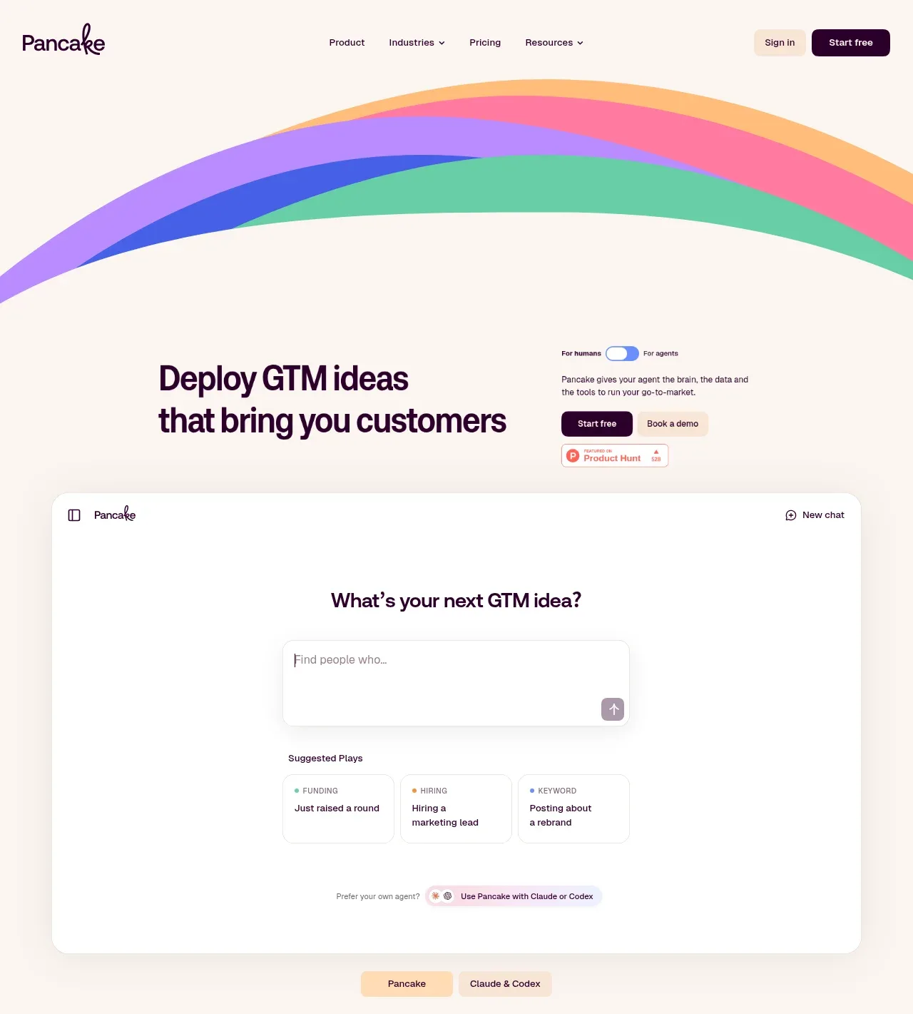
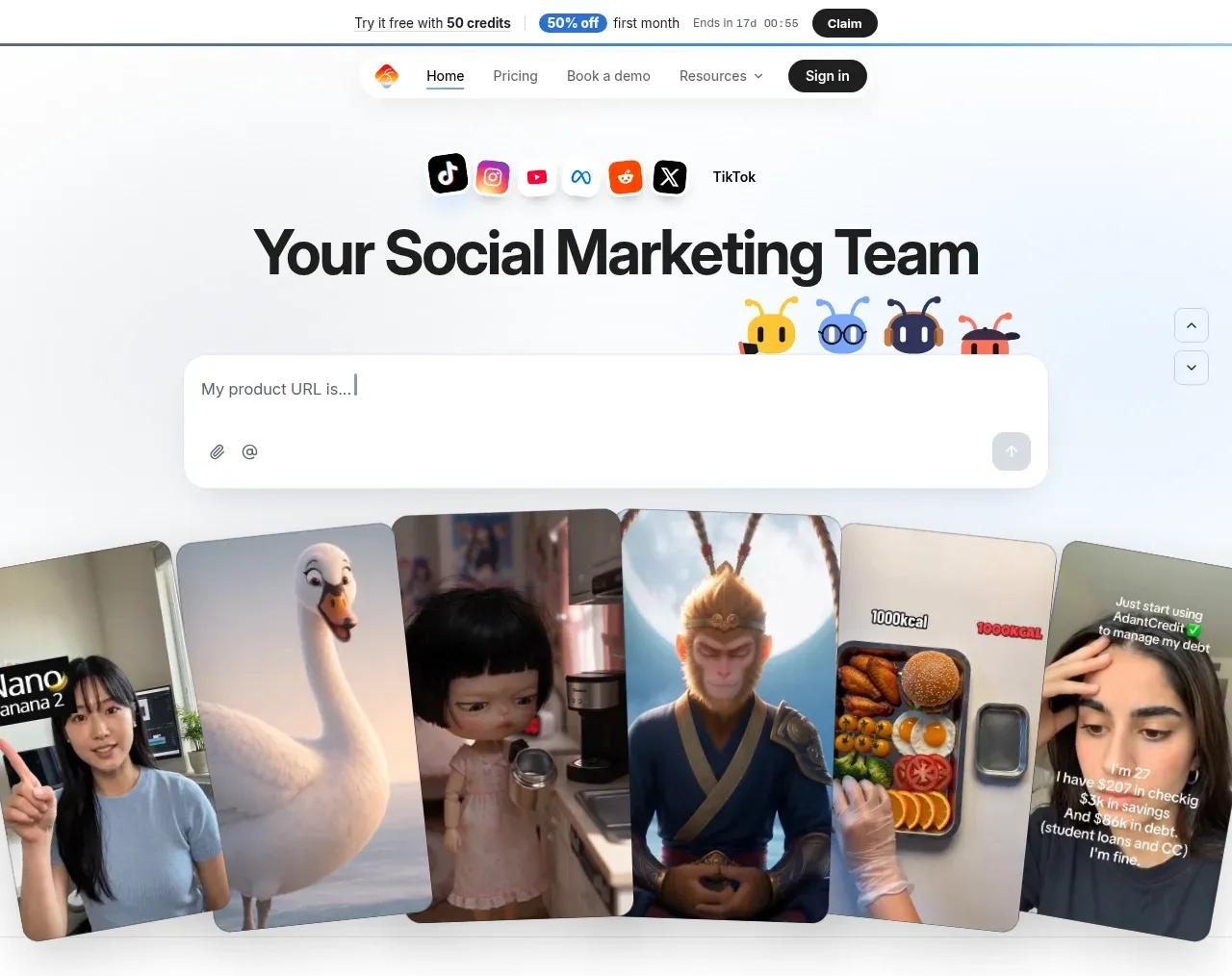
The hero combines platform badges, a large benefit-led headline, a product-link input, friendly agent avatars, and a curved collage of social content previews.
Prompt preview
## Reference images

Study these alongside the description below: hierarchy, rhythm, spacing, colour. Build for the product you are asked about, using this design language.

- Component: https://kage-design-assets.t3.tigrisfiles.io/components/adant-2-0/1b13b0a2-e64e-418d-a933-0f40a66c40ee-1792044357-1.webp
- Full page it was cut from: https://kage-design-assets.t3.tigrisfiles.io/screenshots/adant-2-0/1b13b0a2-e64e-418d-a933-0f40a66c40ee-1792044250464-full.webp
- Component on Kage: https://kage.design/component/adant-2-0-hero

## Before you start
Ask what the user's product does, what outcome it promises, and what visual language the brand should have. Use those answers to create an original hero based on the rules below.

Create a bright, centered hero directly below the navigation. Start with a small row of abstract channel/category badges, then a very large two-line headline focused on an outcome, followed by a short supporting sentence if needed. Include one prominent rounded input or prompt field with a clear submit affordance; make it feel like the product starts working immediately. Below or behind it, place a wide visual proof area made from several tilted, rounded content cards with varied aspect ratios, soft shadows, and slight overlap. Add a few small character-like status markers only if they fit the user's brand. Use near-white #F8FAFC, ink #111318, pale blue #EAF3FF, and one brand accent around #4C8FE8. Use 52–68px desktop headline type, 14px supporting text, 12–16px field text, 24–32px card radii, and 80–120px vertical breathing room. Keep the CTA/input visually dominant and make the collage decorative but understandable.

### Never
- Never use logos, product names, copy, illustrations, or imagery from the reference.
- Never copy the exact social badges, agents, collage assets, or headline.
- Never let decorative cards obscure the primary interaction.