kage
kage
pancake.ai
Design analysis
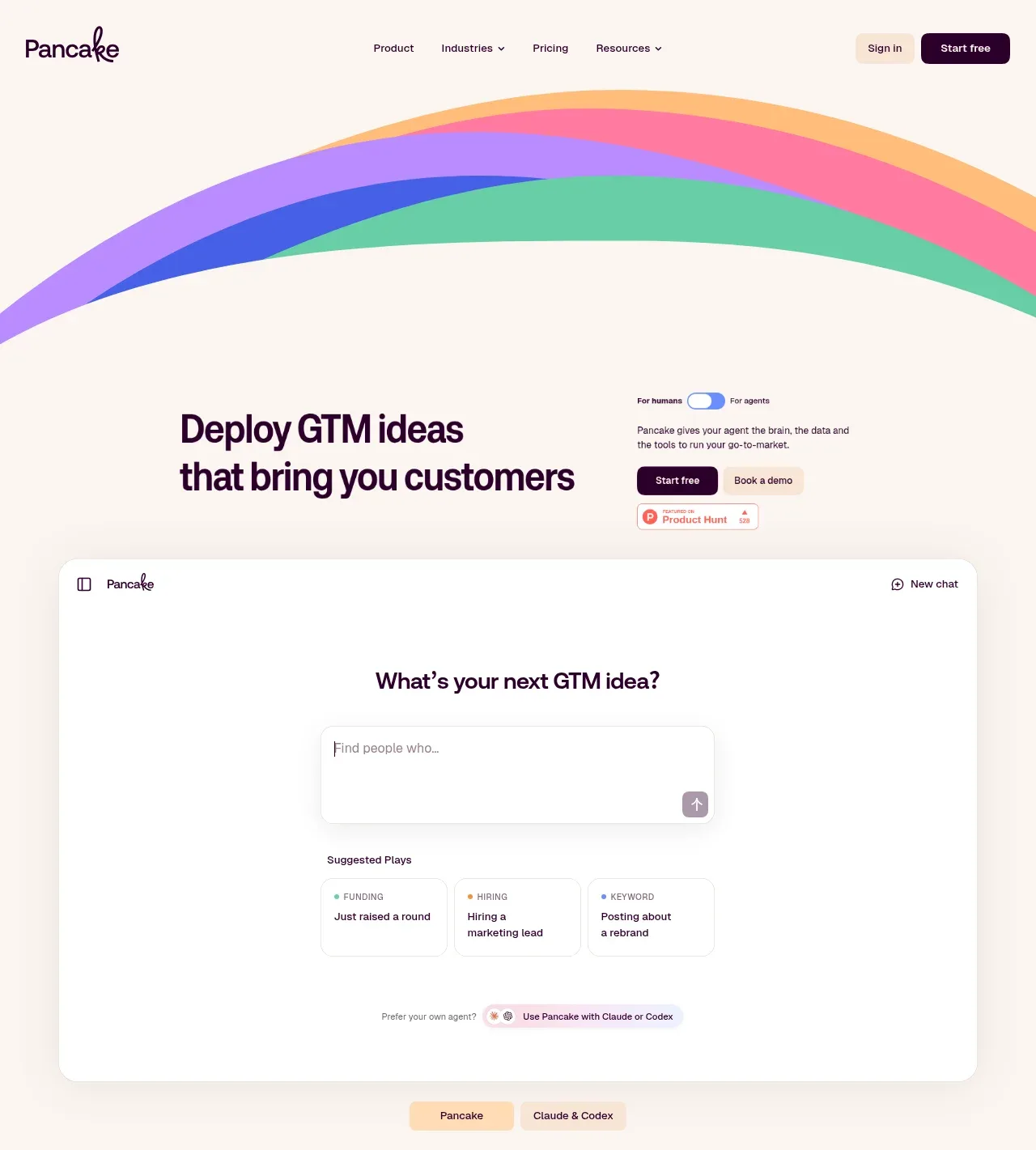
The hero pairs a large, high-contrast statement with a small audience toggle, two CTAs, social proof, and a large rounded product-preview panel. Layered sweeping color bands create a memorable frame while the preview makes the promise tangible.
Prompt preview
## Reference images

Study these alongside the description below: hierarchy, rhythm, spacing, colour. Build for the product you are asked about, using this design language.

- Component: https://kage-design-assets.t3.tigrisfiles.io/components/pancake/f2dcc4e1-7584-486e-8c34-37279d03f6e2-1792044191-1.webp
- Full page it was cut from: https://kage-design-assets.t3.tigrisfiles.io/screenshots/pancake/f2dcc4e1-7584-486e-8c34-37279d03f6e2-1792044073540-full.webp
- Component on Kage: https://kage.design/component/pancake-hero

## Before you start
Ask what the user's product does, who the target audience is, what the primary conversion action should be, and which brand colors and proof points are credible. Apply these principles to that product.

Create a full-width landing-page hero beneath the navigation. Use a warm ivory canvas (`#fbf7f1`) and a restrained dark-plum palette (`#210025`). At the top, add an abstract, non-literal set of broad curved bands in approximate coral `#f45b87`, lavender `#a77af2`, blue `#3e55d8`, mint `#62c9a4`, and apricot `#ffbd78`; the bands should feel like a flexible brand motif, not an illustration. Below it, use a two-column max-width layout: a very large 52–64px headline with tight line-height on the left, and concise supporting copy, an audience switch or segmented control, primary/secondary CTAs, and a small trust badge on the right. Follow with a large white or near-white product-preview mockup, about 90% width, with a 20–24px radius, faint border, soft shadow, and enough internal whitespace to feel like a real interface. Include a prominent input or prompt area, suggested options, and a small mode selector so the demo communicates interaction. Keep section spacing generous and make the hero responsive by stacking the columns and reducing type on mobile. Buttons should have 10–12px radius and strong focus states.

Never: use the reference logo, product name, exact copy, illustrations, or imagery.